Table of Contents >> Show >> Hide
Some patterns whisper. Stripes stroll into the room carrying a tote bag, a linen umbrella, and the confidence of someone who has never once overpacked for a weekend at the shore. They are crisp without being cold, playful without becoming juvenile, and timeless without feeling stuffy. In other words, classic summer stripes know exactly who they are.
That may explain why they keep reappearing whenever warm-weather style comes back into focus. Whether you see them on breezy bedding, cabana-style umbrellas, ticking-stripe pillows, painted walls, woven rugs, or beach towels with suspiciously good posture, stripes have a way of making a space feel brighter, lighter, and more awake. They suggest sunshine, travel, porches, fresh sheets, seaside lunches, and that glorious emotional state known as “windows open, phone ignored.”
This is the lesson of the stripe as object: a simple line can do a surprising amount of work. It can organize a room, sharpen a lazy corner, add rhythm to a neutral palette, and make a summer interior feel collected instead of chaotic. The right stripe can be nautical, preppy, rustic, modern, Mediterranean, cottagey, or quietly luxurious. The wrong stripe can make your room look like it is auditioning for a theme restaurant. So let’s discuss the difference.
Why Summer and Stripes Belong Together
Summer design is usually less about adding more and more stuff and more about changing the mood. Heavy fabrics become lighter ones. Moody colors lift. The room starts breathing again. Stripes fit beautifully into that seasonal reset because they bring order without heaviness. They are graphic, but not complicated. Decorative, but never fussy.
Classic summer stripes also tap into a visual language people already understand. Blue and white stripes feel coastal. Red and white stripes feel cheerful and nostalgic. Black and cream stripes feel tailored and grown-up. Yellow and ivory stripes look like lemonade learned table manners. Even faded multi-color stripes can feel relaxed and sun-washed, like a market tote you brought home from a trip and refuse to stop talking about.
And then there is the optical trickery. Thin stripes can read almost like texture from a distance. Wider stripes can frame an object or emphasize architecture. Vertical stripes pull the eye upward. Horizontal stripes can make a bench, rug, or bed feel broader and more grounded. Diagonal stripes, used sparingly, add movement. This is one of the reasons the pattern keeps showing up in every design era: it is decorative, yes, but also functional.
The Great Stripe Families of Summer
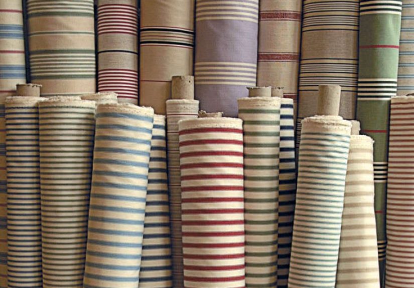
1. Breton Stripes
The Breton stripe is the chic overachiever of the group. It is simple, balanced, and somehow always looks as if it just returned from a tasteful holiday. Usually associated with navy and white, it brings a clean maritime spirit without demanding a ship’s wheel on the wall. In interiors, Breton-style stripes work beautifully on throw pillows, slipcovers, lightweight quilts, and even framed textiles. Their charm is in their restraint.
2. Cabana Stripes
Cabana stripes are bolder, sunnier, and fully aware that summer is a social season. These are the stripes of pool umbrellas, lounge cushions, awnings, and statement napkins. They tend to be wider and more playful, often in combinations like blue and white, green and cream, or tomato red and ivory. Used outdoors, they look festive. Used indoors, they can make a room feel like a glamorous summer hotel in the best possible way.
3. Ticking Stripes
If cabana stripes are the extroverts, ticking stripes are the old-soul introverts with impeccable taste. Narrow, even, and often rendered in muted blues, charcoals, or grain-sack red, ticking stripes feel utilitarian in the loveliest way. They bring a rustic, collected feel to kitchens, breakfast nooks, mudrooms, and guest bedrooms. They are excellent at making a space look “accidentally well designed,” which is one of the highest compliments an interior can receive.
4. Awning and Deck-Chair Stripes
These are stripes with vacation energy. They call to mind seaside resorts, market stalls, vintage umbrellas, and canvas that has seen enough sunlight to earn character. When used on furniture, cushions, or outdoor dining accessories, they instantly suggest a laid-back summer ritual. The key is not to overcommit. One striped bench cushion says, “Come sit in the shade.” Six striped surfaces say, “Please check in at the front desk.”
5. Painterly and Imperfect Stripes
Not every stripe has to stand at attention. Hand-drawn or slightly irregular stripes can soften the look, especially in more casual or artistic homes. These are the stripes that pair nicely with plaster walls, rattan, ceramics, and linen. They feel less preppy and more bohemian, less yacht club and more creative retreat. Summer loves both moods, and your home can choose its own adventure.
How to Use Classic Summer Stripes Without Looking Costume-y
Start Small if You’re Stripe-Shy
The easiest way to work with stripes is through objects rather than major commitments. Try a striped tablecloth, outdoor pillow, bath towel, lampshade, or upholstered dining chair seat. A stripe in a small dose can wake up a room faster than a complicated makeover and with much less emotional damage to your weekend.
Let Texture Do Half the Work
Summer stripes shine brightest when paired with tactile materials: linen, cotton, jute, cane, wicker, teak, seagrass, weathered wood, matte ceramics, and soft washed canvas. Texture keeps the look from becoming too flat or too graphic. A blue-and-white striped cushion on a slick acrylic chair can feel a bit stern. The same cushion on a woven chair beside a clay pot and a stack of books suddenly becomes a lifestyle.
Use a Controlled Palette
The smartest striped rooms usually keep the colors disciplined. That does not mean boring. It means choosing a lane. Navy, white, sand, and pale wood create a classic coastal scheme. Green, cream, and terracotta feel garden-fresh. Black, ivory, and brown leather feel chic and city-summer ready. The stripe already provides movement, so the rest of the room can relax.
Mix Scale, Not Chaos
One of the best tricks in decorating with stripes is mixing widths. A narrow ticking stripe can sit beautifully beside a chunky awning stripe, especially if the colors are related. This creates depth without visual clutter. What you want to avoid is a room full of competing stripe sizes and unrelated color stories that make your eye sprint laps. Think conversation, not argument.
Remember That Stripes Love Solids
Classic summer stripes are sociable, but they do not need a crowded guest list. Pair them with solid upholstery, simple ceramics, and plain bedding so they have room to breathe. A striped runner on a wood table. A striped duvet with white sheets. A striped umbrella over neutral seating. That balance is what makes the pattern feel expensive rather than noisy.
Use Stripes to Highlight a Season, Not Scream It
There is a fine line between summery and souvenir-shop enthusiasm. The most elegant approach is to let stripes suggest the season, then support them with natural light, greenery, breezy fabrics, and a few well-chosen warm-weather details. A striped pillow beside a woven tray and a bowl of lemons is charming. A room full of anchors, coral, rope knots, and seventeen competing stripes is an intervention.
Where Stripes Work Best in the Home
Bedrooms
Summer bedrooms love stripes because the pattern makes bedding feel fresh and tailored. A striped duvet, sham, or coverlet instantly gives the bed structure. Ticking stripes are especially effective here because they feel relaxed but orderly. Add white sheets, a woven basket, and one bedside flower stem pretending not to try too hard.
Kitchens and Breakfast Nooks
Few things look happier in the summer than a striped kitchen textile. Tea towels, seat cushions, café curtains, and table linens are low-risk ways to add the pattern. Red, blue, green, and mustard stripes all work beautifully here, particularly when paired with white walls, open shelving, or vintage-inspired accessories.
Living Rooms
In living spaces, stripes work best as punctuation marks. A striped ottoman, lumbar pillow, or accent chair can energize a room that feels too beige, too safe, or too sleepy. If the room already has patterned elements, keep the stripe simple. Think of it as the clean handwriting in an otherwise expressive notebook.
Bathrooms
Bathrooms are natural striped territory. The pattern feels crisp, clean, and classic in this setting. A striped shower curtain, hand towel, bath mat, or Roman shade adds charm without much effort. Blue-and-white is the default favorite, but charcoal, olive, and clay can be just as stylish for a more grounded look.
Porches, Patios, and Outdoor Dining Areas
This may be the spiritual homeland of summer stripes. Cushions, umbrellas, rugs, and table linens all wear stripes beautifully outdoors. The key here is durability and restraint. One standout striped element, supported by natural wood, potted plants, and a few solid accents, feels polished and inviting. It says, “Cold drinks at six,” not “Gift shop closes in fifteen minutes.”
Common Mistakes to Avoid
Going too thematic: Stripes do not need a costume department. Keep the rest of the decor grounded.
Ignoring proportion: A super-wide stripe can overwhelm a tiny object, while a hairline stripe may disappear on a large surface.
Forgetting texture: Flat stripes on flat materials can feel lifeless. Pair them with natural finishes.
Using too many bright colors at once: Summer is cheerful, not chaotic. Let one or two colors lead.
Making everything match: A good summer room feels collected. Matching every striped element exactly can make it feel staged.
The Real Object Lesson
What classic summer stripes teach us is surprisingly useful: style does not need to be complicated to be memorable. A line repeated with confidence becomes rhythm. Rhythm becomes mood. Mood becomes atmosphere. And atmosphere, more than almost anything else, is what makes a home feel beautiful.
That is why stripes endure. They can be breezy or formal, nostalgic or modern, polished or playful. They can live on a market umbrella, a grain-sack runner, a painted wall, or a perfect old deck chair that has faded just enough to become poetry. They work because they are disciplined, and because summer itself benefits from a little structure. Sunshine is wonderful. Sunshine with a striped cushion is better.
Experiences With Classic Summer Stripes
The most convincing argument for summer stripes is not theoretical. It is experiential. You understand the pattern best when you live with it for a while and notice what it does to ordinary moments.
Picture a guest room that felt forgettable for months: white walls, decent lamp, perfectly fine bed, zero personality. Then someone adds a blue ticking-stripe coverlet, a pale woven rug, and a striped Roman shade. Suddenly the room has a point of view. Nothing dramatic happened. No wall was demolished. No Italian artisan descended from the hills with a carved antique armoire. The room simply became more awake. Stripes gave it structure, and structure gave it charm.
Or imagine an outdoor table set for a lazy July lunch. The dishes are plain white. The chairs are simple wood. The food is casual. But the tablecloth is striped in soft green and cream, and the napkins pick up one of those colors with quiet confidence. That one pattern organizes the whole scene. Tomatoes look redder. Lemonade looks colder. Even the bread appears to have better manners. That is the magic of a stripe: it can make everyday objects feel edited.
There is also something emotional about the pattern. Many people associate stripes with old beach umbrellas, motel pool chairs, camp blankets, sailcloth, deck chairs, pajamas at a family cottage, or the sort of towel that gets thrown over one shoulder on the way to the water. Stripes carry memory well. They can feel nostalgic without becoming dusty, especially when used in fresh materials and cleaner color palettes.
One of the best experiences with classic summer stripes is how forgiving they are. Florals can feel too sweet. Tropical prints can become loud very quickly. Checks can lean rustic or holiday depending on scale and color. But stripes have range. They can sit comfortably in a farmhouse kitchen, a city apartment, a beach house, a traditional bedroom, or a modern patio. They adapt. They do not demand that the entire house change its personality to suit them.
And perhaps most importantly, stripes make seasonal decorating feel achievable. Not everyone wants to repaint walls or buy new furniture every time the weather changes. Most of us want small, satisfying updates that create a shift in atmosphere. That is where summer stripes earn their reputation. A pillow, a towel, a runner, a lampshade, a cushion, a table linen set: these are accessible changes, but they have outsized effect. They tell the eye that the season has changed, and the room follows.
So yes, classic summer stripes are lovely to look at. But their real value is how they make people feel: lighter, calmer, more open to leisure, and maybe just a little more stylish while carrying iced tea from the kitchen to the porch. For a simple pattern made of repeated lines, that is a pretty impressive summer résumé.
Conclusion
Classic summer stripes remain relevant because they solve two design problems at once: they add energy, and they create order. That balance is rare. Whether you prefer Breton restraint, ticking-stripe simplicity, or cheerful cabana drama, the pattern brings a fresh seasonal note that feels familiar without being tired. Use it on objects first, pair it with texture, keep the color story focused, and let the stripe do what it does best: bring rhythm to a room.
In the end, the lesson is simple. Summer style does not need to be reinvented every year. Sometimes it just needs a clean line, a good fabric, and enough confidence to leave a little empty space around the pretty things.