Table of Contents >> Show >> Hide
- Jump to a method
- Quick Start: Pick Your Path (So You Don’t Waste an Hour)
- 1) One-Tap AI “Sketch” Styles in Google Photos Remix
- 2) Turn a Photo Into a Drawing in PowerPoint or Word (Yes, Really)
- 3) Trace It for a True Hand-Drawn Look (iPhone/iPad/Windows)
- 4) Photoshop Pencil Sketch (Control-Freak Friendly, Results-Friendly Too)
- 5) Free Desktop Method: GIMP Sketch Workflow
- Troubleshooting: Why Your “Drawing” Looks Weird (and Fixes That Work)
- FAQ: Photo-to-Drawing Questions People Actually Ask
- Real-World Experiences: What Usually Happens When You Try This (500-Word Reality Check)
- Conclusion
Ever look at a photo and think, “This would slap as a sketch”? Same. The good news: you don’t need an art degree,
a fancy tablet, or a mysterious room lit only by a single dramatic lamp. You just need the right method for your
goalquick social post, printable wall art, a clean line drawing for a logo, or a “wow, did you draw that?” moment.
This guide breaks down five simple, realistic ways to convert a photo into a drawingranging from
one-tap AI styles to the classic Photoshop pencil-sketch recipe that refuses to retire (because it works).
I’ll also show you how to avoid the most common “why does my sketch look like a haunted receipt?” problems.
Quick Start: Pick Your Path (So You Don’t Waste an Hour)
The “best” way to turn a photo into a drawing depends on what you actually want:
- Fast + fun styles (anime/comic/sketch): use an AI style tool (Method #1).
- No new software, office-friendly: use PowerPoint/Word artistic effects (Method #2).
- Looks like you drew it: trace with Markup/Notes/OneNote (Method #3).
- Highest control + printable quality: Photoshop sketch workflow (Method #4).
- Free desktop option: GIMP sketch workflow (Method #5).
1) One-Tap AI “Sketch” Styles in Google Photos Remix
If your goal is “I need this to look like a drawing right now,” AI style tools are the quickest route.
Google Photos’ Remix feature (where available) is built for exactly this: you pick a style like
sketch, and it generates a stylized version without you babysitting layers and sliders.
Best for
- Social posts, profile pics, quick gifts, “turn my dog into a comic hero” energy
- People who want results faster than they want control
How to do it (typical flow)
- Open Google Photos and find the photo you want to draw-ify.
- Go to Create (or a similar menu) and look for Remix.
- Select a style like Sketch (some versions also offer anime/comic/3D styles).
- Tap Generate, then save your favorite result.
Make the AI result look more “artist-made”
- Start with a clean photo: simple background, good lighting, crisp subject edges.
- Crop first: AI styles look better when the subject fills more of the frame.
- Expect variation: generate more than once if the first pass is “meh.”
Heads-up: AI stylization can sometimes invent details (extra eyelashes, bonus buttons,
surprise jewelry). If accuracy matterslike a product photo or formal portraituse Methods #2–#5 instead.
2) Turn a Photo Into a Drawing in PowerPoint or Word (Yes, Really)
This is the most underrated method in the whole guide: Microsoft PowerPoint and Word include
Artistic Effects that can make a photo look like a pencil sketch or line drawing.
If you already have Microsoft Office, this is basically a “free” trick hiding in plain sight.
Best for
- Quick sketch effects for presentations, handouts, posters, classroom materials
- People who want “good enough” results without learning an editor
Step-by-step
- Insert your photo into PowerPoint or Word.
- Select the image, then go to Picture Format.
- Open Artistic Effects and hover to preview options.
- Pick a sketch-style effect (commonly options like Pencil Sketch, Pencil Grayscale, or Line Drawing).
- If available, tweak effect settings (some versions let you adjust intensity/pressure/pencil size).
PowerPoint pro tip
If your sketch looks too “flat,” bump Contrast slightly and reduce Color Saturation
(or switch to grayscale). Sketch effects love contrast the way toddlers love asking “why?”endlessly and loudly.
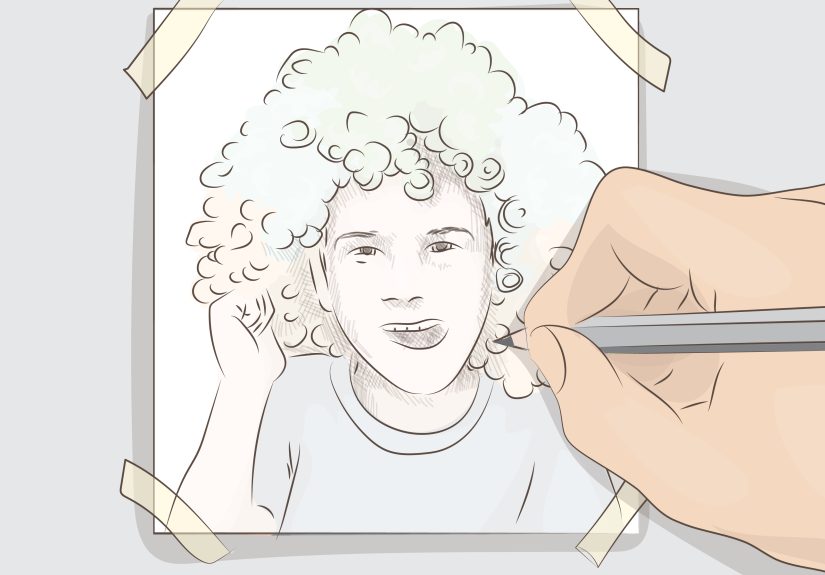
3) Trace It for a True Hand-Drawn Look (iPhone/iPad/Windows)
Filters can imitate pencil lines, but tracing gives you something filters can’t: intentional line choices.
A traced drawing often looks more personal (and less “I pressed a button”), especially if you simplify shapes and
exaggerate the features you actually care about.
Best for
- Custom portraits, stickers, avatars, tattoo-style line art, “I drew this” authenticity
- People with a stylus (Apple Pencil, Surface Pen) though fingers work in a pinch
Option A: iPhone/iPad with Markup or Notes
- Open the photo in Photos or Notes.
- Tap Markup (or the drawing tools).
- Use a thin pen/marker to trace key outlines: jawline, eyes, brows, nose bridge, lips, hair silhouette.
- Add a few shading hints (short strokes) instead of trying to shade everything.
- Save/export the image.
Option B: Windows Photos (or OneNote) for tracing
- Open the image in Windows Photos.
- Use the draw/ink tools to sketch directly on top, or paste the image into OneNote and draw in the Draw tab.
- Keep lines clean: fewer strokes, longer confident lines.
- Export as PNG for sharing.
How to make tracing look less like tracing
- Simplify: remove tiny details and keep only the big shapes.
- Stylize on purpose: thicker outer contour, thinner interior lines.
- Cheat with shading: add 2–3 shadow areas (under chin, hairline, eye sockets) and stop.
If you want a “clean logo” look, tracing is often the easiest way to get crisp line artbecause you decide what
stays and what disappears.
4) Photoshop Pencil Sketch (Control-Freak Friendly, Results-Friendly Too)
If you want the classic “pencil drawing from a photo” lookwhite paper, graphite lines, realistic shadingPhotoshop
is still the gold standard. The workflow below is fast, flexible, and doesn’t require a single complicated spell.
(Okay, one blend mode, but you’ll be fine.)
Best for
- Printable art, client work, portfolio pieces
- People who want control over line strength, shading, and paper texture
The 5-minute workflow
- Duplicate the background layer. (Always. It’s Photoshop’s emotional support blanket.)
- Desaturate the duplicate (make it black and white).
- Duplicate again, then Invert that top B&W layer.
- Change the inverted layer’s blend mode to Color Dodge.
- Apply a Gaussian Blur to the inverted layer. Adjust blur until pencil lines and shading appear.
What’s happening under the hood: Color Dodge + blur turns tonal transitions into sketch-like strokes. You control
the “pencil softness” mainly with blur amount and contrast.
Add paper texture (optional, but it sells the illusion)
- Place a paper texture image above your sketch layers.
- Set it to Multiply or Overlay and lower opacity until it looks natural.
- Mask the texture if it’s messing up faces (paper texture should whisper, not shout).
Want a cleaner line drawing instead of shading?
- Try Filter Gallery sketch filters (like Photocopy/Graphic Pen styles) for bold outlines.
- Or run an edge detect-style approach, then clean lines with Levels/Curves.
Common Photoshop upgrades
- Fix the background first: remove or blur a busy background before sketching.
- Boost contrast carefully: use Curves to bring out midtones without crushing highlights.
- Sharpen last: light sharpening helps pencil lines feel crisp, but too much looks crunchy.
5) Free Desktop Method: GIMP Sketch Workflow
Don’t want Photoshop? Fair. GIMP (free, open-source) can still get you a convincing sketch look. Some versions also
include artistic filters (like Photocopy-style effects) that can push a photo toward a drawn/cartoon feel with fewer steps.
Best for
- Budget-friendly editing
- People comfortable clicking menus and adjusting sliders
Simple GIMP approach (layer-based “pencil” look)
- Open your photo and duplicate the layer.
- Desaturate the duplicate to black and white.
- Duplicate again, invert the top layer, and set a brightening blend mode (GIMP’s equivalent options vary).
- Apply blur until it looks sketchy.
- Use Levels to control line strength and clean up the whites.
Shortcut option: artistic filters
If you see an artistic filter that resembles “photocopy,” “cartoon,” or “sketch,” try itthen clean the result with
Levels/Curves and a tiny bit of sharpening. Filters can get you 80% of the way there; a couple adjustments get you
the remaining 20%.
Troubleshooting: Why Your “Drawing” Looks Weird (and Fixes That Work)
- Problem: The background turns into noisy chaos.
Fix: blur or remove the background first. Sketch effects love turning clutter into confetti. - Problem: The face looks gray and lifeless.
Fix: lift the whites (Levels) and add contrast in midtones (Curves). Keep highlights clean. - Problem: Lines are too thick or “burned in.”
Fix: reduce contrast, lower effect intensity, or back off sharpening. - Problem: Everything looks soft and blurry, not sketchy.
Fix: increase contrast and try a smaller blur radius (Photoshop method), or switch to a line-focused filter. - Problem: The result looks fake (AI-ish) rather than drawn.
Fix: add subtle texture, simplify details, or combine AI output with light manual tracing.
FAQ: Photo-to-Drawing Questions People Actually Ask
Which photos work best for turning into drawings?
Choose images with clear lighting, a sharp subject, and a simple background.
Portraits near a window, outdoor shade, or evenly lit rooms usually behave best. High-contrast photos are your friend.
Can I turn a photo into a clean line drawing (like for a logo or tattoo stencil)?
Yestracing (Method #3) is the most reliable. For a filter-based approach, aim for edge/outline effects and then
clean up by removing background noise and thickening only the lines you want.
How do I make it printable?
Export high resolution (preferably 300 DPI for printing) and avoid over-sharpening. Paper texture can help on-screen,
but test-print a small section first so it doesn’t muddy fine detail.
Is AI or Photoshop “better”?
AI is faster and more playful. Photoshop (or GIMP) is better when you need predictable controlespecially for
clients, printing, or consistency across multiple images.
Real-World Experiences: What Usually Happens When You Try This (500-Word Reality Check)
Here’s the part nobody tells you: the first attempt is often not the final attemptand that’s normal. Most people
start by throwing a random selfie into a sketch effect, expecting museum-quality line work, and then wonder why the
output looks like a security-camera still from a ghost documentary. The “secret” is that sketch tools don’t create
artistry from thin air; they exaggerate what’s already in the photo. If the original has harsh overhead lighting,
deep shadows, or a busy background, the “drawing” will faithfully translate that into odd shading, blotchy textures,
and lines where you never wanted lines.
The biggest quality jump usually comes from choosing a better starting photo, not from choosing a
fancier app. Clear lighting and a calm background do more than a hundred sliders. A close-up portrait taken in
soft daylight tends to convert beautifully, because the face has gentle gradients that become believable pencil
shading. Meanwhile, a night photo with digital noise becomes a sketch that looks like it was drawn on sandpaper
with a nervous squirrel.
People also tend to discover that “drawing” can mean different styles. Some want realistic graphite
(subtle shading, paper texture), others want bold comic outlines, and others want that clean,
minimalist line drawing look that’s perfect for avatars and icons. This is why a one-tap AI sketch
might feel “off” for a logobut absolutely perfect for a fun social post. Meanwhile, tracing can feel slower, but
it produces a result that looks intentional because you decide which details survive.
Another common experience: once you get a sketch you like, you’ll immediately want a second versioncleaner,
darker, lighter, more dramatic, less dramatic. The best workflow is to treat your first success as a “base,” then
make a few variations: one with stronger lines, one with softer shading, one with a touch of texture. That gives
you options for different uses (profile picture vs. print vs. thumbnail). People who do this regularly often keep a
small checklist: crop, simplify background, increase contrast slightly, apply sketch effect, then refine.
Finally, there’s the “confidence curve.” At first, everything feels like trial and error. Then you realize there
are only a few knobs that truly matter: contrast, blur/softness, line strength, and background complexity. Once
those clicks happen, turning a photo into a drawing becomes less like “fighting software” and more like choosing a
style on purpose. And that’s when it gets funbecause now you’re not just converting photos. You’re designing how
you want the image to feel.
Conclusion
Turning a photo into a drawing isn’t one trickit’s five different roads to five different vibes. If you want speed,
use AI stylization. If you want “I did this at work without installing anything,” use PowerPoint. If you want it to
feel personal, trace it. If you want full creative control, use Photoshop. And if your budget is “zero dollars and
a dream,” GIMP still delivers.
Pick one method, try it on a clean photo, then make one small improvement (crop, contrast, simpler background).
That’s how “pretty good” becomes “wow.”