Table of Contents >> Show >> Hide
- 1) Putting the bed on the wrong wall
- 2) Not centering the bed (even when the window isn’t centered)
- 3) Treating symmetry like it’s optional (then wondering why the room feels tense)
- 4) Blocking a window with a headboard (especially a tall one)
- 5) Choosing furniture that’s out of scale (too big, too tiny, or just… wrong)
- 6) Jamming the bedroom with too much furniture (especially bulky storage)
- 7) Treating lighting like an afterthought
- Quick Layout Audit: the 5-minute designer test
- Real-World Bedroom Walk-Throughs (Extra): What These Mistakes Look Like in Real Life
- Conclusion: Make the layout do the relaxing for you
- SEO Tags
Bedrooms are supposed to be restful. And yet, some bedrooms feel like they were laid out by a well-meaning raccoon:
the bed is shoved somewhere “temporary,” the dresser blocks a drawer, and you need Olympic-level agility to get to
the closet. Interior designers notice these problems instantlynot because they’re judging you (okay, maybe a tiny
bit), but because layout mistakes create friction you feel every single day.
The good news: most bedroom layout mistakes are fixable without remodeling, buying a whole new furniture set, or
learning geometry beyond “this corner is… not helpful.” Below are seven bedroom layout mistakes designers always
noticeplus practical, real-world ways to correct them so your room looks calmer and works better.
1) Putting the bed on the wrong wall
Why designers notice it
In most bedrooms, the bed is the visual “headline.” If you walk in and see the side of the bed first, or you have
to take an awkward lap around the mattress just to understand the room, the layout immediately feels off. It’s not
about rules for the sake of rulesit’s about creating a natural, welcoming sightline the moment you enter.
Fix it
- Stand in the doorway and pick the “main view” wall. The ideal bed wall is typically the one that
lets you see the headboard (and bedside setup) right away, not the mattress edge. - If the bed can’t go directly across from the door, try the wall to the right or left of the
entry so circulation still feels natural. - Don’t forget the practical stuff: outlets for lamps/chargers, HVAC vents, and whether a door will
smack into your nightstand.
Design reality check: Sometimes the “best” wall is the one that keeps you from clotheslining yourself on a
dresser corner at 2 a.m. Choose the wall that makes daily life easiestand then make it look intentional.
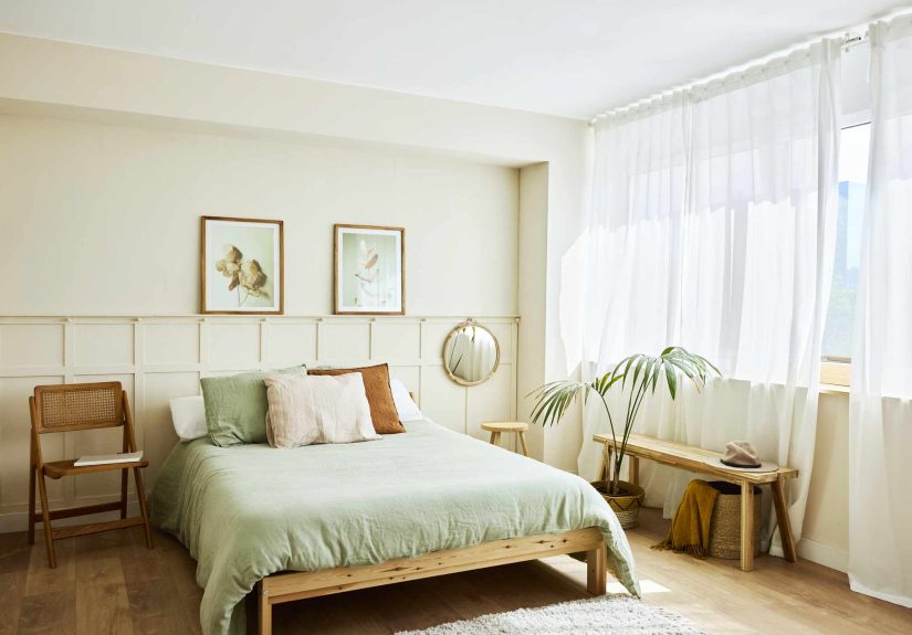
2) Not centering the bed (even when the window isn’t centered)
Why designers notice it
A bed that’s floating off-center reads as accidental, like you moved in during a rainstorm and never finished.
Designers tend to center the bed on the wall because it creates instant orderespecially important in a room meant
for rest. Even if the window on that wall is off-center, the bed usually still wants to be centered.
Fix it
- Center the bed on the wall first, then “balance” the rest. Use matching lamps, symmetrical
bedding, or art placement to visually even out an off-center window. - Use a rug as an anchor. A properly sized rug under the bed helps the whole sleep zone feel placed
(not drifting). - Cheat with spacing. If one side is tighter, use a slimmer nightstand or a wall-mounted shelf on
that side so the bed can stay centered.
Small-room trick: If you can’t center the bed and keep walkways, it may be a sign the bed is too large for
the roomor you’re asking the room to hold too many “supporting actors” (see mistake #6).
3) Treating symmetry like it’s optional (then wondering why the room feels tense)
Why designers notice it
Symmetry isn’t about matching everything like a furniture showroom. It’s about creating a sense of balance.
Designers love a classic “hotel-style” layout: the bed centered, flanked by two nightstands and two lights. It reads
calm, organized, and finishedlike the bedroom has its life together.
Fix it
- Create a pair. If you can, put a nightstand on each side of the bed. If not, pair the visual
weightuse a sconce on one side and a table lamp on the other, or a floating shelf that matches the nightstand’s
height. - Match function, not necessarily furniture. Nightstands don’t have to be identical, but they
should offer similar surface area and height so both sides feel equally usable. - Balance the “stuff.” If one nightstand has a lamp, water glass, and books, and the other has…
anxiety and a single lonely charger, your room will look lopsided.
Humor, but true: If one side of the bed looks like a spa and the other looks like an airport charging
station, your layout is sending mixed signals.
4) Blocking a window with a headboard (especially a tall one)
Why designers notice it
Windows are “visual breathing room.” When a tall headboard blocks part of a window, the room can feel darker, more
crowded, and oddly squishedlike the architecture is wearing an awkward hat. Sometimes bed placement forces this,
but designers try hard to avoid it.
Fix it
- Try a lower headboard. If the bed must sit in front of a window, a lower profile minimizes light
loss. - Choose an “airy” headboard material. Open weaves or slatted styles let light pass through better
than a solid wall of upholstery. - Re-check other walls. Sometimes swapping the bed and dresser solves two issues at once: the window
stays clear and your circulation improves.
Bonus tip: If privacy is the reason the bed ended up in front of the window, upgrade window treatments
instead of sacrificing your best daylight.
5) Choosing furniture that’s out of scale (too big, too tiny, or just… wrong)
Why designers notice it
Scale problems show up as “pinch points” and “dead zones.” An oversized bed can block doors and drawers, while tiny
nightstands can look comically undersized next to a tall headboard. Designers measure because bedrooms aren’t just
pretty picturesthey’re obstacle courses you walk daily (preferably without bruises).
Fix it: the measurement-based approach
- Start with bed clearance. As a practical target, aim for about 30 inches of clearance at the sides
and about 36 inches at the foot of the bed when possible. If you’re tight on space, even 24 inches on each side
can help you make the bed without rage. - Mind the door zone. Don’t place the bed so close to the door that it becomes a roadblock. Give
yourself enough room to enter, turn, and move naturally. - Mock it up before you buy. Use painter’s tape on the floor (or cardboard footprints) to test bed,
nightstand, and dresser sizes before committing.
Fix it: the “visual weight” approach
If you love a bigger bed but the room is modest, choose a visually lighter headboard (open frame, slimmer posts, or
less bulky shapes). This keeps the room from feeling dominated by one giant rectangle.
Don’t let a tiny rug shrink the entire sleep zone
Designers also notice when a rug is too small because it throws off proportion and makes furniture look oversized.
A bedroom rug generally works best when it’s wide enough to relate to the nightstands and extends generously beyond
the foot of the bedso your feet land on something soft instead of a cold “welcome to adulthood” floorboard.
6) Jamming the bedroom with too much furniture (especially bulky storage)
Why designers notice it
Bedrooms get cluttered fast because they’re asked to do a lot: sleep, dress, store, charge devices, sometimes work,
sometimes hide laundry “for later.” But when you add too many large piecesextra dressers, oversized chairs, random
benchesthe room loses circulation. Designers frequently look for clear pathways and enough space around the bed to
move comfortably.
Fix it
- Prioritize the essentials. Bed, landing zones (nightstands or shelves), and the storage you truly
need. Everything else has to earn its rent. - Build up, not out. When space is limited, shift storage vertical: wall shelves, tall wardrobes,
and wall-mounted options reduce bulky footprints. - Replace “more furniture” with “smarter furniture.” Under-bed storage, beds with drawers, or closet
upgrades can reduce the urge to keep adding dressers. - Protect your walkways. Give yourself comfortable clearance around the bed so you’re not squeezing
between corners like a cat trying to fit in a too-small box.
Designer mindset: If you need three dressers, the problem may not be “insufficient furniture.” It might be
closet organization, poorly used vertical space, or keeping too much in the room that doesn’t belong there.
7) Treating lighting like an afterthought
Why designers notice it
Lighting is part of layout because it affects where furniture should go. If your only light is an overhead fixture,
you’ll either live in glareor you’ll move around in the dark like you’re in a suspense movie. Designers prefer
layered lighting: ambient (overall), task (reading/getting ready), and accent (mood/highlight).
Fix it
- Plan lighting with the furniture plan. Decide where you’ll read, dress, and relaxand light those
spots on purpose. - Upgrade bedside lighting. If your nightstand is tiny, use wall sconces or pendants to free up
surface space. - Use dimmers where possible. Your bedroom should handle “wake up” and “wind down” without needing
a full personality change. - Keep bulb color consistent. Mixing warm and cool bulbs in one room can make the space feel subtly
off.
Quick Layout Audit: the 5-minute designer test
Want a fast reality check? Do these five things and see what annoys you immediately:
- Enter the room. Is the bed the “main view,” or do you see the side of it first?
- Walk to each side of the bed. Do you have comfortable clearance, or are you shimmying?
- Open every door and drawer. Anything scraping, bumping, or blocked is a layout red flag.
- Reach for your nighttime essentials. Do you have a landing zone for a lamp, water, book, or phone?
- Turn off the overhead light. Do you still have usable lighting, or is it “good luck, everyone”?
Real-World Bedroom Walk-Throughs (Extra): What These Mistakes Look Like in Real Life
Designers don’t just “see” layout mistakesthey see how those mistakes show up in your routine. Here are a few
common, real-life scenarios (the kind that happen in everyday homes) and how small layout changes make a big
difference.
The small bedroom with the corner-bed compromise
In tight bedrooms, people often tuck the bed into a corner to “save space.” On paper, it looks efficient. In real
life, it usually means one person climbs in and out like they’re escaping a submarine. Making the bed becomes a
weekly upper-body workout, and the room starts to feel unbalanced because one side of the bed has all the activity:
the lamp, the charger, the nightstand clutter, the laundry pile that’s “not a pile, it’s a system.”
The fix isn’t always “buy a smaller bed.” Sometimes it’s simply rotating the bed so at least one long side has
clearance, then switching to a slimmer nightstand or a floating shelf. If the closet door hits furniture, swapping
to a different dresser depth (or moving storage into the closet with better shelving) can free the circulation you
thought you didn’t have.
The primary bedroom that looks fine… until you try to live in it
This one is sneaky. The bed is centered, the headboard is gorgeous, and the room photographs beautifully. But daily
life reveals the problem: the dresser drawers can’t fully open because the bed is too close, or the door swing eats
the space where a nightstand should be. Often, the room has too many “big rectangles” competingking bed, wide
dresser, bulky chair, and a bench that seemed like a good idea until it became a landing strip for clothes.
The fix is usually a scale adjustment, not a style overhaul. Replacing one oversized piece with a narrower version
(like a slimmer dresser) can restore function instantly. And sometimes, simply removing the bench at the foot of
the bed creates enough clearance to walk comfortably, open drawers, and make the space feel like a bedroom again
not a storage unit with pillows.
The “why does this room feel stressful?” lighting and symmetry combo
A lot of bedrooms feel unsettled for one simple reason: your eyes have nowhere to rest. One side of the bed is
visually heavy (tall lamp, stacked books, big nightstand), the other side is bare, and the only overhead light is
bright enough to interrogate someone. That imbalance reads as low-level chaoseven if the room is clean.
This is where symmetry and lighting do the heavy lifting. You don’t need matching furniture sets, but you do need
balanced function: two similar-height lights (or a lamp and a sconce), and two usable landing zones. Then layer
lighting: ambient for general glow, task for reading, accent for softness. It’s the difference between “This room
looks fine” and “I exhale the second I walk in.”
The window problem (a.k.a. the headboard vs. daylight showdown)
Sometimes the only wall that fits the bed is the window wall, and people solve it with a tall headboard right across
the glass. The room immediately feels darker, and the windowone of the best architectural featuresturns into a
background extra. A better approach is choosing a lower-profile headboard or an open material, then treating the
window like a feature: hang curtains properly, keep the sill clear, and let light do its job. If privacy is the
issue, blackout or privacy-lined curtains solve the problem without sacrificing the room’s daylight.
Bottom line: “Good layout” isn’t a designer secret handshake. It’s a bedroom that’s easy to walk
through, easy to use, and visually calmbecause you’ve removed the daily friction points.
Conclusion: Make the layout do the relaxing for you
A great bedroom layout isn’t about perfectionit’s about flow, balance, and making the room feel like it’s on your
team. Put the bed on the wall that creates a natural first view, keep it centered when you can, build in symmetry
with nightstands and lights, protect windows, choose properly scaled pieces, avoid cramming in bulky furniture, and
plan lighting like it matters (because it does). Do that, and your bedroom stops feeling like a collection of
objects and starts feeling like a true retreat.