Table of Contents >> Show >> Hide
- Before You Pick Tile: The Quick “Looks Great, Lives Well” Checklist
- 49 Shower Tile Ideas That Make a Bathroom Feel Designed
- How to Make Any Shower Tile Look Intentional (Not Accidental)
- Conclusion: Your Shower Can Be the Showstopper
- Real-World Experiences: What People Wish They Knew Before Picking Shower Tile
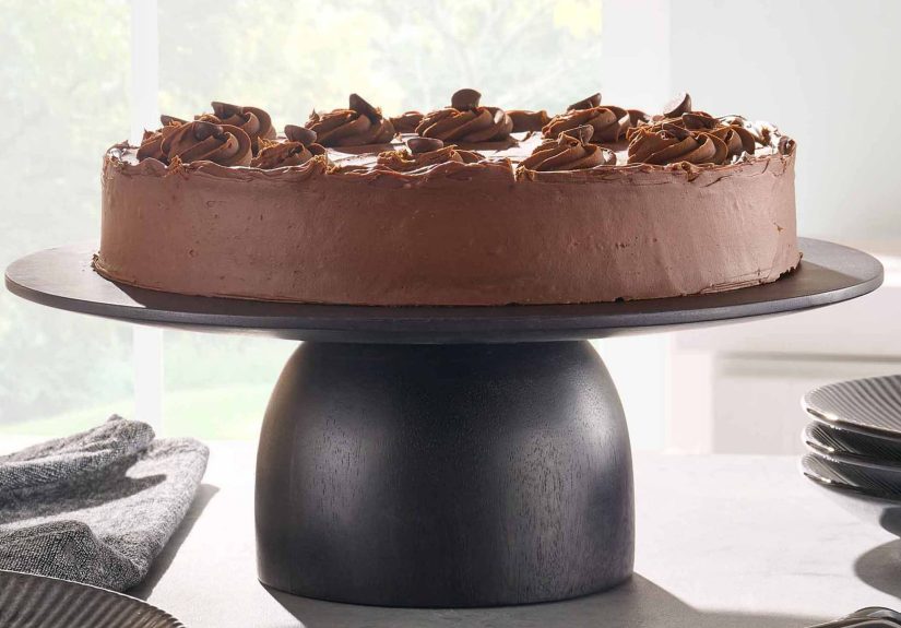
A shower is basically a tiny room you visit every dayoften half-awake, sometimes singing like you’re headlining Coachella, and occasionally questioning why conditioner bottles are designed to launch themselves off ledges. So yes: your shower deserves tile that looks good, works hard, and won’t punish you with endless grout scrubbing.
The best shower tile ideas do three things at once: they flatter the size of the bathroom, handle water like a champ, and create a “wow” momenteven if the rest of your space is just “clean enough to pass inspection.” Below you’ll find 49 standout looks, plus the practical design rules that keep them from turning into a “beautiful mistake” two months after install.
Before You Pick Tile: The Quick “Looks Great, Lives Well” Checklist
1) Choose the right tile for the job (walls vs. floors)
Walls can handle bigger formats, bolder colors, and smoother finishes. Shower floors need traction and need to follow the slope to the drain, which is why smaller mosaics (often 2-inch or smaller) are popularthey bend with the pitch and reduce awkward cuts. If you love the look of large-format floor tile, plan for smart cutting and a slip-resistant finish.
2) Decide what you want to “stand out”
Pick one hero moment: an accent wall, a bold niche, a dramatic floor pattern, or a full tile “wrap” that climbs the ceiling. When everything is screaming, nothing is singing. (And your shower should sing.)
3) Grout isn’t an afterthoughtit’s a design ingredient
Grout color can make the same tile look crisp and graphic (high contrast) or calm and seamless (tone-on-tone). Also: more tile pieces = more grout lines = more maintenance. That doesn’t mean “avoid mosaics,” it means “place mosaics on purpose.”
4) Commit to a finish level you’ll enjoy maintaining
Glossy tile bounces light and looks cleanbut it can show water spots. Matte finishes hide smudges better but can look flat without texture or thoughtful lighting. Natural stone is gorgeous but often needs more care than porcelain look-alikes.
5) Sample in your actual bathroom lighting
Tiles can shift wildly between warm bulbs, daylight, and LED vanity lighting. Bring samples home, tape them up, and view them morning and night. The goal is “love it always,” not “love it only at noon.”
49 Shower Tile Ideas That Make a Bathroom Feel Designed
Color, Contrast, and Mood (1–10)
- All-white tile with a twist. Keep it bright, then add interest with a handmade-look surface, a micro bevel, or a satin glaze.
- Moody charcoal walls. Dark tile feels luxe and cocooningpair with great lighting and warm metals to avoid “cave vibes.”
- Sage green serenity. Soft green reads spa-like and timeless, especially in glossy or gently variegated finishes.
- Ocean blues in stacked rectangles. A clean layout + watery color = calm energy that still feels special.
- Two-tone split. One tile on bottom, another on top (or walls vs. ceiling) to create visual structure without busy patterns.
- White tile + black grout. Classic, graphic, and confidentjust know high contrast can highlight imperfect lines.
- Warm neutrals (greige, sand, clay). These shades soften hard surfaces and make bathrooms feel less clinical.
- Soft blush or dusty rose. Understated pink can read modern, not childishespecially with matte black or brushed nickel.
- Jewel-tone niche moment. Keep walls neutral, then pop a niche in emerald, sapphire, or deep teal like a built-in display case.
- Monochrome “color drench.” Tile the shower walls, ceiling, and even adjacent walls in one hue for a bold, intentional envelope.
Patterns and Layout Moves (11–22)
- Vertical stacked subway. Same classic tile, fresher lookalso makes ceilings feel taller.
- Horizontal stack for a modern grid. Clean lines, minimalist energy, and a great fit for contemporary bathrooms.
- Herringbone wall feature. A pattern that adds motion without needing loud colorperfect for an accent wall.
- Chevron (true V pattern). More dramatic than herringbone and reads super tailored in a walk-in shower.
- Brick/running bond, scaled up. Use larger “subway” sizes to keep the classic look but reduce grout lines.
- Diagonal set tile. Turning a square tile 45° can make a shower feel bigger and more dynamic.
- Grid of perfect squares. A simple square tile can look designer when paired with the right grout and trim.
- Kit Kat / bar mosaic stripes. Skinny linear mosaics add a boutique-hotel feelespecially in tonal colors.
- Mix shapes in the same color family. Example: rectangular walls + hex floor, all in warm white, to add texture quietly.
- Border band done right. A single band (at shoulder height or around a niche) can frame the shower like architecture.
- Picture-frame accent wall. Surround a bold tile panel with simple field tile so the statement looks curated, not chaotic.
- “Random accent” sprinkle. Scatter a few contrasting tiles within a fieldbest when the palette is controlled and repeats feel intentional.
Texture and Material Looks (23–33)
- Marble-look porcelain. Get the elegant veining without committing to the maintenance of natural marble.
- Real marbleselective and strategic. Use it where you’ll love it most, then pair with simple finishes to let it shine.
- Terrazzo tile (or terrazzo-look porcelain). Speckled patterns hide water spots and add playful mid-century energy.
- Concrete-effect tile. Industrial and moderngreat with black fixtures, warm wood, or minimal grout lines.
- Zellige-inspired tile. That uneven, light-catching surface adds movement even in a single solid color.
- Stone pebble floor (with restraint). A spa classic; choose a flatter pebble profile for comfort and easier cleaning.
- Slate-look texture. Natural, earthy, and richworks beautifully with brass and creamy whites.
- Glass mosaic shimmer. Use it as an accent so it sparkles without overwhelming (and without a billion grout lines everywhere).
- 3D geometric tile. Sculptural relief looks high-endkeep the color simple so shadows do the talking.
- Fluted/linear texture tile. Subtle grooves create a sleek, tailored lookespecially when installed vertically.
- Handmade-look ceramic. Slight variation in edges and glaze gives character that reads custom.
Standout Features and Details (34–43)
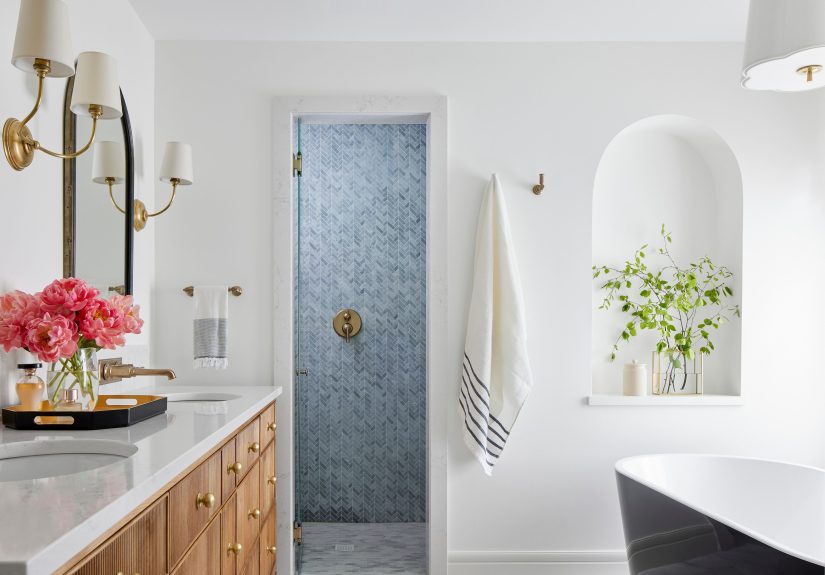
- Wrap the tile into the niche. Treat the niche like a mini room: tile the back differently, then line the sides for a framed effect.
- Contrast niche “jewelry box.” Dark niche inside a light shower (or vice versa) adds depth and a designer punch.
- Waterfall accent strip. A vertical stripe from ceiling to floor draws the eye up and gives a focal line behind fixtures.
- Floor-to-ceiling tile. Extending tile to the ceiling feels finished and helps protect wallsespecially in steamy bathrooms.
- Tile the shower ceiling in a bold color. It’s unexpected and dramaticlike wearing great shoes with a simple outfit.
- Match the shower floor to the bathroom floor. A continuous surface makes the room feel bigger and more seamless.
- Or… make the shower floor a “rug.” Use a patterned mosaic centered inside the shower like a built-in tile rug.
- Mix finishes, not colors. Matte wall tile + glossy niche tile in the same color reads subtle but expensive.
- Metal trim as a clean frame. Coordinating edge trim can make transitions crisp (and makes tile lines look intentional).
- Feature wall behind the glass. Put your boldest tile on the wall most visible from the doorway for maximum impact.
- Patterned tile “panel” at eye level. Keep the rest calm so the pattern feels like art, not noise.
Small Bathrooms, Big Impact (44–49)
- Large-format walls for fewer grout lines. In small showers, fewer lines can read cleaner and more spacious.
- Vertical orientation to “lift” the room. Tall layouts (vertical stack, linear texture) visually raise the ceiling.
- Light-reflecting glossy tile. Bounce light around to make compact showers feel brighter and more open.
- One tile everywhere. Same tile on shower walls and main bathroom walls creates continuity that feels larger and calmer.
- Micro mosaic just on the floor. Keep walls simple, then add detail where it’s functional for slope and slip resistance.
- Budget-friendly classic done sharply. Basic ceramic subway can look high-end with thoughtful layout, aligned grout lines, and quality fixtures.
How to Make Any Shower Tile Look Intentional (Not Accidental)
Pick one “quiet” tile and one “loud” tile
If you want a patterned shower wall, choose a simple floor. If you want a statement floor, let the walls be calm. This one decision prevents the design from turning into a visual group chat where everyone is talking at once.
Use grout color to control the vibe
Contrast grout makes patterns pop and feels crisp and graphic. Matching grout blurs edges and creates a smooth, modern surface. Either can be gorgeousjust choose based on whether you want “tile as texture” or “tile as pattern.”
Mind the transitions
The edgescorners, curb, niches, and where tile meets drywallare where a shower looks “custom” or “contractor-grade.” Clean trim choices, aligned lines, and thoughtful stopping points matter as much as the tile itself.
Don’t ignore the boring stuff (it’s what keeps pretty tile pretty)
A shower is a wet environment. Your tile is the outfit, but waterproofing is the actual job. Prioritize proper prep, correct setting materials, and movement accommodations so the shower performs long-term and doesn’t become an expensive science experiment.
Conclusion: Your Shower Can Be the Showstopper
The best standout bathrooms aren’t just boldthey’re thoughtful. Start by choosing a mood (bright, moody, spa, playful), then use layout, texture, and a single hero moment to make your shower memorable. Whether you go classic subway with a fresh twist, marble-look porcelain for effortless elegance, or a color-drenched tile cocoon, the goal is the same: a shower that feels designed, durable, and uniquely yours.
Real-World Experiences: What People Wish They Knew Before Picking Shower Tile
In real remodel life, the biggest “tile regret” usually isn’t the tile itselfit’s what happens around it. Homeowners often fall in love with a tiny mosaic sheet in a store and don’t realize that choosing it for all four shower walls means signing up for a whole lot of grout. The look can be stunning, but the daily experience is different. A common compromise that people end up loving is to keep mosaics where they make the most sense: on the shower floor (for slope and traction) or in a niche/feature band where you get the sparkle without the full-time grout relationship.
Another frequent “aha” moment comes from lighting. A tile that looks soft white in a showroom can lean icy blue under cool LEDsor turn creamy under warm bulbs. Many people only discover this after installation, when the shower suddenly feels like it belongs in a different house. The best real-world approach is simple but powerful: tape up two or three samples at home and check them at 7 a.m., at midday, and at night. It’s not the most glamorous step, but it prevents the kind of surprise you can’t return.
Grout is where expectations meet reality. People often choose grout by default (or let someone else decide), then wonder why the shower looks busy, dirty, or “off” even though the tile is gorgeous. In everyday bathrooms, matching grout can be a sanity saver because it visually calms the surface and hides minor discoloration. On the flip side, contrast grout can look incrediblebut it also makes every line more noticeable, which means layout precision matters. Many homeowners who love the graphic look end up happiest when they keep contrast grout to one deliberate zone (like a feature wall) rather than everywhere.
There’s also a practical lesson about texture and cleaning. Glossy tiles reflect light beautifully, but in some water areas they can show spotting, especially with hard water. Matte tiles can hide spots better, but certain ultra-textured surfaces can trap soap residue if the texture is very deep. People who want the easiest maintenance often land on a middle ground: a satin or lightly textured wall tile paired with a small, slip-friendly floor tile. It still feels elevated, but it doesn’t demand a weekly deep-clean marathon.
Finally, real bathrooms teach you to design for habits. If you have multiple bottles, plan a niche (or two) so you’re not balancing everything on a tiny corner shelf like it’s a suspense movie. If you share a bathroom, consider choosing tile that looks good even when the shower door is open and towels are inevitably… doing towel things. The most successful standout showers aren’t just Instagram-worthy; they’re built for real routinesmorning rushes, quick cleanups, and the occasional “I’ll clean it later” week we all pretend doesn’t happen.