Table of Contents >> Show >> Hide
- What “Flow” Actually Means (No Beret Required)
- The 20 Furniture Faux Pas (and the Fixes That Actually Work)
- 1) Treating the walls like a parking lot
- 2) Blocking the “main runway” through the room
- 3) Buying furniture before measuring (a.k.a. “hope as a strategy”)
- 4) Choosing an oversized sofa for a not-oversized life
- 5) Going too small and ending up with “dollhouse syndrome”
- 6) The “coffee table island” rug situation
- 7) Using a rug to decorate instead of to anchor
- 8) Coffee table spacing that’s either a leap or a knee hazard
- 9) No landing zones for real-life stuff
- 10) Seating arranged like strangers at a bus stop
- 11) Designing the whole room around the TV like it’s royalty
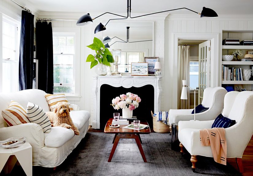
- 12) Ignoring the room’s natural focal point (or inventing five new ones)
- 13) Putting the sofa right in the flow of traffic
- 14) Blocking windows with tall, bulky pieces
- 15) Ignoring height balance (everything living at the same “eye level”)
- 16) Overcrowding “just in case” seating
- 17) The matchy-matchy showroom set
- 18) “Looks amazing, feels terrible” furniture
- 19) Dining layouts with zero clearance (hosting on hard mode)
- 20) Bedroom layouts that make mornings unnecessarily spicy
- Quick Cheat Sheet: Tiny Tweaks That Make a Big Difference
- Conclusion
- Extra: Real-World Experiences People Run Into (and What They Learn)
Ever walk into a room and feel like something’s… off? Like the furniture is secretly plotting against you?
Maybe you’re doing the sideways crab-walk around a coffee table. Maybe your sofa is shouting “WELCOME!” while
also blocking the only path to the kitchen. Or maybe your rug is the size of a bath mat, bravely trying to
anchor a full living room like it’s doing CrossFit.
“Flow” isn’t just a design word people whisper at showrooms. It’s the way your space moves, functions, and
feelshow easily you can walk through it, how naturally conversations happen, and whether the room reads as
calm or chaotic. The good news: you don’t need a bigger house. You need fewer layout crimes.
What “Flow” Actually Means (No Beret Required)
Flow is the invisible choreography of your home. When it’s right, you glide. When it’s wrong, you bump your
shin and start questioning your life choices. Great flow comes down to:
- Clear traffic paths (so people can walk without navigating an obstacle course)
- Comfortable spacing (so seating feels social, not like a waiting room)
- Scale and proportion (so furniture fits the roomand the humans in it)
- Visual calm (so your eyes can rest, not sprint)
The 20 Furniture Faux Pas (and the Fixes That Actually Work)
1) Treating the walls like a parking lot
Pushing every piece against the perimeter can make a room feel smaller, colder, and weirdly empty in the
middlelike a dance floor no one asked for. It also kills conversation because everyone sits miles apart.
Fix: Float key pieces. Even pulling the sofa 4–12 inches off the wall (or more, if you can) helps the room feel intentional.
2) Blocking the “main runway” through the room
If people have to squeeze between a chair arm and a console like they’re boarding a budget airline, the layout
is working against you. Good flow means obvious, generous walkways.
Fix: Identify the primary path (door to door, door to kitchen, etc.) and keep it clear. Move furniture out of that line first.
3) Buying furniture before measuring (a.k.a. “hope as a strategy”)
That gorgeous sectional looked perfect onlineuntil it arrived and ate your living room. Without a plan,
you’re basically furnishing by vibes, and vibes don’t respect doorways.
Fix: Measure the room, tape out furniture footprints on the floor, and check door swings, vents, and walkways before you buy.
4) Choosing an oversized sofa for a not-oversized life
Big furniture in a small room shrinks everything: movement, breathing space, even your willingness to host
friends. When your sofa becomes the main architectural feature, it’s time to intervene.
Fix: Look for apartment-scale seating, armless silhouettes, or a sofa + chairs combo instead of a mega-sectional.
5) Going too small and ending up with “dollhouse syndrome”
Tiny pieces can make a room feel unfinished and awkwardlike you borrowed furniture from a fancy hamster.
Small rooms often need smartly scaled pieces, not miniature ones.
Fix: Choose fewer pieces with the right presence. A properly sized rug and sofa can make a small room feel bigger than scattered tiny items.
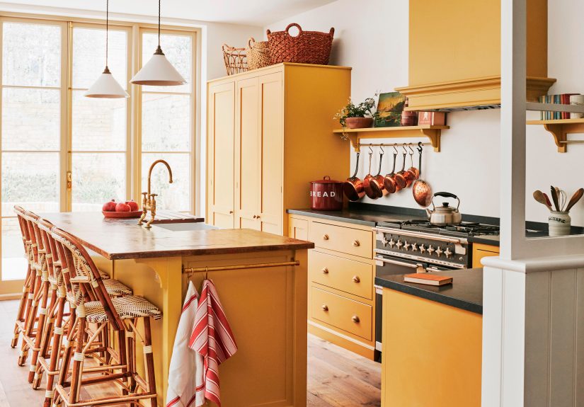
6) The “coffee table island” rug situation
A rug that only fits under the coffee table visually breaks the room into disconnected parts. It’s one of the
fastest ways to make a space feel “off,” even if everything else is cute.
Fix: Go larger so the front legs of major seating sit on the rug (at minimum). Bigger rugs unify furniture and calm the layout.
7) Using a rug to decorate instead of to anchor
Rugs aren’t just patterns on the floorthey’re the “frame” that tells your furniture, “You belong together.”
A poorly placed rug makes the room feel like a group project with no group chat.
Fix: Center the rug with the main seating zone. Align it with the sofa, not the walls, and keep it squared to the room when possible.
8) Coffee table spacing that’s either a leap or a knee hazard
Too far and you can’t reach your drink. Too close and you’re bruising your shins like it’s a hobby. A coffee
table should support living, not punish it.
Fix: Aim for a comfortable reach zone and enough pass-through space. If the room is tight, try an ottoman, nesting tables, or a slim table.
9) No landing zones for real-life stuff
If someone has to hold their drink all night because there’s nowhere to set it, your furniture layout is
basically heckling your guests. Surfaces matter.
Fix: Make sure every seat has a side table within arm’s reach (or a shared surface). Trays can substitute when space is limited.
10) Seating arranged like strangers at a bus stop
When chairs face forward and conversations feel awkward, it’s often because the seating doesn’t “gather.”
A great living room is a friendly circle, not parallel parking.
Fix: Angle chairs slightly toward the sofa, create a U-shape when possible, and keep conversational distances comfortable.
11) Designing the whole room around the TV like it’s royalty
Yes, you can watch shows. No, your living room doesn’t have to look like a showroom for neck strain. When the
TV dictates every piece, the room loses warmth fast.
Fix: Prioritize a conversation zone first, then position the TV for sightlines. If it’s a multi-use space, consider swivel chairs or flexible seating.
12) Ignoring the room’s natural focal point (or inventing five new ones)
A fireplace, a big window, a built-inrooms usually have a natural “anchor.” When furniture points everywhere
and nowhere, the space feels unsettled.
Fix: Pick one primary focal point. Arrange the biggest seating piece to acknowledge it, then support with secondary elements (art, lighting, shelves).
13) Putting the sofa right in the flow of traffic
If the sofa is the thing everyone has to walk around to get anywhere, you’ve created a furniture toll booth.
It’s stressful and makes the room feel smaller.
Fix: Shift the sofa to the side of the main pathway. If the room is narrow, consider a slim-profile sofa or floating a chair instead.
14) Blocking windows with tall, bulky pieces
Natural light is the cheapest luxury your home has. When a tall bookcase or armoire camps in front of the
window, the room feels heavier and gloomierfast.
Fix: Keep tall pieces on solid walls when possible. If something must go near a window, choose a lower profile and let light pass above it.
15) Ignoring height balance (everything living at the same “eye level”)
A room full of low furniture can feel flat. A room full of tall furniture can feel like a forest of corners.
Either way, your eyes get boredor overwhelmed.
Fix: Mix heights: sofa + floor lamp, low media console + taller bookcase, art at eye level, and curtains that visually lift the room.
16) Overcrowding “just in case” seating
Extra chairs are great… until they make every day feel like a crowded airport lounge. If your space is packed
on a normal Tuesday, the room will never feel calm.
Fix: Use flexible seating: poufs, stools, benches, or stackable options you can pull in only when needed.
17) The matchy-matchy showroom set
When every piece is from the same collection, the room can look flat and oddly impersonallike a catalog page
waiting for a price tag. You want harmony, not cloning.
Fix: Mix materials and shapes. Keep one consistent thread (wood tone, metal finish, or color family), then vary silhouettes.
18) “Looks amazing, feels terrible” furniture
The interior-design version of fancy shoes that destroy your feet. If your chairs are gorgeous but no one wants
to sit in them, the room won’t get usedand unused rooms always feel off.
Fix: Test comfort before committing. If you already own the piece, soften it with a pillow, add a throw, or relocate it to a less-used corner.
19) Dining layouts with zero clearance (hosting on hard mode)
Dining rooms need space for chairs to pull out and people to pass behind them. If someone has to stand up so
another person can get to the kitchen, it’s not “cozy”it’s inconvenient.
Fix: Choose the right table size for the room, or swap to a round/oval table for better flow. Consider a bench on one side to save space.
20) Bedroom layouts that make mornings unnecessarily spicy
A bed shoved into a corner, nightstands that can’t hold a phone, or a dresser blocking the closetthese are
the silent reasons mornings feel harder than they should.
Fix: Give the bed breathing room on at least one side, right-size your nightstands to the bed, and keep clear access to closets and doors.
Quick Cheat Sheet: Tiny Tweaks That Make a Big Difference
- Start with function: How do you actually use the roomtalking, watching, working, hosting?
- Protect pathways: Clear, obvious routes reduce stress and make rooms feel larger.
- Unify with an anchor: Rugs and furniture groupings create “zones” that feel intentional.
- Edit ruthlessly: If a piece doesn’t earn its spot, it’s stealing comfort and calm.
- Check the room from the doorway: Your first sightline should feel welcoming, not chaotic.
Conclusion
Furniture mistakes aren’t moral failures (even if your rug is currently a “coffee table island”).
They’re usually planning issues: traffic paths ignored, scale misunderstood, or seating arranged for a lifestyle
you don’t actually live. The fix is almost always the same: measure, make space to move, group furniture with a
purpose, and let the room breathe. When flow improves, the whole house feels easierlike it’s finally on your team.
Extra: Real-World Experiences People Run Into (and What They Learn)
There’s a very specific moment that happens in a lot of homes: someone stands up from the sofa, tries to walk
to the kitchen, and performs a tiny sideways shimmy between a chair and a table. Nobody says anything. Everyone
notices. That’s usually when people realize “flow” isn’t abstractit’s physical.
One common experience is the Great Sofa Shuffle: you start by moving the couch “just a few inches,”
then suddenly you’re sliding rugs, rotating chairs, and discovering that the room had better options all along.
The lesson is simple: most layouts fail because furniture is placed where it’s easy (against walls, centered on a wall),
not where it functions best (grouped for conversation, aligned to a focal point, with clear pathways).
Then there’s the Rug Regret. People often buy a rug that looks right in a storeor fits a budgetonly to
realize at home it makes everything feel disconnected. The “floating coffee table” effect is real, and it’s why so many
homeowners eventually size up. The lesson: a rug isn’t just décor; it’s a tool. When it’s large enough to catch the front
legs of seating, it visually ties the room together and makes even mismatched pieces feel like they belong.
Another classic: the Pretty Chair Nobody Uses. Many spaces have at least one chair that’s stunning and
deeply uncomfortabletoo upright, too narrow, or too delicate for real life. It ends up holding laundry like a very expensive
coat rack. The lesson: comfort is a design feature. The best rooms aren’t the ones that photograph perfectly; they’re the ones
people naturally choose to sit in.
Hosting creates its own set of “aha” moments. People notice fast when there’s nowhere to set a drink,
when chairs are too far apart to talk, or when a layout forces guests to walk through the middle of the seating area
to reach another room. The lesson: plan for real behavior. Add small side tables, pull seating into a conversational shape,
and keep the main walkway clear. You don’t need more square footageyou need smarter placement.
Bedrooms teach flow in a quieter way. If the closet door hits a dresser, if you can’t open a drawer without stepping back,
or if you’re constantly walking around the bed like it’s a roundabout, the room feels more stressful than restful. The lesson:
sleeping spaces thrive on simplicity and clearance. Right-size the nightstands, keep pathways open, and let the bed be the anchor
rather than an obstacle.
Finally, people often discover the magic of negative space the moment they remove something. Not replace itremove it.
A room with breathing room feels more expensive, calmer, and easier to live in. The lesson: emptiness isn’t failure. It’s intention.
Leaving space around furniture improves both movement and mood, which is basically the whole point of flow.