Table of Contents >> Show >> Hide
- What Is Silver Sage, Exactly?
- Why Designers Love Silver Sage
- Inside the Silver Sage Paint Collection
- Where Silver Sage Shines in Your Home
- Choosing the Right Silver Sage for Your Space
- Decorating Tips with Silver Sage Paint
- Common Mistakes with Silver Sage (and How to Avoid Them)
- Real-Life Experiences with Silver Sage Paint
- Final Thoughts: Is the Silver Sage Paint Collection Right for You?
If paint colors had personality types, Silver Sage would be the calm, collected
friend who shows up on time, brings snacks, and somehow makes everyone in the room feel
more relaxed. It’s soft but not boring, colorful but not loud, and neutral enough to work
almost anywhere in the house.
Today, when people say “Silver Sage paint collection,” they might be talking about the
iconic Restoration Hardware hue, Benjamin Moore’s Silver Sage 506, PPG’s Silver Sage, or
whole palettes inspired by this airy sage-green-meets-soft-gray family. All of them live in
that sweet spot between green, gray, and sometimes blue – which is exactly why designers
keep coming back to it for walls, cabinets, and exteriors alike.
In this guide, we’ll walk through what makes Silver Sage so special, how different brands
interpret it, where it works best in your home, and how to build a full Silver Sage–inspired
palette without your rooms turning into one big bowl of guacamole.
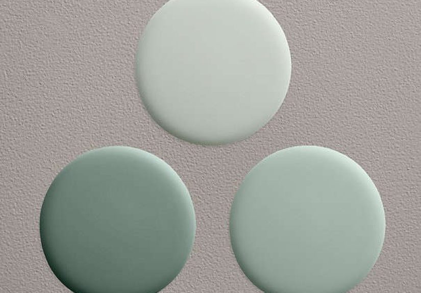
What Is Silver Sage, Exactly?
Think of Silver Sage as a light, muted green with a soft gray veil over it. Many shades in
this family read differently depending on the light: a bit greener in the afternoon, a touch
grayer on cloudy days, sometimes even with a whisper of blue. That chameleon quality is a
huge part of its charm.
Restoration Hardware’s Iconic Silver Sage
Restoration Hardware (RH) helped turn Silver Sage into a design-world celebrity. Their
original Silver Sage wall paint was marketed as “the choice of professionals,” made with
a low-VOC formula that meets stringent air-quality standards – a big plus for people who
care about healthier indoor environments. It sits in a coordinated Silver Sage collection
that includes related hues like Sea Green and Blue Sage, designed to work together
throughout a home.
RH has offered Silver Sage in subtle sheens like Subtle Velvet (similar to a flat/matte
look) and Low Sheen (comparable to eggshell), which keep the finish soft and sophisticated
rather than shiny. Those finishes play especially well with this understated color family,
because they don’t distract with glare or highlight every wall imperfection.
Benjamin Moore Silver Sage 506
Over in Benjamin Moore’s world, Silver Sage 506 is described as “a light gray with a hint
of sage green.” That means your eye first registers a gentle gray, then slowly picks up the
green underneath – exactly the kind of nuance designers love. It also lives among
Benjamin Moore’s popular light green and sage green paint colors, which are frequently
used to create restful, nature-inspired interiors.
On paper, Silver Sage 506 sits in a soft, higher-light-reflectance zone (a fairly high LRV),
meaning it bounces light around nicely and can brighten a space rather than absorb it.
That’s why it works so well in bedrooms, living rooms, and even hallways where you want a
gentle lift without going full white.
PPG Silver Sage & Other Brand Cousins
PPG’s version, Silver Sage PPG1113-2, is described as a “light, neutral, tender green
with a grassy undertone” and is recommended for both interior main walls and exteriors.
Pairings like off-white trim and dusty purple accents are suggested to bring out its
softness while adding depth.
Color-matching tools also show how closely related Silver Sage is to other hues across
brands – you’ll find near matches in Behr, Farrow & Ball, Sherwin-Williams, and Valspar
that sit in that same pale, grayed green family. These alternatives are handy if you love
the Silver Sage mood but are shopping in a different paint brand or need a custom match.
Why Designers Love Silver Sage
A Calm, Nature-Inspired Neutral
From a color psychology standpoint, sage greens sit in the “cool, calming” camp. Green is
strongly linked to nature, balance, and restoration; add gray to soften it, and you get a
hue that feels grounded and gentle instead of neon or intense. Designers often describe
sage green as a “modern neutral” because it complements a wide variety of styles – from
farmhouse and cottage to modern and Scandinavian – without feeling dated.
Silver Sage shades are particularly popular because they:
- Help people feel relaxed and centered, especially in bedrooms and living rooms.
- Bring the outdoors in, echoing foliage, eucalyptus, and dried herbs.
- Offer more personality than white or beige, but still behave like a neutral.
Soft, But Not Flat
One of the biggest complaints about some gray paints is that they can look flat or
depressing in the wrong light. Silver Sage–style colors avoid that problem by layering
green (and sometimes blue) into the mix. The result is subtle movement: as the sun shifts,
so does the color, catching different undertones throughout the day. It’s like built-in
mood lighting – without the electrician bill.
On-Trend Without Being Trendy
Sage and green tones have been trending for several years, and forecasts suggest richer
greens will continue evolving, not disappearing. Even as deep greens and smoky
jade-like hues rise, sage green keeps showing up on “best paint colors” lists because it
plays nicely with both light and dark palettes. Silver Sage sits comfortably in that
sweet spot, feeling current but not “this year only.”
Inside the Silver Sage Paint Collection
While different brands have their own take, the overall Silver Sage paint collection
typically includes:
- A core pale sage-gray (like RH Silver Sage or Benjamin Moore Silver Sage 506).
- Slightly bluer versions (such as colors comparable to Blue Sage or sea-glass tones)
that lean coastal and airy. - Slightly greener, earthier variations that nod toward olive or eucalyptus, adding a bit
more “green” without losing softness. - Coordinating deeper accent shades – forest greens, charcoal grays, or in some palettes,
richer sage tones.
That means you can build an entire home palette within this family: main walls in a light
Silver Sage, kitchen cabinets or an island in a deeper sage, and maybe a powder room or
study in a moodier cousin. Everything ties together without feeling like you bought one
giant paint bucket and never looked back.
Where Silver Sage Shines in Your Home
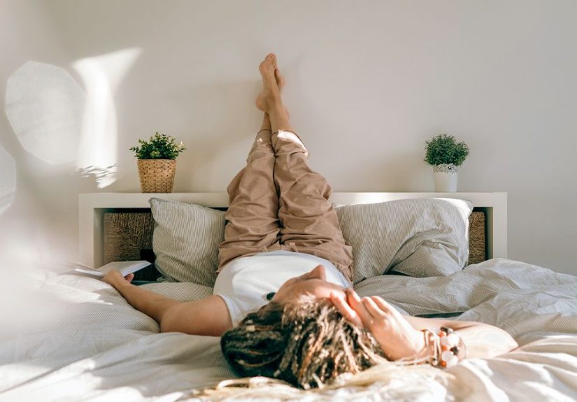
Bedrooms: Spa Vibes Without the Hotel Bill
If there’s one place Silver Sage dominates, it’s bedrooms. Designers often use light sage
as an alternative to white in primary and guest bedrooms because it creates a calm
envelope that still has character. Pair it with:
- Crisp white bedding for a fresh, hotel-adjacent look.
- Beige or taupe linen upholstery for cottage or coastal style.
- Black metal or dark wood accents for a more modern, grounded feel.
In nurseries and kids’ rooms, Silver Sage reads soothing and gender-neutral, and it plays
nicely with pastels, wood tones, and playful artwork as kids grow.
Living Rooms & Family Rooms
In living spaces, Silver Sage is the friend that gets along with everyone: leather
sofas, slipcovered sectionals, patterned rugs, and eclectic gallery walls. Because it’s
understated, it won’t fight your furniture or art. Instead, it quietly ties things
together, making bold pieces look curated rather than chaotic.
Try it with:
- Warm woods and woven textures (jute, rattan, cane) for a natural look.
- Brass or antique gold hardware for a subtle bit of glam.
- Charcoal, navy, or terracotta as accent colors for pillows and accessories.
Kitchens & Bathrooms
Sage green cabinetry has become a design darling, and Silver Sage–style colors are
perfect for that look – especially if you want something lighter and softer than a deep
green. They’re beautiful on:
- Shaker-style cabinets with white or marble-look countertops.
- Bathroom vanities paired with warm metal fixtures and natural stone.
- Beadboard or wainscoting in cottages and farmhouse-style homes.
Because Silver Sage is neither too cold nor too warm, it can play nicely with stainless
steel, black, or white appliances – and it doesn’t clash with wood floors the way some
cooler grays can.
Hallways, Entries, and Exteriors
For entries and hallways, Silver Sage is an excellent “bridge color” between rooms with
different palettes. It’s light enough to keep circulation spaces from feeling cave-like,
but distinct enough to feel intentionally designed.
On exteriors, Silver Sage (especially the slightly greener PPG/PPG-style variants) can be
gorgeous for siding, especially when paired with:
- Soft white trim and a wood front door.
- Black or charcoal window frames for contrast.
- Muted blues or deep greens on shutters or doors.
Choosing the Right Silver Sage for Your Space
Check the Undertones
Not all Silver Sages are created equal. Some lean more blue, others more yellow-green, and
a few are nearly gray with just a hint of sage. To avoid surprises:
- Place large paint swatches on multiple walls and look at them morning, midday, and
evening. - Compare your Silver Sage option next to pure white and a true green.
- Pay attention to existing fixed elements: flooring, countertops, tile, and big
furniture pieces.
For example, a Silver Sage that leans bluer might clash with very warm, orange-toned oak
floors but look perfect with cooler stone or light oak. A warmer sage-gray may be more
forgiving with those honey-toned woods.
Pick the Right Sheen
Because Silver Sage is subtle and soft, the sheen you choose affects the overall vibe:
- Matte/flat or “Subtle Velvet”–type finishes are ideal for bedrooms, living
rooms, and ceilings. They hide imperfections and keep the color looking velvety and
sophisticated. - Eggshell/low sheen is great for hallways, family rooms, and kids’ rooms where
you need a bit more wipeability without shining up the walls. - Satin or semi-gloss is typically reserved for trim, doors, and cabinetry –
especially if you’re using a deeper sage on cabinets and a lighter Silver Sage on walls.
Coordinate, Don’t Compete
When building a full Silver Sage palette, aim for balance:
- Use Silver Sage or a similar light sage-gray on main walls for a cohesive background.
- Add one or two deeper accent colors (forest green, charcoal, deep navy) in smaller
doses: an office, powder room, or built-in shelves. - Layer in warm neutrals – beiges, caramels, wood tones – so the space feels inviting, not
sterile.
Silver Sage is happiest when it’s part of a conversation, not the only voice in the room.
Decorating Tips with Silver Sage Paint
Pairing Silver Sage with Neutrals
You almost can’t go wrong pairing Silver Sage with neutrals, but each neutral shifts the
mood:
- Bright white: clean, fresh, a little coastal. Great for trim, ceilings, and
cabinets. - Cream or warm white: cozy, cottage-like, perfect if you love vintage or
farmhouse decor. - Greige or light taupe: sophisticated and modern, especially in living and dining
rooms.
Adding Contrast and Personality
To keep a Silver Sage room from feeling too quiet, add strategic contrast:
- Black picture frames, curtain rods, or light fixtures.
- Leather chairs or warm cognac-colored pieces for richness.
- Patterned textiles – plaid, stripes, or block prints – in deeper greens and neutrals.
Because Silver Sage is such a good listener, it happily supports art and accessories,
letting them do the talking while it sets the mood.
Common Mistakes with Silver Sage (and How to Avoid Them)
Ignoring Your Lighting
In a north-facing room, Silver Sage can skew cooler and grayer, sometimes even a bit
steely. In a south-facing space with warm sunlight, it can look greener and warmer.
Always test samples in your actual lighting; what looked perfect in a showroom might feel
different at home.
Choosing a Clashing Green
Mixing multiple greens can be tricky. If you already have a lot of green upholstery,
strong emerald accents, or green tile, you’ll want to be sure your Silver Sage doesn’t
fight with them. Stick to one main green family (cooler or warmer) so everything looks
intentionally layered rather than “oops, everything is green now.”
Going Too Gray or Too Pastel
If you go too gray, you might lose the gentle, organic charm that makes Silver Sage
special. If you go too minty or pastel, the room can start feeling like a hospital or ice
cream shop. Aim for that soft, dusty sweet spot: muted green, noticeable but calm.
Real-Life Experiences with Silver Sage Paint
It’s one thing to read a paint description; it’s another to live with it. Here are some
real-world style scenarios that show how a Silver Sage paint collection can transform a
home.
1. The “Goodbye Builder Beige” Living Room
Imagine a standard suburban living room: tall ceilings, beige walls, and a big sectional
that looked great in the showroom but slightly sad under your overhead lighting. One
weekend, you decide to repaint the walls in a Silver Sage shade close to Benjamin Moore
506. Suddenly, the beige sofa looks intentional instead of bland, the white trim pops, and
your plants finally have a backdrop that makes them look like carefully curated decor
instead of “things I forgot to water.”
Friends walk in and say, “Did you get new furniture?” Nope. Just a smarter wall color.
2. A Calm-but-Not-Boring Bedroom
Another homeowner uses Restoration Hardware–style Silver Sage in a primary bedroom with a
lot of natural light. They pair it with crisp white bedding, a textured jute rug, and black
metal bedside lamps. In the morning, the walls read light and airy; at night, they soften
into a deeper, more cocoon-like sage-gray.
The surprising part? The room feels pulled together even on days when the bed isn’t
perfectly made. Silver Sage has that magical “Instagram filter” effect: it gently flatters
everything in the room, including your half-folded laundry basket.
3. A Small Bathroom That Suddenly Feels Fancy
In a tiny bathroom with no windows, going dark can feel risky. One homeowner chooses a
lighter Silver Sage for the walls, keeps the vanity white, and adds brass hardware and a
patterned floor tile. The result is fresh, spa-like, and a little bit boutique hotel –
without tearing anything out.
The green-gray walls keep the space from feeling clinical, while the brass and tile add
personality. A simple switch from stark white to Silver Sage makes the whole room feel
intentional and designed.
4. A Subtle, Coordinated Whole-Home Palette
A family renovating a smaller home wants a cohesive feel from room to room. They choose a
Silver Sage wall color for the main living areas, a slightly deeper sage in the dining
room, and a very soft nearly-gray sage in the hallway. Bedrooms get either the same Silver
Sage or a related neutral, and trim stays a clean warm white.
The effect? You can stand in the entry and see multiple rooms that clearly “belong
together,” without everything being the exact same color. Each space has its own
personality – a darker wall here, a patterned wallpaper there – but the Silver Sage
collection holds it all together like a good storyline.
5. The Exterior Glow-Up
On the outside, a home that used to be a generic light tan gets a full makeover with
Silver Sage–inspired siding (similar to PPG’s Silver Sage), white trim, and a stained wood
front door. The house immediately looks more architectural and grounded, especially when
paired with lush landscaping and black lantern-style light fixtures.
Neighbors notice. (Some of them quietly take paint chip photos on their evening walks.)
The color looks slightly different in morning light versus dusk – sometimes more green,
sometimes more gray – but always elegant and welcoming.
Final Thoughts: Is the Silver Sage Paint Collection Right for You?
If you want a color that:
- Feels calm but not sleepy,
- Works with a wide range of styles and materials, and
- Can serve as the backbone of a whole-home palette,
then the Silver Sage paint collection is absolutely worth sampling. The key is to test
a few variations in your actual space, in your actual light, next to your actual beige
sofa or dramatic black range hood. Once you find the right interpretation, Silver Sage has
a way of making everything else in the room look just a little more intentional – and a
lot more peaceful.
In other words, Silver Sage won’t shout for attention. But it will quietly make your home
look like you hired a designer… even if your “design team” is just you, a paint roller,
and some podcasts.
SEO JSON