Table of Contents >> Show >> Hide
Some content makes you laugh. Some makes you gasp. And then there is the glorious internet category that makes you pinch the bridge of your nose, stare into the middle distance, and whisper, “Oh no. Oh, buddy. You had one job.”
These eyeroll moments are the comedy sweet spot between harmless chaos and painfully avoidable failure. They show up as upside-down signs, packaging that explains nothing, labels that contradict themselves, buttons that lead nowhere, arrows that point to existential despair, and proofreading disasters that somehow survived several human beings, one software suite, and at least one coffee break. They are funny because they look simple. They are memorable because they expose a very human truth: even ordinary tasks fall apart when attention slips, instructions get muddy, or nobody does the final sanity check.
That is exactly why “You Had One Job” moments never get old. They are not just random blunders. They are tiny case studies in how people read, skim, assume, rush, and trust systems a little too much. Beneath every goofy sign fail or baffling product label is a familiar chain reaction: a detail gets missed, a review step gets skipped, and suddenly the whole world is treated to an accidental comedy performance starring one tragic apostrophe or one magnificently wrong arrow.
This is where the topic gets more interesting than a plain old fail compilation. The best “You Had One Job” moments are not only funny. They reveal how weak design, cluttered information, autopilot thinking, and rushed quality control can turn a basic task into a public embarrassment. So yes, let us laugh. But let us also appreciate the anatomy of the flop, because every ridiculous mistake has a backstory, and most of those backstories are more relatable than anybody wants to admit.
Why These Eyeroll Moments Hit So Hard
The phrase “You had one job” works because it sounds brutally simple. Put the label on straight. Spell the name correctly. Make the door sign match the actual door. Put the “push” sticker on the side that gets pushed. Humanity, in theory, should be able to handle this. In practice, humanity occasionally prints “No Publik Parking,” pastes it crooked, and calls it a day.
The humor comes from broken expectations. When people see a sign, a package, or a menu, they expect clarity. They want the thing to do the thing. The second it does not, their brain throws a tiny internal tantrum. It is not just that the mistake is wrong. It is wrong in a place where rightness was supposed to be effortless. That gap between expectation and reality is comedy gold.
There is also a delicious layer of secondhand confidence involved. The viewer is not just noticing the error. The viewer is mentally rewriting the situation and thinking, “I could have caught that in two seconds.” Whether that is true is another matter entirely, but it is part of the thrill. A classic “one job” fail lets the audience feel like the smartest person in the room for a brief, petty, satisfying moment.
And to be fair, these moments are often visual. Visual mistakes land fast. A typo in a long report may hide quietly for weeks, but a sign with two arrows pointing in opposite directions basically jumps out of the bushes and introduces itself. You do not have to explain the joke. Your eyeballs file the complaint immediately.
The Classic Species of “You Had One Job” Fails
Signs That Deliver the Opposite of Guidance
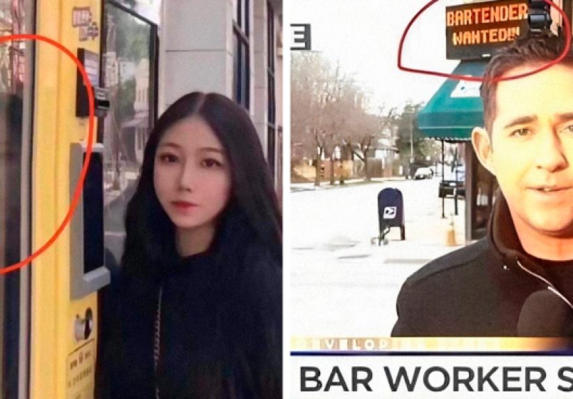
Signs are supposed to reduce confusion. That is their entire brand identity. Which is why sign fails are some of the purest “You Had One Job” material on the internet. A bathroom sign on the wrong door, an arrow that points to a wall, a warning sign hidden behind a plant, or a giant banner with a typo the size of Nebraska all create the same reaction: if the guide is confused, what chance do the rest of us have?
Wayfinding mistakes are especially funny because they often look official. They have the confidence of a government memo and the accuracy of a distracted squirrel. The sign is laminated. The font is serious. The arrows are bold. And yet the message somehow says, “Stairs this way,” while gesturing toward a vending machine and emotional uncertainty.
That mismatch is the joke. Authority is speaking, but nonsense is coming out.
Packaging That Requires a Detective, a Magnifying Glass, and Inner Peace
Packaging fails are sneaky because they sit right at the intersection of design, marketing, and basic communication. Maybe the important information is buried under a blizzard of decorative text. Maybe the label looks almost identical to another product that does something completely different. Maybe the instructions are so cramped and overstyled that reading them feels like a hostage negotiation with a yogurt cup.
These moments trigger eyerolls because packaging is supposed to answer easy questions fast. What is this? What flavor is it? How do I use it? Is this shampoo, conditioner, body wash, or some deeply confusing hybrid product that belongs in a design intervention?
When the answer is not obvious, the package has failed the most basic assignment. It may still look sleek on a shelf, but if customers have to squint, rotate, and pray, the packaging has wandered from branding into performance art.
Proofreading Disasters That Deserve Their Own Slow Clap
Typos remain undefeated in the “You Had One Job” arena. They are small, sharp, and weirdly personal. A single missing letter can make a business look careless. A doubled word can make a sentence wobble like a shopping cart with one bad wheel. An unfortunate autocorrect can turn a sensible message into accidental comedy.
What makes proofreading fails so enduring is that everyone has been on both sides of them. We have all spotted a typo and judged it with theatrical intensity. We have also all sent something and then discovered, three seconds later, that our brain had apparently taken the afternoon off.
That is why typo humor lands. It is mockery with a little self-recognition baked in. You laugh, but part of you is also remembering that email you once sent with the subject line spelled wrong. You know the one. Your soul still has the receipt.
Digital Design Blunders That Feel Like a Personal Attack
The modern “one job” fail is not limited to physical objects. Sometimes it lives online, where it can inconvenience thousands of people before lunch. A button says “Submit” but refreshes the page. A checkout form clears everything if you make one small mistake. A password field demands a symbol, a number, a capital letter, a moon rock, and proof that you have suffered enough.
Digital blunders inspire a special kind of eyeroll because they are interactive. You are not just witnessing the error. You are trapped inside it. The site is asking for your input while simultaneously making you regret your belief in progress.
Unlike a goofy sign in a parking lot, a bad interface can turn an ordinary five-minute task into a small emotional event. That is when a simple usability problem graduates into full-blown “You Had One Job” legend.
Why These Mistakes Keep Happening
The Brain Loves Shortcuts More Than Accuracy
One of the biggest reasons obvious mistakes survive is that humans do not read as carefully as they think they do. We skim. We predict. We fill in gaps. We see what we expect to see. That is handy when reading quickly, but terrible when you are trying to catch an error in your own work.
In other words, the brain is less of a laser scanner and more of a very confident intern. It means well. It moves quickly. It occasionally invents reality.
That is why someone can look directly at a typo and still miss it. Their mind already knows what the sentence was supposed to say, so it politely replaces the broken version with the correct one. The eyes report a problem. The brain says, “No, no, I have decided everything is fine.” This is how mistakes survive long enough to embarrass an entire team.
Clutter Is the Natural Enemy of Common Sense
When too much information fights for attention, the important part often loses. That is true in labels, signs, websites, menus, instruction sheets, and basically every place where someone thought adding more text would somehow create more clarity. It rarely does. It usually creates a visual traffic jam.
Once clutter shows up, people start guessing. They stop reading line by line and begin hunting for clues. If the headline is tiny, the contrast is weak, the order is illogical, and the main instruction is buried under decorative fluff, the result is predictable. Users miss the point, customers get confused, and strangers online get fresh content for their favorite fail threads.
Good communication feels almost boring because it is so easy to use. Bad communication tries to be helpful while dressed as a scavenger hunt.
No Final Check Means Tiny Errors Become Public Events
Most legendary “one job” moments are not caused by one dramatic failure. They are caused by a missing final pass. Nobody stepped back and asked the simplest question in business: “Does this actually make sense?”
That last check matters because the people closest to a project are often the least able to see its flaws. They are too familiar. They know what the sign is meant to mean, what the label is meant to say, and what the button is meant to do. Familiarity smooths over cracks. Fresh eyes find the potholes.
When organizations skip that stage, the consequences range from mildly funny to deeply inconvenient. At best, the internet laughs. At worst, people get lost, waste time, misunderstand a product, or miss something important.
Consistency Is Underrated Until It Disappears
People rely on consistency more than they realize. If arrows change meaning from one hallway to the next, if labels are placed in random spots, if icons look different across a site, or if instructions vary for no good reason, users slow down. They hesitate. They second-guess. That hesitation is where confusion breeds.
Consistency is not glamorous, which is probably why it gets neglected. Nobody throws a parade for “all buttons aligned correctly.” But the second consistency breaks, everyone notices. Suddenly the design is not invisible anymore. It is the problem.
When “Funny” Stops Being Funny
Not every “You Had One Job” moment is harmless. Some are just goofy, and those are great. But others hint at bigger problems. A misleading label, unclear warning, or poor directional sign can waste time, frustrate customers, and in some settings create real safety issues. A joke about a crooked sticker is one thing. A confusing instruction on a product people rely on is a different beast entirely.
That is what makes this topic more than internet fluff. Beneath the humor is a real lesson about communication. People do not need perfect systems. They need clear ones. They need legible text, logical order, obvious instructions, and a final review from someone who was not involved in building the thing at three in the morning.
The funniest failures become memorable precisely because they violate simple standards that should have been easy to meet. That is why the audience reacts so strongly. The mistake feels preventable. And preventable mistakes hit a nerve.
How to Avoid Becoming the Next Eyeroll Screenshot
Use Plain Language Like You Mean It
If a sentence can be shorter, make it shorter. If a label can be clearer, make it clearer. If the main instruction is hiding under marketing fluff, rescue it immediately. Plain language does not make content dull. It makes content usable. That is a beautiful thing.
Design for the Glance, Not the Lecture
Most people do not study signs and labels like they are preparing for finals. They glance. They move. They decide quickly. So the most important information should be visible first, readable at a distance, and impossible to confuse with decorative nonsense. If your design only works when someone stares at it for thirty seconds, it does not work.
Proofread Like Spell-Check Owes You Money
Spell-check is useful, but it is not your wise old editor friend. It will happily wave through the wrong word if that word happens to be spelled correctly. Read text aloud. Read it backward by sentence. Ask another person to review it. Give your future self fewer reasons to wake up in a cold sweat.
Give Important Items a Reality Test
Before anything public goes live, someone should test it in the real world. Can a stranger understand it in five seconds? Does the arrow make sense in the actual hallway? Does the label still work when viewed on a phone, on a shelf, or in a hurry? The best quality check is not theoretical. It is practical.
Make Checklists Your Boring Little Superpower
Checklists are not glamorous, but neither is becoming a meme because your sign points to a brick wall. A short review list catches surprising amounts of nonsense. Spelling, alignment, label match, contrast, placement, consistency, final approval. That simple routine may not earn applause, but it can save a whole lot of public embarrassment.
Real-Life Experiences That Feel Exactly Like “You Had One Job” Moments
Almost everybody has lived through a “You Had One Job” experience without meaning to star in one. You walk into a parking garage and follow a giant arrow toward the elevator, only to discover the arrow was apparently on a spiritual journey of its own. You stand in front of a door that says “Pull,” pull it, and realize the handle is decorative and the sign is lying. You buy a product whose label seems clear until you get home and discover the instructions were printed in font size: ant whisper.
These moments are funny later because they feel so small and so avoidable, but in the moment they create a surprisingly strong emotional response. Not rage, exactly. More like offended disbelief. You are not furious at the object. You are disappointed in it. You believed in that sign. You trusted that package. You entered the relationship assuming basic competence. Then the object betrayed you and left you standing in aisle seven reading conditioner like it is a legal contract.
Workplaces are especially fertile ground for these experiences. Every office has at least one printer label that explains nothing, one form field that rejects correct information, and one meeting room sign that suggests nobody involved has met a calendar. Employees learn to cope, which is part of the problem. Once people get used to confusing systems, they stop complaining and start translating. “Oh, when it says save, it actually means submit.” “When the label says medium, it runs small.” “That staircase sign is wrong, go left instead.” A whole little ecosystem develops around a mistake that should have been fixed in one afternoon.
Retail spaces do it too. You see a sale sign that appears to apply to an entire display, only to discover it applies to exactly one item hidden behind a candle and a decorative basket. Or you grab a snack because the front screams one flavor, while the fine print quietly reveals a plot twist. None of this causes a national emergency, but it does make people feel mildly conned by typography.
Digital life may be the reigning champion, though. There are few experiences more modern than filling out an online form flawlessly and then being told one field is invalid without any clue which one. The website knows. It has chosen silence. That is a textbook “You Had One Job” moment because the entire purpose of the system is to help a user complete a task, not launch an escape room challenge.
Even social moments get caught in the blast radius. Think of invitations with the wrong date, menus with misspelled entrées, event banners with names swapped, or school notices where one sentence accidentally contradicts the next. Nobody planned to create comedy, but there it is anyway, sparkling in broad daylight.
That is the real reason these eyeroll moments endure. They are not rare. They are woven into normal life. They happen when people rush, assume, skim, overdesign, under-review, or trust that “good enough” will pass unnoticed. Sometimes it does. Sometimes it ends up online with a million views and a comments section full of people saying, with exquisite and completely predictable satisfaction, “You had one job.”
And honestly, that is fair. Not because humans should be flawless, but because clarity is kindness. When someone is trying to buy, read, enter, follow, park, click, or understand, the least a system can do is avoid becoming the punchline.
Conclusion
More “You Had One Job” eyeroll moments will keep appearing as long as humans keep making things for other humans, which is to say: forever. That is not depressing. It is strangely comforting. These fails remind us that even in a world full of polished branding, automated workflows, and high-tech tools, one missed detail can still send the whole production tumbling into comedy.
The lesson is not that people are hopeless. It is that clarity, consistency, and review matter more than people think. The funniest blunders are rarely caused by a lack of effort. They are usually caused by a lack of pause. One more glance. One more test. One more proofread. One more person asking, “Wait, does this make any sense?”
If that question gets asked early enough, the internet loses one future fail. If it does not, well, at least the rest of us get a good eyeroll out of it.