Table of Contents >> Show >> Hide
- What Is Tabernacle (308), Exactly?
- Why Tabernacle Works Like a Soft Neutral
- Lighting: The Plot Twist You Should Expect
- Where Tabernacle (308) Looks Especially Good
- 1) Kitchens: clean, bright, and not sterile
- 2) Bedrooms: calm without going full spa cliché
- 3) Living rooms: subtle character, lots of flexibility
- 4) Bathrooms and powder rooms: fresh, tailored, grown-up
- 5) Entryways and hallways: the “welcome home” cheat code
- 6) Exterior accents: charming without being loud
- Color Pairings That Make Tabernacle Sing (Not Scream)
- Finish Matters: Choose the Sheen Like a Pro
- Application Tips: Make the Color Look Like It Cost More
- Common “Oops” Momentsand How to Fix Them
- Final Take: A Green That Behaves
- Real-World Experiences With Tabernacle (308): What People Notice After the Paint Dries
Some paint colors try so hard to be “a vibe” that they end up feeling like a personality test you didn’t sign up for.
Little Greene’s Tabernacle (308) isn’t that kind of color. It’s the calm friend who shows up on time,
brings snacks, and somehow makes your entire room look more expensivewithout demanding credit.
Tabernacle (308) is a pale, historic green that reads like “nature, but indoors” and “classic, but not
museum-y.” It can look softly herbal in warm daylight, slightly misty in cooler light, and surprisingly architectural
when you pair it with the right trim and textures. If you want a green that feels fresh without being loud,
and traditional without feeling dated, you’re in the right pew. (Yes, we’re doing Tabernacle jokes. It’s in the contract.)
What Is Tabernacle (308), Exactly?
Tabernacle (308) comes from Little Greene’s collaboration with the National Trust color archive and is tied to a very
specific, very British kind of outdoor elegance: the kind that includes gardens, leisure sports, and the quiet confidence
of painted wood that’s seen a few decades. The color was used on a small wooden pavilion by a croquet lawn at Chartwell,
Winston Churchill’s home, to coordinate with outdoor furnitureessentially, the 1949 version of “make it match the patio set.”
Quick color profile (so you can picture it)
- Color family: light green with a gentle gray softness
- Overall vibe: botanical, airy, and quietly sophisticated
- Light Reflectance Value (LRV): about 54 (a mid-light color that reflects a decent amount of light)
- Digital reference: often shown around #BED3BB (screens varyyour walls will have the final say)
Translation: Tabernacle lives in that sweet spot where a color feels “real” (not beige cosplay), but still behaves like a
flexible neutral. It doesn’t shout. It suggests.
Why Tabernacle Works Like a Soft Neutral
In American homes right now, green has evolved from “accent wall” to “everywhere, please” because it plays well with wood,
stone, and warm metalsand it makes rooms feel grounded. The trick is choosing a green that won’t hijack your decor.
Tabernacle’s muted, pale tone makes it especially good at acting like a neutral backdrop while still giving you that
nature-inspired lift.
Think of it as the wall color equivalent of a great white T-shirtexcept it hides crumbs better. It pairs beautifully with:
- Warm whites and creamy off-whites (for a relaxed, classic look)
- Greiges and soft taupes (for a modern, tailored vibe)
- Natural woods from white oak to walnut (for instant coziness)
- Brass, aged bronze, and matte black hardware (for structure and contrast)
Lighting: The Plot Twist You Should Expect
Paint color isn’t just colorit’s color plus light plus whatever your room is doing emotionally.
That’s why the same green can look “soft and botanical” in one home and “why is it suddenly gray?” in another.
Tabernacle’s mid-light LRV means it reflects a moderate amount of light, so it typically won’t swallow a room.
But it will shift depending on exposure and bulb temperature.
How Tabernacle tends to behave by room direction
- North-facing rooms (cooler light): Tabernacle may lean more muted and gray-green. Consider warmer trim,
warmer bulbs, and wood tones to keep it from feeling chilly. - South-facing rooms (warm, strong daylight): It usually reads greener and a bit sunniergreat if you want
that “fresh garden air” feeling. - East-facing rooms: Bright and lively in the morning, calmer by afternoon. Perfect for kitchens and breakfast nooks.
- West-facing rooms: Softer earlier in the day, warmer and richer later. Great for living rooms where you want evening glow.
The sampling move that saves your sanity
Don’t judge Tabernacle from a tiny chip held in midair like you’re summoning the spirits of interior design. Paint a sample
on poster board or use a large sample area on multiple walls, then live with it for a few days. Check it in morning light,
afternoon light, and at night with your lamps on. If your trim is already painted, place your sample right next to it so you
can see whether the green looks crisp, creamy, or slightly “sour” (yes, paint can look sourlike milk with opinions).
Where Tabernacle (308) Looks Especially Good
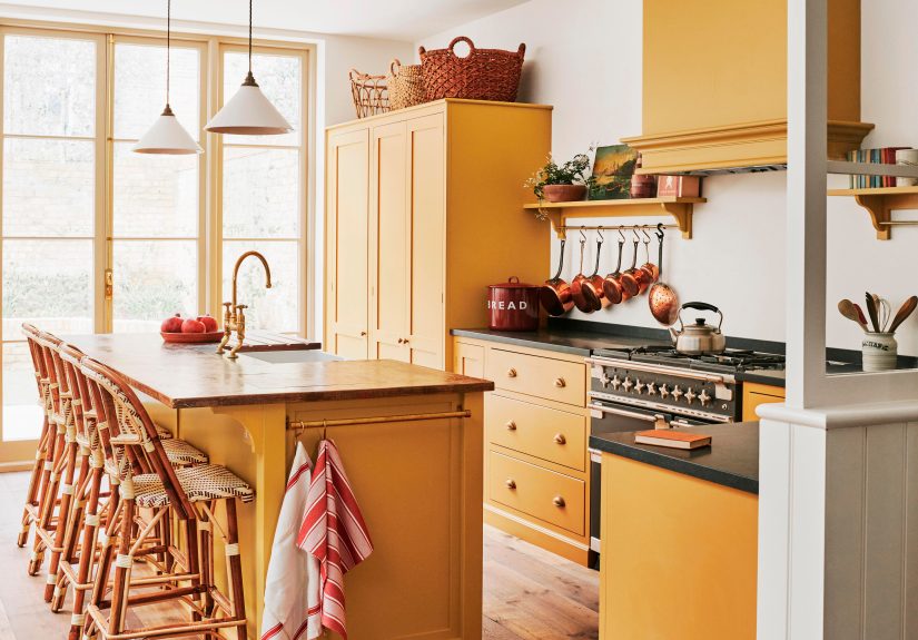
1) Kitchens: clean, bright, and not sterile
Light greens are a kitchen secret weapon because they feel fresh and pair naturally with white cabinets, light wood, and stone.
Tabernacle can work as an all-over wall color, or as a cabinet color if you want something softer than deep forest green.
Pair it with white quartz, butcher block, or warm brass pulls for that “effortless upgrade” look.
Example scheme: Tabernacle walls + creamy white trim + light oak shelves + satin black faucet. It reads modern, but still warm.
2) Bedrooms: calm without going full spa cliché
Green is famously restful, and Tabernacle’s softness helps bedrooms feel airy rather than heavy. It’s a smart alternative to
gray if you’re tired of “greige season” but still want something easy to live with. Layer in linen bedding, warm woods,
and a little contrast (like a navy throw or walnut nightstand) to keep it from feeling too sweet.
3) Living rooms: subtle character, lots of flexibility
In a living room, Tabernacle reads as a gentle atmosphere rather than a bold statement. It’s great for homes with lots of art,
colorful rugs, or eclectic furniture because it doesn’t compete. Add texturethink woven shades, bouclé, or matte plasterand
the color starts to look intentional in a “designer did this” way.
4) Bathrooms and powder rooms: fresh, tailored, grown-up
Tabernacle can feel very “heritage bathroom,” especially with classic tile, brass fixtures, and crisp white trim.
For bathrooms, your paint finish choice matters. You’ll want a washable, moisture-tolerant finish and good ventilation.
In a powder room, you can be more adventurous: color on walls and trim for a wrapped, cozy look that feels custom.
5) Entryways and hallways: the “welcome home” cheat code
If you want guests to walk in and immediately assume you have your life together (even if you absolutely do not),
Tabernacle is a strong choice. Hallways often have inconsistent light, and Tabernacle’s muted tone tends to adapt well.
Add a warm runner, a wood console, and a mirrorand suddenly you live in a magazine.
6) Exterior accents: charming without being loud
Because Tabernacle was historically used outdoors, it can look excellent on exterior elements like garden doors, shutters,
porch ceilings, or small outbuildings. With brick, stone, or natural siding, it reads classic and understated.
The key is to coordinate with your fixed materials: roof color, brick undertones, and surrounding landscape.
Color Pairings That Make Tabernacle Sing (Not Scream)
Tabernacle loves company. Little Greene itself suggests pairing it with deeper neutrals like French Grey – Dark
or Rolling Fog – Dark for warmth and balance, or using a deeper green like Obsidian Green for contrast.
You can also pair it with clean, pale whites for a crisp, classic scheme.
Easy, high-success palettes
- Classic & crisp: Tabernacle + warm white trim + polished nickel or chrome
- Warm & vintage: Tabernacle + creamy off-white + antique brass + walnut
- Modern & grounded: Tabernacle + greige + matte black accents + natural oak
- Color-forward: Tabernacle + dusty blue + soft blush (yes, green and blush can be besties)
- Bold accent moment: Tabernacle + a punchy red or terracotta in small doses (art, textiles, a lamp)
If you want to avoid “hospital hallway energy,” steer clear of pairing Tabernacle with very icy whites and cold blue-grays
unless you have warm lighting and warm textures to balance things out.
Finish Matters: Choose the Sheen Like a Pro
Here’s the not-so-fun truth: the wrong sheen can make a gorgeous color look cheap, patchy, or overly shiny.
The right sheen makes Tabernacle look intentionallike it belongs.
Practical sheen picks (simple and reliable)
- Flat/Matte: Best for ceilings and low-traffic walls. Hides imperfections and gives a soft, velvety look.
- Eggshell: A great all-purpose wall finishslightly more durable and cleanable while still looking soft.
- Satin/Semi-gloss: Better for trim, doors, and areas that need more durability and wipeability.
How Little Greene finishes fit the moment
If you’re using Little Greene paint, you’ll often see Tabernacle offered in finishes like
Absolute Matt Emulsion (a very low-sheen, “dead matt” look) and Intelligent Matt Emulsion
(a very matte finish designed to be more washable and practical). The best pick depends on how your room lives:
quiet adult lounge vs. high-traffic family hallway vs. kitchen chaos zone.
Pro tip: darker colors show roller texture more easily in ultra-flat finishes, but Tabernacle is light enough that you can
usually enjoy a dead-matt look without stressing over every microscopic roller mark.
Application Tips: Make the Color Look Like It Cost More
Tabernacle is forgiving, but good prep is still the difference between “custom home” and “I painted this at midnight.”
Here’s the workflow that keeps you out of trouble:
1) Clean and de-gloss first
Oils, dust, and mystery kitchen residue will mess with adhesion. Wash walls where needed, especially around switches and
door frames. If you’re painting over glossy surfaces or cabinetry, de-gloss properly (your future self will thank you).
2) Patch, sand, and spot-prime repairs
Any patched areas should be sanded smooth and primed so they don’t “flash” through the finish coat. Even a light color
can reveal uneven sheen if repairs weren’t sealed.
3) Use quality tools (because yes, it matters)
A good roller cover and angled brush reduce texture issues and help the color lay down evenly. Cut in neatly, then roll
while the cut edges are still workable for better blending.
4) Two coats is the normal, respectable number
One coat is for people who enjoy living dangerously. Two coats give Tabernacle the even, calm finish it deservesespecially
if you’re covering a darker or more saturated wall color.
Common “Oops” Momentsand How to Fix Them
“It looks grayer than I expected.”
That’s usually cool light (north exposure) or cool bulbs. Switch to warmer bulbs, add warm textures (wood, woven materials),
and consider a creamier trim color instead of a stark white.
“It feels a little too sweet/pastel.”
Add contrast. Tabernacle levels up fast when paired with deeper tones (navy, charcoal, deep green) and sharper hardware
finishes (matte black, aged bronze). You don’t need a new wall coloryou need a stronger supporting cast.
“My trim looks…wrong now.”
Tabernacle will expose trim undertones you never noticed before. If your trim is very cool white, the green may read slightly
cooler. If your trim is creamy, Tabernacle will likely feel warmer and more traditional. Test trim samples right next to your
Tabernacle sample before committing.
Final Take: A Green That Behaves
Little Greene’s Tabernacle (308) is the kind of color that makes a room feel finished without feeling forced.
It’s historic, but not fussy. Soft, but not bland. Green, but not “look at me, I’m GREEN.” If you want a pale green paint color
that can flex across stylestraditional, modern, coastal, cottage, even minimalistTabernacle is a smart, soothing choice.
Real-World Experiences With Tabernacle (308): What People Notice After the Paint Dries
If you’ve ever picked a paint color and thought, “This will change my life,” and then immediately realized your life is still
mostly emails and laundrywelcome to the club. The good news is that Tabernacle tends to deliver the kind of everyday satisfaction
people actually want: it looks good in real lighting, with real furniture, during real life.
In homes with mixed lighting (a little daylight, a little lamp light, and a lot of “why is this room so dim at 4 p.m.?”),
Tabernacle often becomes a quiet stabilizer. Homeowners frequently describe the color as “clean” and “fresh,” but not in a
sterile way. More like the feeling of opening a window on the first warm day of springstill cozy, just brighter.
One common experience: people start noticing how well Tabernacle works with wood tones. In a kitchen with white oak
shelves, it can make the wood look warmer and richer. In a living room with walnut furniture, the green reads more classic and
slightly more muted, like it’s politely stepping back so the wood can be the main character. If your home has a lot of natural
materialswood floors, stone counters, linen upholsteryTabernacle tends to feel like it was always supposed to be there.
Painters and DIYers often report that the color is especially satisfying in matte finishes because it looks soft and
“designer.” The flip side is that matte can reveal surface issues if the wall wasn’t prepped well. The real-world lesson:
spend the extra 30 minutes filling nail holes and feather-sanding patches. Tabernacle is polite, but it will still tell the truth
about your drywall repair from 2017.
Another pattern: Tabernacle becomes a gateway to “just one more paint project.” Someone paints a hallway, loves it, and suddenly
they’re eyeing the mudroom like it owes them money. The color’s versatility encourages expansionentryway today, kitchen tomorrow,
maybe a powder room next weekend. It’s not dramatic enough to get tiring quickly, which is exactly why people keep using it.
Designers who use pale greens often mention that the real magic is in the pairing. With Tabernacle, people notice that
hardware and trim choices change the personality fast:
- Brass + creamy trim makes it feel warmer and more traditional.
- Matte black + crisp trim makes it feel modern and a little sharper.
- Nickel + white tile leans clean, classic, and bright.
Finally, there’s the “emotional” experience: Tabernacle tends to make rooms feel calmer without putting them to sleep. It’s a
green that doesn’t demand attention, but it improves the mood of a space in that subtle way you notice most when you’re living
there every day. If you’re choosing between “safe neutral” and “color with commitment issues,” Tabernacle is the compromise that
actually worksand doesn’t text you at 2 a.m. asking what you are.