Table of Contents >> Show >> Hide
- Why Book Collection Photography Feels So Good (and Why It Resonates Online)
- Start With the Secret Sauce: Light (Not Expensive Gear)
- Composition: How to Make a Shelf Look Like Art Instead of “Stuff”
- Color Is the Joy Multiplier
- Styling Tips for Book Photos That Feel Lively, Not Staged-to-Death
- How I Actually Shoot My Book Photos (Simple Workflow)
- Editing: Make It Better, Not Fake
- Protect the Books While You Photograph Them
- Common Mistakes in Book Collection Photography (and Easy Fixes)
- Conclusion: Photographing Books Is a Small, Beautiful Form of Generosity
- Extra Experience Notes (Added 500+ Words): What I’ve Learned From Photographing My Book Collection for Joy and Color
Some people collect stamps. Some people collect sneakers. I collect booksand apparently, tiny moments of happiness arranged by spine color, cover texture, and the angle of afternoon sunlight on a shelf. What started as “I should clean this bookcase” turned into a full-blown ritual: styling my books, photographing them, and sharing those images to brighten someone’s feed (including my own on rough days).
If that sounds a little dramatic, good. Books are dramatic. They literally have plots.
This article is part personal story, part practical guide, and part love letter to color, composition, and cozy corners. If you’ve ever looked at your bookshelf and thought, this is pretty, but why do my photos make it look like a hostage scene?you’re in the right place. I’ll show you how to photograph a book collection beautifully using simple still-life techniques, smart composition, better lighting, and book-safe handling habits that protect the collection while you create.
Why Book Collection Photography Feels So Good (and Why It Resonates Online)
Photographing books is a form of still life photography, which is fancy photography language for “beautiful pictures of objects that do not complain about retakes.” That matters because still life gives you control. Unlike portraits or street photography, your subjects stay put. You can move a stack half an inch, rotate a mug, wait for better light, and try five versions of the same frame without anyone asking, “Are we done yet?”
That control is exactly why book photos can feel so joyful. Books already carry personality through color, typography, wear, and shape. A bright mass-market paperback screams summer energy; a linen-bound hardcover whispers “I own three fountain pens.” When you photograph a collection, you’re not just documenting objectsyou’re styling mood, memory, and identity.
And online? Book photos are shareable because they offer visual comfort. They combine pattern, color, nostalgia, and a sense of place. In an endless stream of noise, a clean, colorful bookshelf image feels like a deep exhale.
Start With the Secret Sauce: Light (Not Expensive Gear)
If your book photos look flat, dull, or weirdly yellow, the problem usually isn’t your camera. It’s the light. The good news: you do not need a studio full of gear to make your books look great. You need better quality light and a little patience.
1) Use soft natural light first
Window light is the easiest win. It’s flattering, consistent enough for practice, and perfect for showing cover texture, paper edges, and fabric bindings. Side light (from the left or right) is especially useful because it reveals texture and depth. Front light can flatten details, while overhead room lights can make everything look tired and beige.
Try this: place your books or stack near a window with indirect daylight. If sunlight is blasting directly onto the scene, diffuse it with a sheer curtain. You want light that wraps around the objects, not light that turns every glossy dust jacket into a mirror.
2) Add a cheap reflector (or a white poster board)
If one side of your arrangement is too dark, bounce light back in. A small reflector works beautifully, but a piece of white foam board is the budget hero of book photography. Place it opposite the window to lift shadows without killing the cozy contrast.
This is one of those tiny tricks that makes a photo look “edited” before you edit anything. It also helps preserve detail in darker spines so your navy books don’t become a single mysterious rectangle of doom.
3) Know when dramatic light is your friend
Not every photo needs to be bright and airy. If you want a moody, cinematic vibe, stronger side lighting can create more contrast and shadow. That can be beautiful for leather-bound volumes, vintage covers, and dark academia setups. The key is intention: choose the mood, then light for it.
Composition: How to Make a Shelf Look Like Art Instead of “Stuff”
A beautiful book photo is rarely about owning prettier books. It’s usually about compositionhow the eye moves through the frame. This is where a few basic photography principles make a huge difference.
1) Use the rule of thirds without worshipping it
Imagine a 3×3 grid over your image. Placing a focal point (like a bright red spine, a face-out cover, or a stack with a cup on top) near one of the intersections often creates a more dynamic image than centering everything. It’s a guideline, not a law. If centered looks better, center it and move on with your life.
2) Use negative space on purpose
Negative space is the empty area around your subjectand it’s not “wasted.” It gives the eye room to rest and makes your subject stand out. A little blank wall, empty shelf area, or uncluttered tabletop can transform a busy arrangement into a polished photo. In other words: not every inch of your shelf needs to audition for the lead role.
3) Balance visual weight
Bright colors, bold typography, and high contrast pull attention. If one side of your frame has a neon orange cover, the other side may need a balancing element: a plant, a darker stack, or a bit more negative space. Think of the frame like a seesaw. You’re not aiming for symmetry every timeyou’re aiming for visual harmony.
4) Change your angle before changing your books
Sometimes the setup is fine and the camera position is the problem. Try shooting straight-on for shelf portraits, 45 degrees for cozy vignettes, and overhead for flat lays. A small shift in angle can improve lines, reduce glare, and make the arrangement feel more intentional.
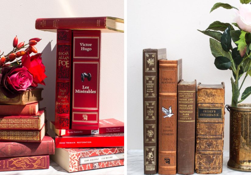
Color Is the Joy Multiplier
The title of this piece includes “joy and color” for a reason: color is emotional. It’s often the first thing people notice in a book photo, and it can completely change the mood of an image.
1) Pick a color strategy before you style
Here are four easy approaches that work:
- Rainbow shelves: Bold, playful, instantly eye-catching.
- Tonal grouping: Similar shades together (all blues, warm neutrals, greens).
- Accent color: Mostly neutral books with one color pop (yellow, red, cobalt).
- Mood palette: “Autumn,” “coastal,” “dark academia,” “spring garden,” etc.
You don’t have to permanently organize your library this way. Many great book photographers temporarily restyle one shelf or one stack for a photo, then put everything back. That is not cheating. That is called art direction.
2) Fix weird color casts with white balance
If your whites look orange, blue, or green, your white balance is off. This happens all the time under mixed lighting (window + warm lamp + overhead light = chaos). The easiest fix is to use one main light source while shooting, then fine-tune white balance in editing so your colors look accurateor intentionally warmer/cooler if that suits your aesthetic.
3) Don’t over-saturate every shot
Yes, color is the starbut if everything is turned to 11, nothing stands out. Increase saturation or vibrance gently, and protect detail in the cover art and text. The goal is “wow, that looks beautiful,” not “wow, my retinas filed a complaint.”
Styling Tips for Book Photos That Feel Lively, Not Staged-to-Death
Home styling editors and bookshelf stylists repeat a few principles for a reason: they work. Whether you’re photographing a full bookcase or a tiny stack on a nightstand, these tricks create depth and interest.
1) Mix vertical and horizontal stacks
A shelf full of only vertical books can look stiff. A shelf full of only horizontal stacks can look like a moving box exploded. Mix both. Horizontal stacks create platforms for small objects (a candle, tiny vase, reading glasses), while vertical rows preserve the “library” feeling.
2) Create “pockets of interest”
Instead of decorating every shelf evenly, build mini focal zones. One shelf can feature a colorful stack, one plant, and a framed print. Another can be mostly books with one sculptural object. These visual pauses keep the bookshelf from looking overcrowded and help the viewer’s eye move through the photo.
3) Use texture to avoid flatness
Books already bring texturecloth, matte paper, glossy jackets, worn edges. Enhance that with natural materials like ceramic, wood, or linen. A trailing plant, woven bookmark, or textured mug can add softness and depth without stealing the show.
4) Leave breathing room
One of the most common styling mistakes is overfilling the frame. If every shelf is jammed with books and objects, the photo reads as clutter, not abundance. A little open space makes the colors and shapes feel intentional.
How I Actually Shoot My Book Photos (Simple Workflow)
You can absolutely do this with a phone. Modern smartphones are excellent for book photography, especially when you use composition tools and basic camera controls instead of just tapping wildly and hoping for magic.
Phone setup that helps immediately
- Turn on grid and level: This helps keep shelves straight and compositions cleaner.
- Choose an aspect ratio intentionally: 1:1 for classic feed-style shots, 4:3 for general use, 16:9 for wide shelf scenes.
- Tap to focus and adjust exposure: Bright covers can trick your camera into underexposing the whole frame.
- Use a timer for sharpness: Especially in low light or awkward positions.
If you shoot on a Pixel, framing hints, focus/exposure controls, lens selection, and panorama options can be especially handy for straight shelves, close detail shots, and wider bookcase scenes.
My go-to shot list for one shelf
- Wide shelf portrait (straight-on): captures the overall color story.
- Detail close-up (spines, texture, page edges): adds intimacy.
- Styled vignette (stack + object + plant): creates a focal image for social posts.
- Overhead flat lay (selected books on table): great for seasonal themes or reading lists.
- Panorama or stitched wide shot (for tall/wide shelves): use carefully to avoid warped lines.
Stability matters more than fancy gear
If you want sharper images, stabilize the camera. A tripod is ideal, but even bracing your elbows on a shelf, using a stack of books as support, or setting the phone on a stable surface helps. Sharpness is a huge part of what makes a photo feel polished.
Editing: Make It Better, Not Fake
Editing is where you refine the photo you tooknot rescue a chaotic image from another dimension. Keep your edits clean, consistent, and light-handed.
Quick editing checklist
- Straighten: Crooked shelves are surprisingly distracting.
- Crop: Remove edge clutter and improve composition.
- Exposure: Brighten carefully; protect highlights on glossy covers.
- White balance: Fix orange/blue casts so color looks intentional.
- Contrast: Add a little depth, especially for flat phone images.
- Color: Adjust vibrance/saturation gently.
- Spot cleanup: Dust, lint, and fingerprints love close-up shots.
A consistent editing style also helps your book photography feel recognizable over time. Maybe your look is bright and cheerful, or moody and warm. Either way, consistency builds a visual signatureand yes, that matters if you’re sharing for an audience.
Protect the Books While You Photograph Them
Pretty photos are not worth damaged bindings. If you love your collection, safe handling should be part of your creative process. Preservation experts consistently emphasize prevention: good storage, proper environment, and careful handling do the most work.
Book-safe photo habits I recommend
- Handle books with clean hands. Clean hands improve grip and reduce transfer of oils and grime.
- Don’t force books flat. Especially for older or stiff bindings. If you need an open-book shot, support it with cushions or soft props.
- Use support for fragile or heavy volumes. Wedges, bolsters, or soft supports reduce stress on the spine.
- Dust gently before shooting. A soft dry cloth or brush helps prevent dust transfer to pages and shows up less in close-ups.
- Avoid tape “repairs.” Even products marketed as “archival” can create future problems.
- Return books to supportive shelving. Keep books upright with proper support; avoid overcrowding shelves.
- Don’t store oversize books spine-up. If a book cannot stand upright safely, store it flat or spine-down per preservation guidance.
Also: if you’re styling near a window, be mindful of extended direct sun exposure. A few minutes for a photo is one thing; leaving prized books baking in harsh light all afternoon is another.
Common Mistakes in Book Collection Photography (and Easy Fixes)
Mistake #1: Shooting under mixed lighting
Fix: Turn off overhead lights and use window light, or use one consistent lamp setup.
Mistake #2: Too much clutter around the books
Fix: Remove half the props. Then remove one more.
Mistake #3: Crooked lines everywhere
Fix: Use grid/level tools and straighten in editing.
Mistake #4: Flat, lifeless arrangements
Fix: Add variationstack orientation, height changes, color contrast, texture.
Mistake #5: Overediting colors
Fix: Adjust white balance first, then use subtle vibrance instead of cranking saturation.
Mistake #6: Damaging books for the shot
Fix: Support the book. Change the angle. Respect the spine. The photo is not worth the repair bill.
Conclusion: Photographing Books Is a Small, Beautiful Form of Generosity
When I photograph my book collection, I’m doing more than making content. I’m slowing down. I’m noticing color combinations I’d normally miss. I’m appreciating the design of covers, the wear on favorite spines, the accidental poetry of a stack on a windowsill. And when I share those images, I’m not trying to impress people with how many books I ownI’m trying to pass along a little visual joy.
That joy is part technique (light, composition, color) and part intention (care, patience, storytelling). You don’t need an enormous library, expensive gear, or a perfectly styled home. You just need a few books you love, decent light, and the willingness to experiment.
And if a stack falls over while you’re arranging it? Congratulations. You are now officially a book photographer.
Extra Experience Notes (Added 500+ Words): What I’ve Learned From Photographing My Book Collection for Joy and Color
The biggest surprise in this whole process is that photographing my books changed the way I experience reading itself. Before I started taking pictures, my shelves were mostly functional: I knew where things were, I grabbed what I needed, and that was that. Once I began styling and photographing them, I started seeing my collection as a living visual diary. The bright paperbacks I bought during a stressful summer sit differently in my mind than the muted hardcovers I collected during a quieter season. When I line them up for a photo, I can literally see chapters of my life in color blocks.
I also learned that the best photos usually happen after I stop trying so hard. Early on, I would over-style everythingtoo many props, too many stacked objects, too many “cute” details. The result looked like a store display built by someone who had just discovered decorative pears. Now I start with the books first, then add one or two supporting items at most. A small plant. A ceramic mug. Reading glasses. Maybe a ribbon bookmark. If the objects compete with the books, they’re out. The books are the celebrities; the props are the supporting cast.
Another lesson: color stories matter more than rare editions. Some of my most-loved photos feature inexpensive thrifted books with cheerful covers and worn corners. A faded turquoise spine next to a mustard-yellow paperback can create more visual magic than a pristine collector’s edition in bad light. This was honestly liberating. It made the hobby feel creative instead of expensive.
I’ve also become much more patient with natural light. There’s a specific window in my home that produces soft, beautiful side light for about an hour in the late morning. Miss that window (literally and emotionally), and the same shelf looks flat. At first I found this annoying. Now I treat it like a ritual. I prep the scene, make coffee, wait for the light, and shoot slowly. It feels less like “content production” and more like a tiny art practice that keeps me sane.
Sharing the photos has been unexpectedly rewarding too. People don’t just comment on the booksthey comment on the feeling. They say things like “This made my day calmer” or “I want to reorganize my shelves now” or “I forgot how pretty books can be.” That response reminds me that beauty online doesn’t have to be loud to be effective. A quiet photo with good color and thoughtful composition can still connect deeply.
And yes, I still make mistakes. I still get glare on glossy covers. I still notice a distracting receipt in the corner after the fact. I still take twenty versions of the same stack and choose the first one. But that’s part of the charm. Photographing a book collection is not about perfection; it’s about attention. It teaches you to notice light, care for your things, and make something ordinary feel a little luminous.
So if you’re thinking about photographing your own shelves, start small. Pick five books. Use a window. Turn on the grid. Move one thing at a time. Make a picture that feels like you. Then share itbecause a little joy and color goes a long way, and the internet could always use one more beautiful bookshelf.