Table of Contents >> Show >> Hide
- What Is Graphic Lettering, Exactly?
- Why Letters Became Art in the First Place
- From Sacred Script to Street Posters
- Lettering vs. Typography: Cousins, Not Twins
- The Visual Power of Custom Letterforms
- Graphic Lettering in Famous Design Movements
- Why Graphic Lettering Still Thrives in the Digital Age
- Graphic Lettering as Identity, Memory, and Mood
- Examples of Where Lettering Becomes More Than Text
- How Artists Create Strong Lettering Compositions
- Why Graphic Lettering Matters for SEO-Friendly Visual Branding
- Experiences of Living With Graphic Lettering as Art
- Conclusion
Letters are supposed to behave. They are supposed to line up, say what they mean, and then quietly return to work like excellent little employees in a well-managed office. Graphic lettering, however, did not get that memo. It stretches, dances, curves, stacks, drips, shouts, whispers, and occasionally struts around like it owns the whole visual universe. And honestly, sometimes it does.
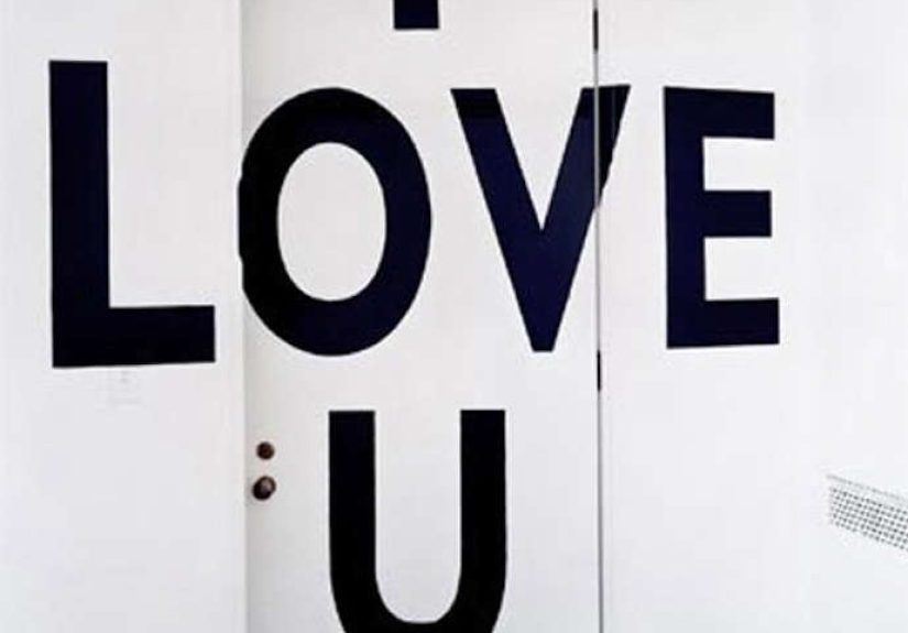
Graphic lettering as art sits at the delicious intersection of language and image. It is not just about making words readable. It is about making words feel alive. A hand-drawn title on a poster, an ornate initial in a book, a bold mural on a brick wall, a custom logo for a brand, or a playful menu board in a coffee shop all prove the same point: letters can carry emotion, history, personality, and atmosphere long before the viewer finishes reading.
That is what makes lettering so fascinating. It is both practical and expressive. It helps us communicate, but it also helps us perform. A single word can look elegant, rebellious, nostalgic, futuristic, sacred, or mischievous depending on how the letters are shaped. In other words, graphic lettering is not decoration glued onto communication. It is communication made visual, memorable, and emotionally charged.
In this article, we will explore how graphic lettering became an art form, why it still matters in modern design, what separates lettering from typography, and how artists continue to reinvent the alphabet in everything from posters and packaging to digital branding and public art.
What Is Graphic Lettering, Exactly?
Graphic lettering is the art of drawing letters as visual forms rather than simply selecting them from a typeface library. That distinction matters. Typography usually involves arranging pre-designed letterforms from a font. Lettering, by contrast, often means creating unique letterforms for a particular word, phrase, title, or composition. One system is built for repeat use. The other is often custom-made for a specific moment.
Think of typography as a beautifully tailored ready-to-wear collection and lettering as couture. Both can be stunning. But lettering often carries a stronger sense of one-time invention. It is shaped around context, mood, and composition. The letters are not just read. They are staged.
Graphic lettering can be simple or elaborate. It may appear as blocky mechanical capitals, flowing script, decorative Victorian swirls, geometric Bauhaus-inspired forms, brush lettering, graffiti-influenced marks, or minimalist modern wordmarks. Sometimes it behaves like illustration. Sometimes it becomes architecture on the page. Sometimes it acts like both at once.
Why Letters Became Art in the First Place
Human beings have been turning writing into art for a very long time. Before lettering lived on album covers, storefronts, and social media graphics, it flourished in manuscripts, inscriptions, scrolls, signs, and sacred texts. In many cultures, the visual form of writing carried enormous aesthetic and symbolic value. The shape of the word was part of its meaning.
That idea still matters today. Graphic lettering works because letters are never neutral. Their forms always communicate something beyond the literal message. Sharp angles can feel forceful. Wide spacing can feel luxurious. Dense blackletter can feel historical or ceremonial. Loose brush lettering can feel intimate and human. Every visual decision becomes part of the emotional script.
This is where graphic lettering starts acting like fine art. Art is not only about depicting objects or scenes. It is also about form, rhythm, contrast, tension, balance, gesture, and symbolism. Lettering uses all of those tools. The alphabet becomes raw material for composition.
From Sacred Script to Street Posters
The history of lettering as art is a wonderfully winding road. In one era, scribes carefully shaped letters by hand, turning texts into objects of devotion and beauty. In another, artists and designers used letters in posters and printed matter to electrify modern life. Later, lettering exploded into advertising, editorial design, album covers, activist graphics, comic books, graffiti culture, and digital media.
One of the biggest shifts happened when print culture expanded and designers realized that text did not need to sit politely on the page like a nervous dinner guest. It could dominate the composition. It could become the image. Posters especially changed the game. Suddenly, letters were scaled, distorted, ornamented, and dramatized to grab attention from across a crowded street.
Art Nouveau pushed this idea into seductive territory with sinuous curves, decorative flourishes, and immersive visual rhythm. Later, modernist designers stripped ornament away and explored geometric clarity, asymmetry, and bold structure. Then postmodern and contemporary designers broke the rules all over again, bringing back expressive chaos, layered forms, handmade texture, and visual play.
So yes, graphic lettering has range. It can wear a velvet cape or a white lab coat. It can be wildly ornamental or crisply rational. Either way, it remains art because form is never accidental.
Lettering vs. Typography: Cousins, Not Twins
This is the part where design people lean forward and get very serious, which is fair. Lettering and typography are related, but they are not interchangeable. Typography deals with arranging letters from an existing type system. Lettering creates the letterforms themselves for a specific use. One relies on a reusable framework. The other often grows directly from the project’s expressive needs.
Still, they constantly influence each other. A hand-lettered poster can inspire a digital font. A typeface can inspire a custom lettering piece. Many designers move fluidly between the two disciplines. That crossover is one reason graphic lettering feels so rich. It borrows from design systems while preserving the unpredictability of drawing.
When graphic lettering becomes art, it usually does so by leaning into qualities typography sometimes has to restrain: individuality, gesture, texture, irregularity, and dramatic composition. A perfect font may be beautifully consistent. A great lettering piece can be beautifully alive.
The Visual Power of Custom Letterforms
Custom letterforms matter because they give words a body. They let designers match visual style to emotional content with extraordinary precision. A jazz festival poster should not necessarily sound like a law firm. A children’s bookstore should not look like a dystopian tech thriller. A luxury perfume package should not scream like a discount warehouse flyer, unless that is somehow the world’s weirdest and most brilliant concept.
Graphic lettering helps solve that problem by making letters part of the storytelling. Consider a few common applications:
- Brand identities: Custom wordmarks can make a brand instantly recognizable and emotionally distinct.
- Posters and editorial covers: Lettering can become the focal image, not just a headline.
- Packaging: Hand-drawn labels suggest craft, heritage, playfulness, or premium quality.
- Public art and murals: Large-scale lettering turns language into place-making.
- Digital campaigns: Animated lettering brings motion, personality, and memorability to screens.
In each case, lettering adds a layer of meaning that plain text often cannot. It shapes perception before the viewer consciously analyzes anything. That is not a side effect. That is the whole point.
Graphic Lettering in Famous Design Movements
Art Nouveau
Art Nouveau treated lettering like a living vine. Letterforms curled, intertwined, and merged with illustration. The result was immersive and ornamental, with type functioning as part of a total visual environment rather than a detached informational layer.
Bauhaus and Modernism
Modernist designers pushed lettering toward geometry, structure, and functional clarity. Instead of floral ornament, they embraced grids, asymmetry, and stripped-down forms. Yet even in its restraint, modernist lettering could be deeply artistic. The drama came from proportion, contrast, and composition rather than decoration.
Postmodern Design
Postmodern lettering cheerfully kicked the neat modernist desk lamp off the table. Designers layered styles, bent rules, quoted history, and treated letterforms as expressive fragments. Readability still mattered, but visual attitude became impossible to ignore.
Graffiti and Street Culture
Graffiti proved that lettering could be public performance. Tags, throw-ups, burners, and mural pieces transformed urban writing into a fiercely inventive art language. Even when styles moved into commercial design, the energy remained: motion, identity, exaggeration, rhythm, and territorial presence.
Why Graphic Lettering Still Thrives in the Digital Age
You might think screens would flatten lettering into endless sameness. Instead, digital culture has made expressive lettering even more valuable. Why? Because when everyone has access to the same fonts, custom visual voice becomes more important, not less.
Brands want distinction. Creators want personality. Audiences want things that feel human. Graphic lettering answers all three. Even when it is polished digitally, it often preserves traces of gesture, irregularity, and authorship. That human signature is powerful in a world crowded with templates.
Digital tools have also expanded what lettering can do. Artists can sketch by hand, refine on tablets, vectorize forms, animate strokes, build three-dimensional letter compositions, or transform lettering into responsive branding systems. The workflow may be modern, but the artistic impulse is ancient: shape language into something worth looking at twice.
Social platforms also helped fuel a lettering revival. Artists can now share experiments instantly, teach techniques, document process videos, and build communities around hand lettering, calligraphy, sign painting, and typographic illustration. The alphabet has become both studio practice and spectator sport.
Graphic Lettering as Identity, Memory, and Mood
One reason graphic lettering feels so emotionally potent is that it carries memory. Certain letter styles remind us of old bookstores, neon diners, pulp paperbacks, protest posters, tattoo flash, comic panels, punk flyers, wedding invitations, baseball scripts, or subway signage. We do not merely read them. We recognize the worlds they imply.
That is why lettering artists often think like historians as much as stylists. They study vernacular signs, old specimen books, hand-painted storefronts, transit maps, packaging archives, and print ephemera. They know that a serif is never just a serif. It may signal prestige, nostalgia, editorial authority, or classic craftsmanship. A chunky rounded letter may suggest friendliness. A dry mechanical capital may suggest engineering, order, or archival precision.
Graphic lettering becomes art when it activates this emotional and cultural memory with intention. It does not simply mimic the past. It interprets it.
Examples of Where Lettering Becomes More Than Text
A book cover title can become a character in the story, foreshadowing tension or whimsy before the first page is turned. A restaurant logo can make the place feel handmade before the menu arrives. A museum exhibition title can signal whether the experience will be scholarly, immersive, radical, or playful. A protest sign can compress urgency, anger, dignity, and solidarity into a few hand-drawn words.
Even data graphics can become a site of artistic lettering. When labels, headings, and visual structure are crafted with intention, information becomes more than neutral display. It becomes visual rhetoric. That is one reason historically significant posters, maps, and charts continue to influence graphic designers today.
There is also a magical moment that happens when viewers stop separating text from image. They no longer think, “Here is the message, and here is the decoration.” They experience both at once. That fusion is where graphic lettering does its best work.
How Artists Create Strong Lettering Compositions
Successful lettering is not random doodling with good posture. It relies on structure. Artists think carefully about spacing, scale, contrast, stroke weight, rhythm, hierarchy, and negative space. They consider how letters interact with one another as shapes, not just characters.
Some of the most important principles include:
- Hierarchy: Which word should lead, and which should support?
- Rhythm: Do the letters create a visual beat or flow?
- Contrast: What happens when thick and thin, large and small, straight and curved forms collide?
- Legibility: Can the viewer decode the message without losing the pleasure of discovery?
- Style consistency: Do all parts of the composition feel like they belong to the same visual voice?
When these elements come together, lettering feels effortless. Of course, it usually took a mountain of sketching, revision, and muttered creative frustration to get there. The alphabet is charming, but it is also very demanding.
Why Graphic Lettering Matters for SEO-Friendly Visual Branding
Yes, this is an art article, but it also lives on the web, where branding and search behavior matter. Graphic lettering supports digital visibility in indirect but meaningful ways. It improves brand recall, increases shareability, strengthens page aesthetics, and gives visual assets a distinct identity that audiences remember.
People are more likely to engage with a feature image, hero graphic, social card, or campaign visual when the headline treatment feels crafted rather than generic. That does not mean every website needs a hand-lettered carnival explosion. It means visual originality supports attention, and attention supports discoverability.
In a crowded content ecosystem, graphic lettering helps a brand look like it has a pulse. That is good design, good storytelling, and, frankly, a lot more fun than another lifeless stock headline dropped into a default font.
Experiences of Living With Graphic Lettering as Art
One of the most interesting things about graphic lettering is that people often form personal relationships with it before they even have the vocabulary to describe what they are seeing. They may not say, “I am drawn to the expressive counterforms and the unusual stroke modulation in this hand-lettered composition.” They just know a café sign made them smile, a book cover made them pause, or a mural made the whole block feel cooler. Lettering enters daily life quietly, then leaves a surprisingly strong imprint.
For many artists and designers, the first experience with graphic lettering is almost accidental. It starts with doodling names in a school notebook, tracing bubble letters, copying a favorite band logo, or trying to make a poster title look less boring. That playful instinct matters. Before lettering becomes a discipline, it often arrives as mischief. It invites experimentation because letters are familiar enough to feel safe, but flexible enough to become strange. You can stretch them, shadow them, stack them, crack them apart, rebuild them, and suddenly language feels like clay.
There is also a tactile pleasure in the process. Pencil sketches, brush pens, ruling pens, paint markers, ink, chalk, and digital styluses all produce different emotional textures. A smooth vector curve can feel precise and architectural. A dry brush stroke can feel warm and immediate. A hand-painted sign may reveal tiny imperfections that make the piece more alive, not less. Many lettering artists describe the experience as halfway between drawing and writing, which is exactly why it can become so absorbing. It uses the discipline of language and the freedom of image at the same time.
Viewers experience that energy too. A custom lettered phrase on a wall can shift the mood of a room. A wedding invitation with elegant script can make the event feel intimate before it begins. A bold protest banner can give a crowd a visual center of gravity. A beautifully lettered package can make an everyday object feel gift-worthy. These are not trivial effects. They are examples of how form shapes emotion in ordinary life.
There is another experience that often comes with lettering: patience. Beautiful lettering rarely appears fully formed in one dramatic burst of genius while orchestral music plays in the background. More often, it emerges through revision. Artists redraw the same word again and again, adjusting width, contrast, spacing, and balance until the piece finally clicks. That process teaches humility. It also teaches observation. You begin to notice how one curve changes a mood, how one serif changes a period reference, how one awkward gap can throw off an entire composition.
Over time, graphic lettering changes the way people see the world. Storefronts become galleries. Street signs become accidental design lessons. Old packaging becomes an archive of visual culture. Even grocery aisles start whispering typographic opinions. Once lettering registers as art, it is hard to turn that awareness off. Thankfully, it makes daily life much more visually interesting.
Conclusion
Graphic lettering as art endures because it does something rare and powerful: it makes language visible in an emotional way. It transforms words into atmosphere, identity, memory, and form. From sacred calligraphy and illuminated books to modern posters, murals, logos, and digital campaigns, lettering has proved again and again that the alphabet is not merely a tool for saying things. It is a medium for making people feel them.
That is why graphic lettering continues to matter. It bridges craft and concept, tradition and experimentation, reading and seeing. It can be elegant, radical, humorous, intimate, monumental, or rebellious. Sometimes all in the same composition, which is frankly a lot to ask of twenty-six letters, yet here we are.
If art is the act of giving form to human thought and feeling, then graphic lettering absolutely belongs in the conversation. It always has. And judging by the way artists keep reinventing it, it is not even close to done.