Table of Contents >> Show >> Hide
- Before You Mix Anything: What “Color” Is Made Of
- Choose Your Arena: Pigment, Paint Counter, or Pixels
- The Pro Method: How to Mix a Custom Color in 9 Repeatable Steps
- Define the target (don’t mix “vibes”)
- Control the lighting (your color needs a fair trial)
- Start with the right base (the “cake batter” matters)
- Mix small test batches (your future self will thank you)
- Adjust hue first (get it in the right family)
- Then adjust value (lighter or darker)
- Then adjust chroma (bright vs. muted)
- Stir like you mean it (uniform color isn’t optional)
- Test properly: large swatches, right surface, right sheen
- Color Matching Tools: When to DIY vs. When to Use Tech
- Three Real Examples: How Pros “Steer” a Mix
- Common Custom-Color Mistakes (and the Fix)
- A Simple Toolkit for Better Color Mixing
- Conclusion
- Field Notes: Real-World Custom Color Experiences (Extra )
- Sources Consulted (No Links)
Mixing a custom color is a little like cooking without a recipe: exciting, empowering, andif you’re not carefulone careless “pinch”
turns into a full-blown “Why is my wall the color of sad grape juice?” situation. The good news: pros don’t have magic paint powers.
They have a process.
In this guide, you’ll learn how to mix a custom color with repeatable steps, smarter testing, and a few “don’t-do-what-I-did” lessons
borrowed from real-world paint counters and studios. We’ll cover color theory without making it feel like homework, plus practical
tricks for matching undertones, controlling lighting, and keeping your mix consistentwhether you’re blending artist paint, wall paint,
or trying to make a digital color behave in the physical world.
Before You Mix Anything: What “Color” Is Made Of
When people say “I want a custom color,” they usually mean one (or more) of these tweaks: make it warmer/cooler, lighter/darker,
brighter/more muted, or “the same but less… aggressive.” To do that reliably, you’ll want to think like a color nerd for about five
minutes. (Then you can go back to being fun.)
Think in 3 sliders: hue, value, and chroma
- Hue: the color family (red, green, blue, etc.).
- Value: how light or dark it is. (A pale mint vs. a deep forest green.)
- Chroma: how intense or muted it is. (Neon vs. dusty.)
Most “mystery mixing problems” happen because you try to fix the wrong slider firstlike adding white to “make it less blue,” which
just gives you a lighter blue that is still… definitely blue.
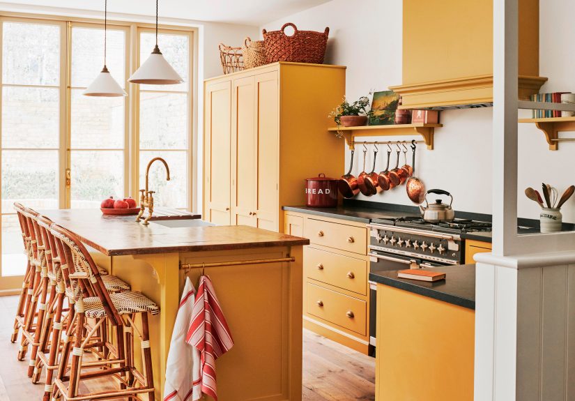
Masstone vs. undertone: why your “gray” fights your sofa
Pros often distinguish between how a paint looks when applied thickly (its masstone) and the character it shows when
it’s spread thin or influenced by what’s underneath (its undertone). This matters because most real surfaces aren’t
viewed in perfect, neutral lightingand colors tend to “cast” in ways that only show up once they’re on the wall.
Translation: a “simple neutral” can suddenly look green-ish, pink-ish, or yellow-ish in your room, next to your flooring, under your
bulbs, at 4:30 p.m. when the sun is doing that dramatic thing through your window.
Choose Your Arena: Pigment, Paint Counter, or Pixels
Additive vs. subtractive color (a.k.a. why your screen lies politely)
Digital color on screens is typically additive (light-based, like RGB/hex). Physical paint and ink are
subtractive (pigment-based, like CMYK and real pigments). That’s why “this hex code” rarely matches “this paint chip”
perfectly. The material, texture, and finish all change how light reflectsand therefore what you see.
Metamerism: the “it matched at the store” plot twist
Two samples can look identical under one light source and drift apart under another. That phenomenon is common enough that color
professionals plan around it by checking colors under consistent lighting conditions and in the actual space. If your custom mix will
live in a room with mixed lighting (daylight + warm lamps + overhead LEDs), test it like it will be seen: in that mess of reality.
The Pro Method: How to Mix a Custom Color in 9 Repeatable Steps
This is the workflow that keeps “custom” from turning into “chaos.” Use it for artist paints, DIY home blends, or even when you’re
collaborating with a paint store to dial in a formula.
Define the target (don’t mix “vibes”)
Choose one clear target: a physical sample, a paint chip, a fabric swatch, a printed brand card, or a photo. If it’s a photo,
assume it’s a “starting point,” not gospelcamera auto-white-balance loves to play pranks.Control the lighting (your color needs a fair trial)
Evaluate color in the space where it will live, at different times of day. Also check your bulb temperature: lighting that’s
cooler vs. warmer can shift how undertones read. If you’re comparing options, keep the lighting consistent so you’re judging the
colornot the lamp’s personality.Start with the right base (the “cake batter” matters)
For house paint, the base (ultra-white, mid, deep) affects how much tint can be added and how the final color develops. A base is
not just “white paint.” It’s a carefully designed carrier that limits pigment load and influences coverage and saturation.For artist paint, your “base” is usually white (or a mixing white) plus your chosen primaries. Note that different whites behave
differently: some are strong and opaque for pastels, others are more transparent for subtle tinting and glazing. Choosing the
right white can be the difference between “creamy muted sky” and “chalky sadness.”Mix small test batches (your future self will thank you)
Start with a small amountseriously. Mix in a cup, palette, or container you can label. Keep your increments tiny, especially when
darkening or neutralizing. It’s much easier to add one more drop than to un-add twelve.Pro tip: Use a digital scale (grams) or consistent “drops” with a pipette. Write down what you did as you go.
Adjust hue first (get it in the right family)
If your mix is too blue, don’t immediately reach for white. First, move it toward the target hue: add a warmer blue, a tiny touch
of green, or a whisper of reddepending on where your target sits. A color wheel is your shortcut: it helps you see which direction
to nudge without guessing.Then adjust value (lighter or darker)
To make a color lighter, add white (creating a tint). To make it darker, you can use blackbut black can “dirty” mixtures fast.
Many painters prefer to darken with deeper versions of the hue, earth colors, or a “chromatic black” approach (darkening by mixing
complementary colors) to keep the mix lively instead of muddy.Then adjust chroma (bright vs. muted)
Want it less intense? Neutralize with a tiny amount of the complementary color (the opposite on the wheel). This reduces chroma
without necessarily changing value as much as dumping in gray or white. Earth colors can also help: for example, warm ochres can
subdue overly bright mixes while keeping them natural-looking.Stir like you mean it (uniform color isn’t optional)
Uneven mixing creates “surprises” that show up laterlike streaks, weird shifts, or a wall that looks like it has opinions.
Thoroughly stir, and if you’re combining multiple containers (common in wall paint), intermix them for consistency.Test properly: large swatches, right surface, right sheen
Tiny chips are useful for narrowing options, but they’re lousy for final decisions. Create a larger sample (often called a
drawdown) and view it in place. Paint finish matters too: sheen changes how light reflects, which changes how the color reads.
If you’ll use satin on the wall, don’t judge the color on a flat sample and expect a perfect match.Also: prep matters. Primer, especially when tinted appropriately, can help the topcoat reach true color more efficiently and reduce
the “why does this not match the chip?” heartbreak.
Color Matching Tools: When to DIY vs. When to Use Tech
You don’t have to do everything by hand. In fact, for matching an existing wall or a specific object, tech can save you hours.
Paint store matching (fast, accurate, still worth testing)
Many paint brands and retailers offer color matching that converts a physical sample into a formula. Some systems use controlled
lighting and algorithms to reduce the “phone camera chaos.” It’s especially useful for touch-ups, competitive color matching, or when
you need a repeatable formula for multiple gallons.
Apps and visualizers (great for previewing, not final truth)
Room visualizer apps can help you explore directions quickly and reduce decision fatigue. They can compensate for shadows and angles,
but your eyes (in your actual room) still get the final vote. Consider them a shortlist generator, not a verdict.
Three Real Examples: How Pros “Steer” a Mix
Example 1: “This white looks… yellow. Why?”
Whites aren’t just whitethey often lean warm or cool based on undertones. The fix isn’t always “pick a different white” (though that
helps). First, compare your white to a true, clean white and to a cooler white in the same lighting. If your trim is a cool white and
your wall white has a warm undertone, the wall can suddenly look buttery. Align undertones for harmonywarm with warm, cool with cool.
Example 2: Making a sage green that doesn’t go “hospital”
Sage lives in a narrow zone where too much blue feels cold and too much yellow feels swampy. A reliable approach:
- Start with a muted green base (not a neon green).
- Lower chroma with a micro-dose of the complement (red family) or a soft earth tone.
- Control value with white carefullytoo much turns it minty, too little makes it heavy.
- Test next to flooring and fabrics, because undertones decide whether “sage” reads cozy or clinical.
Example 3: Matching an existing wall for a touch-up
The fastest path is usually a physical sample matched at a paint store. Then do a real-world test: paint the match on a small board,
let it dry fully, and hold it on the wall in daylight and at night. If the color “matches until evening,” that’s your cue to test for
lighting-driven shifts (and to consider whether you need a closer match under your most common lighting).
Common Custom-Color Mistakes (and the Fix)
- Mistake: Mixing without consistent lighting.
Fix: Judge color in the actual space, at multiple times, and be mindful of bulb temperature. - Mistake: Ignoring undertones.
Fix: Compare colors side-by-side, and align warm with warm and cool with cool for smoother combinations. - Mistake: Overusing black to darken.
Fix: Darken with deeper hues, earth tones, or complementary mixes to keep richness. - Mistake: Testing on tiny swatches only.
Fix: Paint larger samples (or boards) so you can see how the color behaves on a meaningful area. - Mistake: Forgetting sheen and prep.
Fix: Match the finish you’ll use, prep properly, and consider primer strategies when coverage or accuracy is tricky.
A Simple Toolkit for Better Color Mixing
- Digital scale (grams) or pipettes (consistent drops)
- Stir sticks or palette knives (scrape the sideshidden pigment is real)
- White/neutral test boards (so the background doesn’t distort your read)
- Labels + marker (date, ratios, paint brand/base, sheen)
- Good lighting (or at least consistent lighting) for evaluation
Bonus tip: If you create a winner, store a small sealed sample labeled with your ratios. “Future you” will treat “past you” like a
minor deity.
Conclusion
Mixing a custom color isn’t about luckit’s about controlling variables. Decide what you’re aiming for, manage lighting, start with the
right base, adjust hue/value/chroma in that order, and test like a professional (bigger samples, correct sheen, real conditions).
Whether you’re DIY mixing in a cup or working with store color-matching tech, the same truth holds: the room will tell you the truth
eventually, so you might as well ask it early.
Field Notes: Real-World Custom Color Experiences (Extra )
The most useful “experience” with custom color mixing is realizing that color is a moving target. In studios, workshops, and paint
counters, the best mixers aren’t the ones with perfect intuitionthey’re the ones who keep variables from sneaking in like tiny chaos
gremlins. Here are some situations pros run into all the time, plus what they do about them.
1) The “One Drop Too Far” Moment
Almost everyone has done it: your color is 95% perfect, so you add a “tiny” squirt of tint… and suddenly it’s 40% too intense. Pros
avoid this by stepping down their increments as they approach the target. Early in the mix, add larger amounts. Near the finish line,
switch to toothpick-level additions (literally, sometimes) and mix thoroughly before judging.
2) The Dry-Down Surprise
Wet paint can mislead you. Many mixes shift slightly as they dry, and some surfaces make colors read differently once the film forms.
Experienced mixers wait for full dry-down before making final callsespecially for neutrals and anything in the “barely-there” range.
3) The “Why Does It Look Different Over There?” Panic
You step three feet left and the color changes. That’s not your imagination; it’s lighting angles, reflections, and surrounding colors
doing their thing. Pros test samples in multiple spotsnear windows, in shadowy corners, and next to dominant room elements (flooring,
cabinets, big furniture). They don’t chase a single “perfect moment.” They look for a color that behaves well across most moments.
4) The Undertone Ambush
Undertones love to show up uninvited. A “neutral gray” might suddenly whisper green next to warm wood, or look lavender under certain
LEDs. In practice, pros compare candidates against a few anchors: a clean white, a true gray, and a strong reference hue (like a clear
blue or yellow). Those comparisons make undertones easier to spot than staring at one sample in isolation.
5) The Sheen Switcheroo
Someone tests in flat, then paints in satin, and wonders why the wall looks different. Reflective finishes can deepen perceived color
and highlight texture. Experienced painters test in the same sheen (or as close as possible) and keep sheen consistent when matching.
6) The “It Matched in Daylight… Not at Night” Twist
This is where lighting and metamerism-like behavior bites. A mix can appear close in daylight but diverge under warm lamps. Pros check
samples under the lighting the room will actually use mostthen choose the best overall compromise. Sometimes you match “night life”
over “day life,” because that’s when the room is enjoyed.
7) The Formula That Vanished
The most painful custom color is the one you can’t recreate. Pros keep simple records: brand, base, pigments/tints, and the ratio
method (drops, grams, or parts). Even a phone photo of a labeled note can save a project later.
8) The “Too Clean” Color Problem
Some mixes look oddly synthetictoo perfect, too bright, too “sticker.” Seasoned mixers often tame these colors with tiny touches of
earth tones or complementary colors, which can make a shade feel more natural and architectural without making it dull.
The recurring theme: custom color mixing is less like guessing and more like steering. Small moves, frequent checks, and good notes
turn a “maybe” color into a repeatable, dependable one.
Sources Consulted (No Links)
Sherwin-Williams; Benjamin Moore; BEHR (including The Home Depot color services); PPG Paints; Valspar; Golden Artist Colors; Gamblin
Artists Colors; Formlabs; Adobe Help Center; Pantone; Better Homes & Gardens; Southern Living; Hirshfield’s.