Table of Contents >> Show >> Hide
- Why Nature-Inspired Kitchen Colors Are Winning in 2026
- 1. Warm Sand, Mushroom, Putty, and Khaki Are the New Kitchen Neutrals
- 2. Earthy Greens Are Becoming a Kitchen Staple, Not a Risk
- 3. Smoky Blues and Blue-Greens Bring Calm Without Going Coastal
- 4. Clay, Terracotta, Ochre, and Sunbaked Yellow Add Heat in a Good Way
- 5. Brown Is Back, and This Time It Looks Expensive
- How to Use These Colors Without Overdoing It
- What Is Falling Out of Favor
- Final Thoughts
- Extended Experience: What These Nature-Inspired Kitchen Colors Feel Like in Real Life
- SEO Tags
The all-white kitchen had a fabulous run. It was crisp, clean, photogenic, and for a while it seemed legally required on Pinterest. But in 2026, designers are clearly moving in a warmer, more grounded direction. The new kitchen mood is less “sterile showroom” and more “beautiful room where someone actually makes pasta on a Tuesday.”
Across trend reports, designer interviews, and paint forecasts, one idea keeps showing up: nature-inspired color is taking over the kitchen. That does not mean every home is suddenly turning into a forest-themed cafe. It means the most influential palettes now borrow from landscapes, stone, wood, herbs, clay, and sky. Think mushroom and putty instead of bright white. Think olive, eucalyptus, and sage instead of icy gray. Think smoky blue, sunbaked terracotta, and rich brown that feels more espresso bean than builder-grade beige.
In other words, kitchens are getting soul again.
Why Nature-Inspired Kitchen Colors Are Winning in 2026
There are a few reasons this shift feels bigger than a passing fad. First, homeowners want kitchens that feel emotionally warm, not just visually tidy. After years of cool grays and hard whites, softer earth-based tones feel easier to live with. They are forgiving in changing light, friendlier with natural materials, and much better at making a kitchen feel like part of a home instead of a separate design experiment.
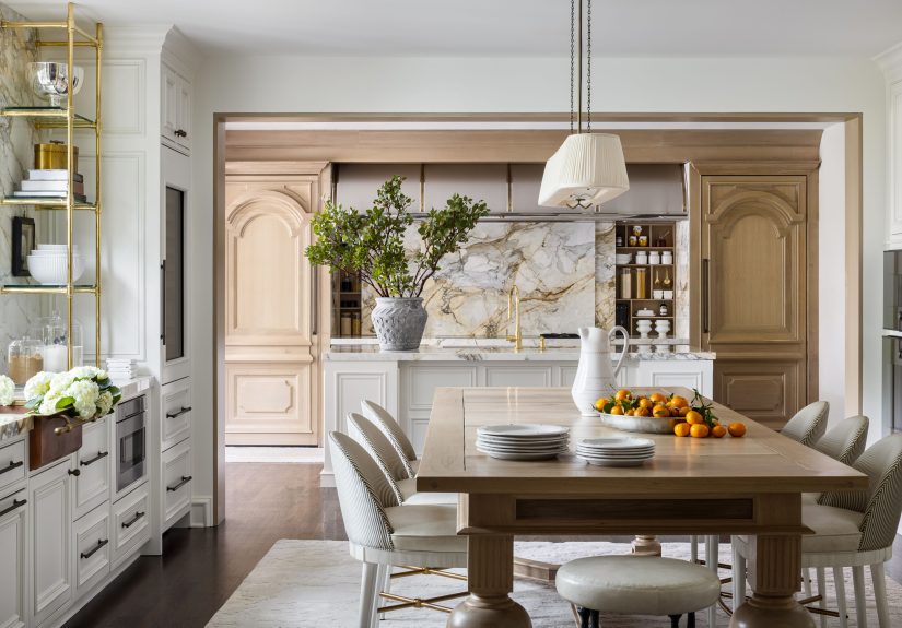
Second, the materials trending in kitchens naturally support this palette. White oak, walnut, quartzite, unlacquered brass, handmade tile, plaster-like finishes, and textured stone all look better when paired with colors that echo the natural world. A putty wall, sage island, or smoky blue pantry door feels intentional next to those finishes. A bright, cold white can feel like it crashed the party uninvited.
Third, designers are pushing for more personalization. Homeowners still want timeless kitchens, but timeless no longer means colorless. In 2026, it means choosing colors with depth, restraint, and staying power. That is exactly why nature-inspired shades are having such a moment: they feel expressive without being exhausting.
1. Warm Sand, Mushroom, Putty, and Khaki Are the New Kitchen Neutrals
If 2026 had a signature backdrop, it would be this family of warm neutrals. These shades sit somewhere between cream, beige, taupe, stone, and soft brown, and they are replacing stark white as the default choice for kitchens. Designers love them because they feel elegant without feeling chilly. They also play beautifully with wood cabinetry, plaster hoods, and veined counters.
One of the biggest clues came from the year’s color forecasts. Sherwin-Williams selected Universal Khaki as its 2026 Color of the Year, which says a lot about where the industry is headed. This kind of grounded neutral feels calm, tailored, and highly livable. Better Homes & Gardens and other design publications are also calling out “cashmere kitchen” tones like mushroom gray, soft taupe, putty, and earthy sand as defining shades for the year.
These colors work especially well on walls, perimeter cabinetry, and large surfaces that need longevity. They create a soft cocoon effect without darkening the room too much. If your kitchen gets a lot of daylight, these shades can glow. If it gets less natural light, they still feel warm rather than flat.
Best ways to use warm neutrals
- Paint the main cabinetry in mushroom, putty, or stone.
- Use a creamy off-white on walls instead of a cold bright white.
- Pair with white oak, walnut, travertine, or beige quartzite for a layered look.
- Add aged brass or bronze hardware to keep the palette rich.
What makes these shades so appealing is that they do not scream for attention. They whisper. And in a world of overachieving accent walls, whispering is suddenly very chic.
2. Earthy Greens Are Becoming a Kitchen Staple, Not a Risk
Green is no longer the “bold choice” in kitchen design. In 2026, it is edging into neutral territory. Designers are especially drawn to muddier, more natural greens rather than bright emeralds or jewel tones. That means sage, olive, eucalyptus, moss, avocado, and forest green are all showing up in cabinetry, islands, backsplashes, and even pantry walls.
This is one of the clearest trend lines of the year. Designers quoted across ELLE Decor, Real Simple, Veranda, and The Spruce all describe green as calming, versatile, and deeply compatible with classic kitchen materials. Some prefer soft green-grays that change with the light. Others are leaning into darker, moodier greens with old-world richness.
Official paint forecasts reinforce the point. Dunn-Edwards named Midnight Garden, a deep muted green with earthy undertones, as its 2026 Color of the Year. Valspar went with Warm Eucalyptus, a restorative green that feels soft and grounded. Even when the exact tone changes, the message is the same: green belongs in the kitchen, and it is here to stay.
Why green works so well in kitchens
It bridges the gap between color and neutrality. Green looks fantastic with butcher block, walnut, marble, limestone, terracotta, and brass. It can feel fresh in the morning, cozy at night, and surprisingly timeless year-round. It also helps kitchens feel connected to the outdoors, which is part of why it works so well in homes that want a biophilic, lived-in look.
For a safe entry point, try sage or eucalyptus on lower cabinets or an island. For more drama, go for forest green or a smoky olive on full cabinetry. Either way, the 2026 version of green is less “look at me” and more “of course this kitchen was always supposed to be this color.”
3. Smoky Blues and Blue-Greens Bring Calm Without Going Coastal
Blue is still very much in the kitchen conversation, but it is evolving. The breezy coastal blue of past years is giving way to moodier, smokier shades with gray or green undertones. Designers are highlighting slate blue, charcoal blue, dusty navy, and blue-greens that feel more mineral than nautical.
This matters because blue can easily go wrong in a kitchen. Too bright, and it feels childish. Too icy, and it feels clinical. But smoky blue works because it behaves like a sophisticated neutral. It brings depth and contrast while still feeling calm. Publications covering 2026 kitchen paint trends repeatedly call out slate blue and smoky blue-gray as ideal for cabinetry, bar areas, and islands.
Behr’s Hidden Gem, a smoky jade with blue-green character, fits beautifully into this category. It gives homeowners a way to use color without making the room feel loud. Meanwhile, darker shades like charcoal blue or inky blue pair especially well with marble, soapstone, warm wood, and unlacquered brass.
Where smoky blue works best
- On a kitchen island in a mostly neutral room.
- On lower cabinets paired with creamy upper cabinets.
- Inside a pantry, scullery, or beverage nook.
- On a range hood or built-in hutch for contrast.
The key is to keep the undertones soft and grounded. In 2026, blue is not trying to be beachy. It is trying to be elegant.
4. Clay, Terracotta, Ochre, and Sunbaked Yellow Add Heat in a Good Way
Not every nature-inspired kitchen color in 2026 is cool and leafy. Designers are also leaning into colors that feel sunbaked and mineral-rich: clay, terracotta, cinnamon, ochre, and mellow butter yellow. These shades add warmth, personality, and a touch of Mediterranean ease without making a kitchen feel overly themed.
House Beautiful and Veranda both point to clay and mustard-adjacent tones as rising favorites, especially when used with natural wood, stone, and tactile finishes. These colors are particularly effective in smaller doses. A pantry door in a dusty yellow. A tile backsplash in warm caramel. A painted island in clay. A breakfast nook wrapped in a muted ochre. Suddenly the room looks collected, layered, and just a little bit sun-kissed.
This is also where 2026 kitchens get more playful. Warm earth colors bring energy, but because they are rooted in natural references, they do not feel random. Terracotta recalls clay pots and baked earth. Ochre suggests dry grass, spice, and sunlight. Butter yellow, when softened, acts like light bouncing around the room instead of a cartoon crayon attack.
If you love warmth but are not ready for green, this color family is worth serious attention. It is cheerful, grown-up, and surprisingly versatile.
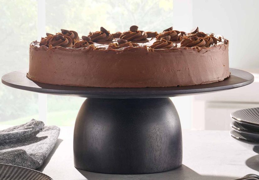
5. Brown Is Back, and This Time It Looks Expensive
Yes, brown is back. No, this is not the sad brown of dated laminate kitchens. The 2026 version is rich, dimensional, and handsome. Think chocolate, espresso, walnut, tobacco, and burnt umber. Designers are embracing brown through stained wood cabinetry, deeper paint colors, and layered neutral schemes that feel collected rather than flat.
Benjamin Moore’s 2026 Color of the Year, Silhouette, is a refined brown with burnt umber and charcoal notes, which neatly captures the mood. ELLE Decor, Real Simple, and Southern Living are also seeing deeper brown stains and rich taupes move into kitchens as homeowners shift away from bright white and thin-feeling grays.
Brown works especially well when you want a kitchen to feel grounded and architectural. Walnut cabinetry, dark-stained oak, or espresso-toned islands can add gravity to a space without making it gloomy. Pair those browns with creamy walls, soft green accents, stone counters, and aged metal, and the effect feels timeless rather than trendy.
In fact, one of the smartest 2026 moves is combining brown and green. It is a naturally harmonious duo that makes a kitchen feel both polished and organic. Mother Nature, once again, remains annoyingly good at color theory.
How to Use These Colors Without Overdoing It
The best 2026 kitchens are not using every trending color at once like they are assembling a very tasteful salad. They are choosing one dominant tone, one supporting neutral, and one accent family. That keeps the room layered but cohesive.
A simple formula that works
- Base: warm neutral, creamy white, or soft stone
- Main character: earthy green, smoky blue, or rich brown
- Accent: clay, brass, terracotta, or natural wood
Two-tone cabinetry is especially useful here. You might use putty upper cabinets with a forest green island. Or white oak lowers with painted mushroom uppers. Or warm neutral walls with a smoky blue pantry. These combinations feel current because they create depth and visual rhythm without relying on high-contrast black-and-white drama.
Texture matters, too. A nature-inspired palette works best when paired with finishes that feel tactile: honed stone, zellige tile, plaster, wood grain, woven lighting, linen Roman shades, and aged metals. Flat shiny surfaces can make these colors lose some of their magic.
What Is Falling Out of Favor
Designers are not saying white kitchens are gone forever. They are saying the whitest, coldest, most clinical versions are losing steam. Cool gray is also taking a back seat, especially when it reads flat or lifeless. And overly bright primary colors are still more niche than mainstream in kitchens.
In 2026, the palette is simply more nuanced. More earthy. More emotionally intelligent. Less “I bought this kitchen from a catalog in one click,” and more “this room has been thoughtfully put together over time.”
Final Thoughts
The defining kitchen colors of 2026 are not about novelty for novelty’s sake. They are about creating spaces that feel grounded, welcoming, and deeply livable. Warm mushroom neutrals, earthy greens, smoky blues, clay tones, and refined browns all support the same bigger idea: the kitchen should feel connected to real life, real materials, and real comfort.
If you are remodeling, updating cabinetry, or just plotting paint samples like a very stylish chess match, nature-inspired color is the clearest direction to follow. It is versatile enough for modern homes, classic enough for traditional spaces, and warm enough to make the kitchen feel like the emotional center of the house again.
And honestly, after years of white-on-white-on-more-white, a little earthiness feels less like a trend and more like a relief.
Extended Experience: What These Nature-Inspired Kitchen Colors Feel Like in Real Life
One reason these colors are resonating so strongly in 2026 is that they do more than look good in polished reveal photos. They also feel good in everyday use. That matters in a kitchen, because this is not a room people pass through once a day while admiring their own restraint. It is a room that gets tested by coffee spills, rushed breakfasts, late-night leftovers, homework sessions, holiday chaos, and the occasional attempt to cook something “simple” that somehow uses every pan in the house.
Warm neutrals tend to make a kitchen feel softer from the moment the sun comes up. In morning light, shades like putty, mushroom, sand, and creamy off-white look gentle rather than glaring. They reduce the sharpness that bright white can create, especially in kitchens with lots of direct daylight. By evening, those same tones feel even cozier under pendants and sconces, which is why so many designers see them as better long-term choices for real homes.
Earthy greens create a different kind of experience. They bring a visual sense of calm, which is useful in a room that can easily feel overstimulating. Homeowners often like green because it seems to settle the space without making it boring. Sage and eucalyptus can make a kitchen feel fresh and airy, while deeper greens like olive or forest can make it feel enveloping and intimate. They also tend to hide everyday wear a bit better than stark white, which is not the most glamorous design argument, but it is one of the most practical.
Smoky blues and blue-greens are especially effective for people who want color but are nervous about commitment. In daily life, these tones feel polished and quiet. They read differently depending on the light, which keeps them interesting. In natural daylight they can feel crisp and mineral-like; at night they become moodier and more cocooning. That shape-shifting quality is one reason they work so well on islands, lower cabinets, and pantry doors.
Clay tones and muted yellows affect the experience of a kitchen in an even warmer way. They add a sense of glow. Used well, they can make the room feel cheerful, hospitable, and a little more relaxed. These shades are particularly appealing in homes where the kitchen serves as both workspace and gathering space, because they visually warm up the room without requiring elaborate styling tricks.
Then there are the richer browns and wood tones, which tend to make kitchens feel established. Not old-fashioned, just rooted. Walnut, espresso, tobacco, and warm stained oak can give the room substance. They make stone counters feel more elegant, brass look more intentional, and open shelving seem less exposed. People are drawn to that because it creates the impression that a kitchen has depth and permanence rather than just trend awareness.
Put all of this together, and the appeal becomes obvious. These colors support the way people actually want to live: comfortably, warmly, and with a little more personality. In real-life kitchens, that is often the difference between a room that looks impressive for a week and one that still feels right years later.