Table of Contents >> Show >> Hide
- 1. Choosing Warm Earth Tones That Read More Muddy Than Cozy
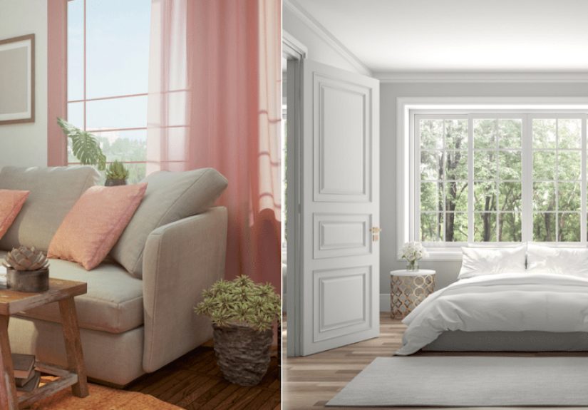
- 2. Ignoring Undertones in Whites, Grays, and “Safe” Neutrals
- 3. Picking the Wrong Sheen for the Room
- 4. Testing Paint on a Tiny Chip Instead of in Real Life
- 5. Forgetting That Lighting Changes Everything
- 6. Painting Trim, Ceilings, and Doors the Wrong Color
- 7. Skipping Prep Work and Painting Over Dirty or Damaged Surfaces
- 8. Breaking Visual Flow From Room to Room
- How to Make Paint Look Cleaner, Brighter, and More Expensive
- Real-World Experiences: What These Paint Mistakes Actually Feel Like in Daily Life
- Conclusion
You can buy a fancy roller, cue up a “weekend makeover” playlist, and promise yourself this paint job will finally make the house look fresh. Then Sunday night arrives, and somehow the room looks… tired. Not “moody.” Not “rich.” Not “designer.” Just tired. As if your walls stayed up too late and now need electrolytes.
The truth is, a dingy-looking house is not always caused by old paint. More often, it comes from a handful of paint mistakes that sabotage color, light, and overall clarity. The wrong undertone can make white look yellow. The wrong sheen can flatten a space or spotlight every wall flaw. Bad lighting can turn a sophisticated greige into a sad bowl of oatmeal. Harsh, but fair.
The good news? Most of these paint mistakes are fixable. Below are eight common reasons paint makes a home look dull, muddy, or dated, plus smart ways to bring back brightness, contrast, and that elusive “Why does this room suddenly look expensive?” effect.
1. Choosing Warm Earth Tones That Read More Muddy Than Cozy
Warm neutrals can be beautiful, but there is a fine line between inviting and why does this wall look like old coffee. Browns, heavy tans, murky taupes, and certain beige paints can absorb light instead of reflecting it, especially in rooms with limited natural light.
This is one of the fastest ways to make a house look dingy. A color that seemed soft and comforting on a tiny swatch can look flat and dusty when stretched across four full walls. The problem is even worse in hallways, older homes with low ceilings, and north-facing rooms where cool light already works against warmth.
How to fix it
Trade muddy earth tones for cleaner neutrals with more clarity. Look for soft whites, creamy whites, pale greiges, muted warm grays, or barely-there taupes with balanced undertones. If you still want warmth, use it in textiles, wood finishes, or accent decor instead of coating the entire room in a color that behaves like wet cardboard under weak lighting.
2. Ignoring Undertones in Whites, Grays, and “Safe” Neutrals
Many homeowners believe white is just white and gray is just gray. Paint companies would like a word. Every neutral has an undertone, and that undertone becomes dramatically more obvious once the paint is on the wall.
A white with yellow or pink undertones can look creamy in one home and grimy in another. A gray with green undertones can look fresh in daylight but swampy at night. A greige that looked elegant online can suddenly clash with your flooring, countertops, trim, and furniture the minute it meets reality.
This is why some rooms feel “off” even when the paint color is technically popular. The color is not necessarily bad. It is just wrong for the fixed elements in the space.
How to fix it
Compare samples side by side with true white paper, trim, flooring, and upholstery before committing. Do not evaluate one paint chip in isolation. View several options together so the undertones reveal themselves. If your room already has warm woods, creamy tile, or beige stone, a crisp blue-based white may look harsh. If your space has cooler finishes, a yellowed white can read tired fast.
3. Picking the Wrong Sheen for the Room
Color gets all the attention, but sheen quietly controls how clean, bright, and polished a room feels. Flat and matte finishes absorb more light, which helps hide imperfections but can also make a space feel dull if the room is already dark. Glossier finishes bounce more light, but they also highlight every patch, dent, roller mark, and wall sin from the last three decades.
Using one sheen everywhere is another common mistake. A finish that works on a bedroom wall might be a poor choice for trim, a bathroom, or a busy family room. When the sheen is wrong, the room either feels lifeless or strangely shiny, like the walls are trying too hard.
How to fix it
Choose sheen strategically. Matte or flat can work well on ceilings and low-traffic walls with imperfect surfaces. Eggshell or soft satin usually gives walls a more balanced, cleanable finish without too much glare. Semi-gloss often works better for trim, doors, and cabinetry where you want durability and a little contrast. In dim spaces, a slightly higher sheen can help reflect light, but only if the wall surface is properly prepped.
4. Testing Paint on a Tiny Chip Instead of in Real Life
This is the paint equivalent of buying jeans based on how they looked folded on a shelf. Paint chips are helpful, but they are not the final exam. A color changes depending on wall size, room orientation, shadows, time of day, bulb temperature, and the colors surrounding it.
Many homeowners skip proper testing because they are eager to get started. Totally understandable. Also how perfectly nice people end up repainting a whole room two weeks later.
How to fix it
Use large painted samples or peel-and-stick samples and move them around the room. Check them morning, afternoon, evening, and under lamplight. Look at them next to trim, flooring, rugs, and cabinetry. A paint color that seems bright in direct daylight may turn gloomy at sunset. A white that looks crisp at noon may become buttery under warm LED bulbs at night.
5. Forgetting That Lighting Changes Everything
Lighting is the sneakiest design partner in the room. It has opinions. Strong ones. Natural light shifts by direction and time of day, while artificial lighting can dramatically change how whites and neutrals appear. Warm bulbs can enhance yellow, peach, and cream undertones. Cooler daylight-style bulbs can make blue and gray undertones feel sharper and cleaner.
If you pick paint without considering the room’s light, even a beautiful color can look dingy. Dim rooms especially need thoughtful coordination between paint and lighting. Otherwise the walls can end up feeling flat, shadowy, or oddly discolored.
How to fix it
Match paint decisions to the room’s actual light conditions. In dark or north-facing spaces, choose colors with enough warmth or brightness to avoid a cold, murky cast. In sunny rooms, watch out for undertones that intensify too much. Also check your bulbs. Consistent lighting temperature throughout the house makes color transitions feel more intentional. If your dining room glows warm amber and your hallway blasts icy daylight, your paint may seem to change personality room by room.
6. Painting Trim, Ceilings, and Doors the Wrong Color
Walls do not work alone. Trim, ceilings, doors, and moldings act like the frame around the picture. If the frame looks dirty, the whole picture suffers.
One common dingy-house mistake is using trim paint that is too creamy, too muddy, or too close to the wall color without enough contrast. Another is leaving an old yellowed ceiling in place after refreshing the walls. Suddenly the new paint looks dull, and you blame the wall color when the real culprit is hanging out overhead like a tired lampshade.
How to fix it
Refresh trim and ceilings along with the walls when possible. Crisp, clean whites often make wall colors look brighter and more intentional. That does not mean every trim must be stark white, but it should look deliberate and fresh. A cleaner ceiling color can lift the whole room, especially in older homes where ceilings quietly collect age and discoloration.
7. Skipping Prep Work and Painting Over Dirty or Damaged Surfaces
Fresh paint cannot perform miracles on top of grime, grease, dents, peeling edges, patchy drywall, or sanding dust. If the surface underneath is dirty or uneven, the new paint may dry in a way that looks blotchy, dull, or rough. High-sheen finishes make this even more obvious, but even forgiving finishes can look dingy when applied over a neglected wall.
This is especially common in kitchens, bathrooms, stairwells, and high-traffic areas where residue builds up gradually. By the time you finally repaint, the wall is carrying years of fingerprints, dust, and mystery smudges no one wants to identify.
How to fix it
Clean first. Patch holes. Sand rough spots. Remove dust. Prime repairs. Caulk gaps where needed. It is not the glamorous part of painting, but it is the part that keeps the finished room from looking amateurish. Think of prep work as the vegetables of the project: not thrilling, absolutely necessary, and annoyingly correct.
8. Breaking Visual Flow From Room to Room
A single room can look decent on its own and still make the house feel dingy overall if the colors fight each other from one space to the next. Abrupt jumps from pink-beige to green-gray to yellow-cream can make the whole home feel visually cluttered, even when each individual color is fine.
This problem shows up most in open floor plans, connected hallways, and homes where people picked colors one room at a time over several years. What started as “fun variety” can end up looking like the walls were chosen by committee during a power outage.
How to fix it
Create a palette with continuity. That does not mean every room has to match. It means the colors should relate. Use one trim color throughout the home, repeat compatible undertones, and let shared spaces act as visual bridges. When rooms flow naturally into one another, the entire house feels cleaner, brighter, and more expensive.
How to Make Paint Look Cleaner, Brighter, and More Expensive
If your home feels dingy after painting, step back and assess the whole picture rather than blaming the wall color alone. In many cases, the best fix is not a dramatic new hue. It is a smarter combination of undertone, sheen, lighting, prep, and contrast.
- Sample before buying gallons.
- Check colors in daylight and at night.
- Coordinate paint with flooring, counters, and trim.
- Use the right sheen for the surface and the amount of traffic.
- Refresh trim and ceilings when they make the room look aged.
- Keep the palette flowing from one room to the next.
In other words, do not let one tiny paint swatch make big life decisions for your walls.
Real-World Experiences: What These Paint Mistakes Actually Feel Like in Daily Life
Anyone who has lived through a paint mistake knows the problem is not just visual. It changes how a room feels when you use it every day. A homeowner may repaint the living room expecting it to feel brighter, only to discover that the new beige makes the sofa look dusty and the artwork look dull. Suddenly the room seems older than it did before the makeover, even though everything is technically “new.” That experience is incredibly common.
Another frequent frustration happens with white paint. People often choose a white that looked fresh online, then put it on their actual walls and wonder why the room now feels yellow at night or stark during the day. The most confusing part is that the paint itself is not defective. It is simply reacting to the bulbs, the window direction, and the existing finishes in the house. That is why homeowners often describe the result as “weird,” “dirty,” or “somehow not right,” even when they cannot immediately explain why.
There is also the classic trim-and-ceiling surprise. You paint the walls, stand back proudly, and then notice the trim suddenly looks old. Or the ceiling, which seemed perfectly fine before, now appears creamier, darker, or slightly smoke-stained compared with the freshly painted walls. Once you see it, you cannot unsee it. It is like buying a brand-new shirt and then realizing your favorite jacket has been secretly fading for years.
Prep mistakes create their own special kind of regret. At first, the room may look acceptable. But once daylight hits the wall at an angle, every patch, bump, and roller edge introduces itself. In kitchens and bathrooms, leftover grime can affect adhesion and finish, so the paint never gets that crisp, even look people were hoping for. Homeowners often say the room looks “unfinished,” and that description is usually right on the money.
Lighting-related mistakes are especially sneaky because they show up in shifts. The color may look lovely at 11 a.m. and depressing by 7 p.m. Families notice this gradually. They start turning on extra lamps. They wonder why the room photographs badly. They move decor around, thinking the accessories are the issue, when the real culprit is the relationship between the paint and the light.
The good news from all these real-world experiences is that the fixes are usually practical, not mysterious. Homeowners who get the best results tend to slow down, test bigger samples, compare undertones, and treat trim, ceilings, and lighting as part of the paint plan. Once they do, the room does not just look better on the wall. It feels better to live in. It feels clearer, calmer, and more intentional.
And that is really the whole goal. Great paint should not call attention to its mistakes. It should quietly make the house look cleaner, brighter, and more like the version you pictured in your head before you opened the first can.
Conclusion
The paint mistakes that make a house look dingy are usually not wild design crimes. They are subtle missteps: muddy neutrals, sneaky undertones, mismatched sheens, bad lighting, tired trim, weak prep, and disconnected color choices. The fix is not guesswork. It is paying attention to how paint actually behaves in a real home.
When you choose cleaner colors, test them properly, prep the surfaces, and coordinate light and finish, the entire house looks sharper. Brighter. Fresher. Less “why does this hallway feel like an old rental?” and more “someone here has excellent taste and probably labels their storage bins.”