Table of Contents >> Show >> Hide
- Why blue front door colors work so well
- How to choose the right blue for your front door
- 21 blue front door colors to inspire your update
- 1. Soft Sky Blue
- 2. Powder Blue
- 3. Haint Blue
- 4. Pale Aqua Blue
- 5. Robin’s Egg Blue
- 6. Dusty Blue
- 7. French Blue
- 8. Denim Blue
- 9. Cottage Blue
- 10. Periwinkle Blue
- 11. Blue-Gray
- 12. Slate Blue
- 13. Steel Blue
- 14. Colonial Blue
- 15. Ocean Blue
- 16. Teal Blue
- 17. Peacock Blue
- 18. Cobalt Blue
- 19. Sapphire Blue
- 20. Navy Blue
- 21. Midnight Blue
- Best pairings for blue front door colors
- Tips for painting your front door like you meant it
- Mistakes to avoid when choosing a blue front door
- Final thoughts
- Extended Experience: What living with a blue front door actually feels like
- SEO Tags
A front door is a small surface with wildly unfair power. It is the handshake, the smile, the “yes, we do know what we’re doing” of your home’s exterior. And if you want a color that feels classic, cheerful, sophisticated, coastal, traditional, and a little bit dramatic without acting like a diva, blue is hard to beat.
Blue front door colors work because they can shift personalities without losing their charm. A pale blue can look airy and welcoming. A slate blue can feel grounded and tailored. A rich navy can make a house look more polished than a pair of shiny loafers. Whether your home is brick, white siding, natural wood, stucco, or painted clapboard, there is a blue that can make the entry feel intentional instead of accidental.
In this guide, you’ll find 21 blue front door colors worth considering, plus tips on how to choose the right tone for your home. Some lean soft and breezy, some go full moody masterpiece, and a few happily live in that magical space between blue and green where curb appeal tends to throw a little party.
Why blue front door colors work so well
Blue is one of the most versatile exterior accent colors because it plays nicely with so many common materials. It looks crisp against white trim, handsome next to red brick, fresh with greige siding, and rich against stone. Lighter blues can brighten a shady porch, while darker blues add contrast and definition to homes with pale exteriors.
Another reason blue keeps winning? It can feel bold without becoming exhausting. Red can shout. Yellow can sing at full volume. Blue, even when dramatic, usually sounds more like confident conversation than karaoke at midnight. That makes it a smart choice for homeowners who want personality without regret.
How to choose the right blue for your front door
Look at the fixed features first
Before you fall in love with a paint chip under suspiciously flattering store lighting, study the parts of your exterior that are not changing anytime soon: brick, stone, roof shingles, trim, shutters, and walkway materials. If those elements are warm, a blue with a hint of green or gray often feels more natural. If your exterior is cooler, a cleaner navy or sky blue can look sharp and cohesive.
Think about style, not just color
A deep navy often suits Colonial, traditional, and modern farmhouse homes. Soft powder blue feels right at home on cottage, coastal, and Craftsman exteriors. Teal-leaning blues can give a neutral house more energy, while slate and steel blues bring a tailored, architectural look.
Test it outside, morning to evening
Blue is famous for changing its mind in different light. What looks like a charming dusty blue at noon can read icy, gray, or almost green by late afternoon. Sample your color directly on the door or on large test boards, and check it in full sun, shade, and porch light. Exterior color is basically theater. Lighting is the director.
21 blue front door colors to inspire your update
1. Soft Sky Blue
If your goal is “welcoming” with a side of “I definitely remember to water the porch fern,” soft sky blue is a strong contender. It brightens darker entries and feels especially lovely with white siding, cream trim, or weathered wood accents.
2. Powder Blue
Powder blue brings a gentle vintage sweetness that works beautifully on cottages and traditional homes. It looks best when paired with crisp trim and understated hardware so the look stays charming instead of sugary.
3. Haint Blue
Borrowed from a long Southern tradition, haint blue has a soft blue-green cast that feels calm, historic, and slightly storybook. It is a wonderful choice for porches with beadboard ceilings, white railings, and homes that lean coastal or cottage in style.
4. Pale Aqua Blue
Pale aqua feels fresh, beachy, and just a little playful. It can give a basic exterior more personality without looking too loud. Try it on white, sand, or light gray homes when you want the entry to feel cheerful but still polished.
5. Robin’s Egg Blue
This shade has a classic, almost nostalgic charm. It works especially well on older homes, Southern-style facades, and entries with decorative millwork. Add brass hardware and potted greenery, and suddenly your front stoop has excellent manners.
6. Dusty Blue
Dusty blue is perfect if you like color but do not want your door to look like it was raised on energy drinks. Its muted quality makes it easier to pair with stone, taupe siding, and warm white trim.
7. French Blue
French blue feels elegant without being stuffy. It has enough pigment to stand out, but it still reads refined. This shade works beautifully on brick homes and exteriors with black lanterns, matte hardware, and clipped shrubs.
8. Denim Blue
Denim blue is relaxed, approachable, and surprisingly versatile. It can make a home feel casual in the best way, especially when paired with warm wood, red brick, or creamy paint colors. Think polished jeans, not lazy Sunday sweatpants.
9. Cottage Blue
Cottage blue often sits between powder blue and slate, giving you softness with a bit more substance. It is ideal for farmhouse, bungalow, and storybook-style homes where you want charm without going overly pastel.
10. Periwinkle Blue
Periwinkle adds a whisper of violet, which makes it feel whimsical and slightly unexpected. This is a great pick for doors with panels, arches, or decorative trim because the color adds character without overwhelming the details.
11. Blue-Gray
Blue-gray is the peace treaty between color and neutrality. It is subtle, sophisticated, and easy to live with. If your exterior includes stone, cool grays, or black accents, this shade can look tailored and timeless.
12. Slate Blue
Slate blue is one of the safest ways to be interesting. It carries depth and mood, but its gray undertones help it harmonize with landscaping, natural materials, and a wide range of trim colors. It is especially strong on homes that need a little architectural definition.
13. Steel Blue
For a sharper, more modern look, steel blue brings a cooler edge. It pairs nicely with black-framed windows, clean-lined planters, and contemporary homes that benefit from a sleek, restrained accent color.
14. Colonial Blue
Colonial blue feels rooted in tradition and works beautifully on historic and New England-inspired homes. It has enough depth to look established and handsome, especially with white columns, brick walkways, and classic lantern-style sconces.
15. Ocean Blue
Ocean blue has a breezy, saturated quality that feels spirited without being neon. This is a strong choice for homes near water, coastal-inspired facades, or anyone who wants the front door to carry the energy of a summer vacation without requiring sand in the car.
16. Teal Blue
Teal-leaning blue is bold, lively, and full of personality. It works best when the rest of the exterior is fairly quiet, like white, light gray, beige, or natural wood. Let the door be the star and avoid competing colors nearby.
17. Peacock Blue
Peacock blue is dramatic in the most charming way. Rich and jewel-toned, it can make a plain entry look curated and expensive. Pair it with brass or aged bronze hardware for a look that says, “Yes, I own a wreath for every season.”
18. Cobalt Blue
Cobalt is bright, crisp, and energetic. It is best for homeowners who genuinely want a statement color. Used well, it can make a neutral exterior look fresh and modern. Used badly, it can look like the door lost a dare. Test carefully.
19. Sapphire Blue
Sapphire blue brings richness and glamour. It looks beautiful on white, pale gray, or stone exteriors and can make even a simple slab door feel special. This shade shines with high-contrast trim and clean landscaping.
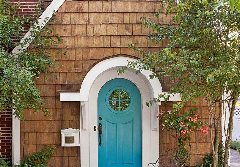
20. Navy Blue
Navy is the all-star of blue front door colors. It is classic, flexible, and rarely looks trendy in a bad way. If you want a front door update that feels safe but still stylish, navy is your friend. It suits traditional, transitional, farmhouse, and even modern homes.
21. Midnight Blue
Midnight blue is moody, elegant, and almost black in low light. It brings drama without the starkness of a true black door. This is a beautiful option for homes with white trim, warm wood elements, or refined exterior details that deserve a stronger focal point.
Best pairings for blue front door colors
If your house is white, nearly every blue is fair game. Soft blues feel airy, while navy and midnight create a sharper, more classic contrast. For brick homes, dusty blue, French blue, slate blue, and blue-gray often work better than icy blues because they echo the warmth of the masonry. For beige or greige exteriors, teal blues, denim blues, and slate tones usually strike the right balance between warmth and freshness.
Hardware matters, too. Brass warms up cool blues. Black hardware gives blue doors a clean, graphic look. Nickel and chrome can feel crisp and modern on lighter blues. And if you have a storm door, make sure it coordinates instead of visually arguing with the color choice like an uninvited neighbor.
Tips for painting your front door like you meant it
Choose the right finish
Satin and semi-gloss are popular for front doors because they are easier to clean and help architectural details stand out. Higher sheen can add a little punch, but it also highlights every dent, ding, and questionable sanding decision from 2018.
Prep before you paint
Clean the surface thoroughly, remove peeling paint, sand rough areas, and use the right primer if needed. Good prep is not exciting, but neither is watching your fabulous blue front door peel like a sunburned tourist.
Coordinate the whole entry
The prettiest door in the world cannot save a sad porch light, a crooked doormat, and a half-dead plant. Once the paint dries, refresh the hardware, sweep the stoop, and add planters or a wreath that make the blue feel intentional.
Mistakes to avoid when choosing a blue front door
- Picking a shade that clashes with roof tones, brick undertones, or stonework.
- Ignoring how the color changes in shade versus full sun.
- Using a bright blue on an already busy exterior with too many competing accents.
- Skipping sample tests and trusting a tiny swatch with your whole reputation.
- Forgetting to check HOA, condo, or historic district rules before painting.
Final thoughts
A blue front door is one of the easiest ways to update your home’s exterior without committing to a full paint overhaul. It can be elegant, charming, playful, coastal, traditional, or bold depending on the shade you choose. The trick is not just choosing a pretty blue. It is choosing the blue that makes sense with your home’s architecture, light, and existing materials.
If you want something timeless, start with navy, slate, or blue-gray. If you want a lighter, friendlier look, explore sky blue, powder blue, or robin’s egg. And if you want your entry to make a memorable first impression, peacock, sapphire, or teal blue can absolutely do the job. Just sample first. Future you deserves that courtesy.
Extended Experience: What living with a blue front door actually feels like
Once a blue front door is painted and the last brushstroke dries, something funny tends to happen: the whole front of the house starts acting better. Homeowners often notice that the entry suddenly feels more finished, even if nothing else changed. The mailbox is the same. The porch light is the same. The same squirrel is still running quality control on the azaleas. But the house looks more awake. Blue has a way of making an entrance feel considered rather than accidental.
A lot of people also find that blue is easier to live with over time than trendier statement colors. A red or bright yellow door can be fun, but it asks for attention every single day. Blue tends to feel more balanced. On weekdays it looks polished and calm. On weekends it can feel cheerful and relaxed. During the holidays, blue pairs surprisingly well with wreaths, garlands, brass, black iron, natural wood, and greenery, which means decorating gets easier instead of harder.
There is also the light factor, which becomes part science experiment, part entertainment. In the morning, a soft blue door may look silvery and fresh. By late afternoon, that same color can warm up and reveal green or gray undertones. Dark blues are even more theatrical. Navy can read crisp and classic in bright sun, then turn velvety and dramatic by dusk. Many homeowners end up loving this shift because it makes the exterior feel layered and alive instead of flat.
Another common experience is how often neighbors comment on it. A blue front door tends to attract compliments because it feels familiar but still distinctive. It is not shocking, but it is memorable. People will say the house looks friendlier, fresher, or somehow more expensive, which is always a delightful return on investment for a project involving a paint can and a free Saturday.
Functionally, blue also hides everyday life fairly well, especially mid-tone and darker shades. Dust, fingerprints, and minor scuffs are often less obvious than they would be on stark white or very dark black. That does not mean you can ignore maintenance forever, but it does mean the door can survive normal human behavior, including children, pets, grocery bags, and the occasional armful of packages opened with unnecessary enthusiasm.
Perhaps the best part of a blue front door is that it often inspires other small updates. Once the color is right, homeowners tend to swap tired hardware, add matching planters, update house numbers, or bring in a better doormat. One small change leads to another, and suddenly the entry looks intentional. That is the sneaky brilliance of a blue front door: it is not just a color update. It is often the beginning of a smarter, warmer, more welcoming exterior.