Table of Contents >> Show >> Hide
- Meet Swiftly Green: What the Color Actually Looks Like
- Why “Interior Satin” Is a Big Deal for This Color
- What “Valspar Swiftly Green Interior Satin Paint” Usually Means in Real Life
- Where Swiftly Green Looks Best
- Coordinating Colors That Make Swiftly Green Look Intentional
- Prep Like You Mean It (Because Satin Is Observant)
- How to Apply Swiftly Green in Satin for a Smooth Finish
- How Much Paint You’ll Need (With a Real Example)
- Keeping Swiftly Green Looking Fresh
- Common Mistakes (So You Don’t Star in a DIY Horror Comedy)
- FAQ: Quick Answers About Swiftly Green in Satin
- Real-World Experiences With Valspar Swiftly Green Interior Satin Paint (Extra )
If you’ve ever wished your walls could feel like a sunlit greenhouse without actually requiring you to
remember to water anything, Valspar Swiftly Green (3008-5C) is your kind of color.
It’s called “Swiftly Green,” but it has a warm, golden personalitylike green went on vacation and came
back with a tan and a better attitude.
This guide breaks down what Swiftly Green looks like in real rooms, why an interior satin finish
can make it look extra polished, how to prep and paint so it stays beautiful, and how to avoid the classic
DIY plot twist: “Why does it look different at 7 p.m. than it did at 7 a.m.?”
Meet Swiftly Green: What the Color Actually Looks Like
First, the “green” in Swiftly Green isn’t a cool, minty spa green. It’s warmermore like a mellow
yellow-green that reads cozy and inviting, especially in rooms with natural light. Valspar lists it as part
of the Yellow family with a warm undertone, which explains why it can feel sunny
even when you’re still wearing socks indoors.
Swiftly Green at a glance
- Color name: Swiftly Green
- Color code: 3008-5C
- Undertone: Warm
- LRV (Light Reflective Value): ~55 (a medium-light reflectance that helps rooms feel brighter without going full “glow stick”)
- Digital references: RGB (225, 192, 115) and HEX (#e1c073) for approximate screen matching (useful for mood boards, not for final decisions)
A quick LRV translation: colors with a higher LRV bounce more light around a room, while lower LRV colors
absorb more. With an LRV around the mid-50s, Swiftly Green can brighten a space without washing it out.
It’s a nice middle: not too heavy, not too timid.
How lighting changes Swiftly Green (a.k.a. the “Why is my wall shape-shifting?” section)
Warm greens are famous for their mood swingsin the best way. Swiftly Green tends to:
- Look warmer and more golden in south- or west-facing rooms (more direct, warm light).
- Read slightly softer or more muted in north-facing rooms (cooler, steadier light).
- Lean calmer and greener under cooler LED bulbs, and richer/warmer under soft-white bulbs.
The best move is testing it in your actual space. A paint sample lets you see it in natural light, with your
furniture, flooring, and whatever mysterious undertone your countertop is secretly plotting.
Why “Interior Satin” Is a Big Deal for This Color
Satin sits in the sweet spot between low-sheen (flat/eggshell) and higher-shine (semi-gloss). It has enough
luster to look clean and finished, but not so much that your wall starts reflecting your entire life back at you.
Satin finish benefits (especially for warm greens)
- More durable and easier to clean than flat finishesgreat for hallways, kitchens, bathrooms, laundry rooms, and kid zones.
- More stain and scrub resistant than lower sheens, which matters if your household includes fingerprints, splashes, or “creative experiments.”
- Makes color look a bit richer because it reflects more lightwarm greens can look especially lively.
The trade-off
Satin can highlight wall texture more than flat paint. Translation: if your wall has bumps, ridges, or old patch
jobs that look like they were done during an earthquake, satin will politely notice them. You don’t need perfect
wallsbut you do want decent prep.
What “Valspar Swiftly Green Interior Satin Paint” Usually Means in Real Life
Swiftly Green is a colorand you can typically have that color tinted into different Valspar interior paint lines.
When you see “Swiftly Green Interior Satin,” it often refers to Swiftly Green tinted in an interior paint product,
in a satin sheen, sold through retailers like Lowe’s.
Choosing a Valspar interior paint line for satin
Different product lines emphasize different perks (washability, stain-blocking, scuff resistance, “paint + primer” convenience).
If you’re standing in the paint aisle feeling like you need an advanced degree in Label Studies, here’s a practical way to decide:
- Everyday walls (living rooms, bedrooms, offices): A solid interior paint + primer option in satin is typically plenty.
- Busy areas (hallways, kids’ rooms, kitchens): Favor formulas marketed for scrub/stain/scuff resistance.
- Big color shift (white to Swiftly Green or vice versa): Expect two coats, and consider a primer for best coverage and truest color.
Many Valspar interior options are 100% acrylic and designed to be washable and durable. Some satin product data sheets
also note practical coverage around up to ~400 sq. ft. per gallon, typical recoat windows, and guidance like waiting
before washing.
Where Swiftly Green Looks Best
Swiftly Green is surprisingly flexible because it’s warm. That warmth helps it play nicely with wood tones, brass,
tan leather, creamy whites, and a lot of popular flooring that leans warm.
Great rooms for Swiftly Green in satin
- Hallways: Satin handles traffic, and Swiftly Green keeps the space feeling welcoming instead of tunnel-like.
- Kitchens and breakfast nooks: Warm green + satin sheen = cheerful, wipeable, and “I swear I cook sometimes.”
- Laundry rooms and mudrooms: Places that take abuse deserve a finish that doesn’t panic at a smudge.
- Bathrooms (with proper ventilation): Satin’s cleanability is a plus, and the color feels fresh without being icy.
- Kids’ rooms or playrooms: It’s bright and friendly, and satin helps with cleanup.
Accent ideas that don’t feel like a theme park
- Accent wall behind a bed: Cozy, warm, and easy to decorate around.
- Wainscoting + neutral upper wall: Satin on the lower portion stands up better to scuffs.
- Built-ins or a bookcase wall: Swiftly Green can make shelves feel curated even when they’re… realistically used.
Coordinating Colors That Make Swiftly Green Look Intentional
The easiest way to make Swiftly Green look “designer-chosen” is pairing it with the right supporting cast.
Valspar lists coordinating options such as Ivory Lace (7003-6), Plum Passion (6007-5B),
and Olive Marinade (6007-5C), which gives you a clean neutral, a bold contrasting accent, and a deeper earthy partner.
Easy pairings (no overthinking required)
- Crisp-but-not-harsh whites: Creamy or soft whites keep the warmth feeling intentional.
- Warm neutrals: Beige, greige, tan, and mushroom tones smooth out transitions to floors and upholstery.
- Natural materials: Oak, walnut, cane, rattan, and linen make the color feel grounded and calm.
- Metals: Brass and warm bronze enhance the golden undertone; matte black adds modern contrast.
Finish pairing tips
- Walls: Satin is great where you need cleanability.
- Trim: Many people prefer semi-gloss on trim for maximum wipeability and a crisp edge.
- Ceilings: Flat is a classic choice to hide imperfections and reduce glare.
Prep Like You Mean It (Because Satin Is Observant)
The biggest “pro-looking paint job” secret is not a fancy roller. It’s prep. Good prep makes satin look smooth,
makes color more even, and keeps your finish from peeling later.
Prep checklist
- Clean the walls (especially kitchens and hallways). Paint hates grease. Grease always wins if you don’t clean first.
- Patch holes and cracks, then sand smooth. Feather the edges so you don’t get “patch halos.”
- De-gloss shiny spots (old semi-gloss, glossy trim, or greasy handprints). Paint adheres better to a slightly scuffed surface.
- Spot-prime repairs so patched areas don’t flash through your final coat.
- Use a stain-blocking primer for heavy stains or dramatic color changes.
A quick safety note for older homes
If your home was built before 1978 and you’re scraping or sanding old paint, take lead-safety seriously. When in doubt,
follow lead-safe practices and consider certified helpespecially in homes with kids or pregnant household members.
How to Apply Swiftly Green in Satin for a Smooth Finish
Satin rewards steady technique. Your goal is even coverage and a consistent sheenbecause uneven sheen can look like
the wall has “shiny patches,” even when the color is correct.
Tools that make satin easier
- Angled brush for cutting in (quality matterscheap brushes shed like a stressed-out golden retriever).
- 3/8″ nap roller for most smooth-to-lightly-textured drywall.
- Extension pole for more consistent pressure and fewer “why do my shoulders hate me?” moments.
- Painter’s tape if you want crisp lines, plus a good tool for pressing edges down.
Technique tips that prevent streaks
- Keep a wet edge: Work in sections so you’re not rolling into paint that has already started drying.
- Cut in, then roll soon after: This helps the brushed and rolled areas blend better.
- Finish with light, consistent strokes: Satin can show heavy-handed roller marks.
- Plan for two coats: Especially when shifting from a very light or very dark existing color.
Drying, recoating, and “when can I clean this?”
Many interior acrylic paints dry to the touch relatively quickly, but curing takes longer. Recoat windows are often
a few hours (check your label), and some product data sheets recommend waiting about a week before washing for best
durability. Translation: let it toughen up before you go scrubbing like you’re trying to erase history.
How Much Paint You’ll Need (With a Real Example)
Most interior wall paints commonly cover around 350–400 square feet per gallon, depending on surface texture,
porosity, and application method. Primer often covers less. The simplest math is:
(Total paintable square footage ÷ coverage per gallon) × number of coats = gallons needed
Example: a 10′ × 12′ room with 8′ ceilings
- Wall area: (10+12+10+12) × 8 = 352 sq. ft.
- Subtract doors/windows (estimate): ~40 sq. ft. → about 312 sq. ft. paintable
- Two coats: 312 × 2 = 624 sq. ft.
- At ~350–400 sq. ft./gal: you’ll likely need 2 gallons (especially if your walls are thirsty or textured)
If you’re painting over fresh drywall, heavy patches, or a high-contrast color, plan for primer and/or extra paint.
If you’re painting smooth, already-painted walls in a similar tone, you may get away with less. The paint can label is the final boss of this decision.
Keeping Swiftly Green Looking Fresh
Cleaning
Once the paint has cured, satin is generally easier to wipe down than flat. Use mild soap and a soft sponge or cloth.
Avoid harsh abrasivessatin is durable, but it doesn’t need to be exfoliated.
Touch-ups
Satin can be trickier to touch up invisibly because sheen differences can show. If you need to fix a mark, try touching up
a larger section (corner to corner or trim line to trim line) rather than a tiny spot. And always stir your touch-up paint well.
Common Mistakes (So You Don’t Star in a DIY Horror Comedy)
- Skipping samples: Warm greens can shift dramatically between morning and evening light.
- Painting over dirty walls: You’ll get adhesion problems, uneven sheen, or weird “ghost stains.”
- Not priming patches: Your wall will look like it has a constellation of slightly different rectangles.
- Overworking drying paint: Rolling back into half-dry paint creates lap marks and texture.
- Using the wrong sheen for the job: Flat in a busy hallway is basically inviting fingerprints to move in.
FAQ: Quick Answers About Swiftly Green in Satin
Does Swiftly Green really look green?
Yesbut it’s a warm, yellow-leaning green that can read more golden in strong warm light. In cooler light, it often looks calmer and greener.
Is satin too shiny for walls?
Not usually. Satin is commonly used on walls when you want more durability and easier cleaning than eggshell or flat. If your walls are very imperfect, eggshell may hide better.
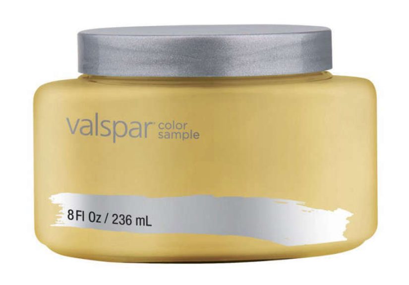
Should I use the 8 oz sample first?
Absolutely. Painting a test area lets you see the color in your home’s lighting and alongside your floors and furnishings. It’s the cheapest way to avoid repainting a whole room later.
What if I want this color but less warmth?
Pair it with cooler whites, cooler lighting (carefully), and accents like charcoal, slate, or black to balance the warmth. You can also use it as an accent instead of full-room coverage.
Real-World Experiences With Valspar Swiftly Green Interior Satin Paint (Extra )
People often fall for Swiftly Green the same way they fall for a bakery window display: it looks warm, inviting, and
slightly nostalgic. The “experience” usually starts with a sample. Someone brushes a 2-foot square on a wall and says,
“Okay… that’s cute.” Then they walk by it three hours later, in different light, and say, “Wait. That’s REALLY cute.”
That’s the warm undertone doing its thingturning the color from “pleasant” to “why do I feel calmer?” as daylight shifts.
In a hallway, the first thing people notice is that satin + Swiftly Green looks cleaner than expected. Hallways are
basically fingerprint runways, but satin tends to wipe down more confidently than flatter finishes. Homeowners often say
the color makes the space feel less like a pass-through and more like an intentional part of the homeespecially when paired
with a soft white trim and warm wood accents. It’s the kind of shade that doesn’t demand attention, but it quietly improves
your mood while you’re hunting for your keys.
Kitchens are where Swiftly Green really shows off. Under-cabinet lighting can pull out the golden notes, making the color
feel sunny and appetizing (which is great… unless you’re trying not to snack). People doing quick refresheslike repainting a
breakfast nook or a small kitchen walloften mention that Swiftly Green looks surprisingly “expensive” for such an approachable
color. Satin adds that gentle glow that reads polished, especially against white cabinets, butcher block counters, or brass hardware.
In kids’ rooms and playrooms, the experience is usually: “This feels cheerful without being babyish.” Swiftly Green is warm,
so it can feel friendly and playful, but it isn’t neon or overly sweet. Parents often appreciate that satin can handle minor
scuffs and mystery smudges. The practical lesson people learn fast is to let the paint cure before heavy cleaningbecause the
first week is when everyone suddenly discovers the wall is the best place to rest their hands while telling a story.
One of the most common “aha” moments is about coordination. Someone tests Swiftly Green and worries it might look too yellow.
Then they add a creamy white next to it, and suddenly it reads greener. Or they place it near a cool gray and notice it warms the
whole palette. People often end up using it as a bridge color: it connects warm floors to cooler furniture, or modern black accents
to traditional wood tones. The overall vibe is cozy and lived-inlike your home is giving a friendly wink instead of trying to be a showroom.
The most repeatable experience-based advice is simple: test it on more than one wall, watch it through a full day, and don’t judge it
under one lightbulb at midnight while holding a flashlight like you’re investigating a crime scene. Swiftly Green changes gently, but it does change.
And when you let it “audition” properly, it tends to earn the role.