Table of Contents >> Show >> Hide
- 1. Using Way Too Many Fonts
- 2. Choosing Cheesy or Unreadable Fonts
- 3. Stretching, Squashing, and Distorting Type
- 4. Terrible Contrast Between Text and Background
- 5. Ignoring Hierarchy, Line Length, and Spacing
- 6. Widows, Orphans, and Ugly Rags
- 7. “Dumb” Quotes, Bad Primes, and Sloppy Punctuation
- 8. Misusing Hyphens, En Dashes, and Em Dashes
- 9. Awful Kerning and Tracking
- 10. Overusing Special Effects: All Caps, Bold, Underline, and Center
- Bonus: How to Spot Typography Crimes in the Wild
- Real-World Experiences With Typography Crimes
Typography is like the soundtrack of your design. When it’s good, most people barely notice it.
When it’s bad, they notice nothing else. From stretched fonts to aggressive ALL CAPS, typography
crimes are quietly sabotaging posters, websites, resumes, menus, and that flyer your cousin made
in Microsoft Word in 2007 and still uses today.
The good news? Most of these mistakes are completely avoidable once you know what to look for.
Let’s walk through the top 10 typography crimes that make designers cringe and readers click away,
plus how to fix each one like a pro.
1. Using Way Too Many Fonts
Why it’s a crime
If your design uses one font for the headline, one for the subhead, another for the body, a
script font for quotes, a display font for buttons, and something “fun” for the footer,
you don’t have a layoutyou have a ransom note.
Too many fonts create visual noise. The viewer doesn’t know where to look, hierarchy falls apart,
and the design feels amateur and chaotic. Most professional branding and web typography guides
recommend sticking to one or two font families: one for headings, one for body text. That’s it.
How to fix it
- Pick one clean, readable font for body text.
- Add one contrasting font (or just a bold/italic of the same family) for headings.
- Rely on weight, size, and color instead of adding more font families.
- Create a simple “type scale” (H1, H2, H3, body, caption) and stick to it across the project.
2. Choosing Cheesy or Unreadable Fonts
Why it’s a crime
Comic Sans for a legal contract. Papyrus for a luxury spa. A hyper-thin script for body text.
Cheesy or hard-to-read fonts instantly cheapen your message and confuse your audience about
the tone you’re trying to set.
A font needs to match the message and the medium. If people have to squint, rotate their phone,
or guess what a letter is supposed to be, the typography has already failedno matter how
“cool” it looked in the font menu.
How to fix it
- Use decorative or script fonts only for very short text, such as a logo or a big headline.
- Choose body fonts designed for readability (serif or sans-serif with open letterforms).
- Ask: “Would I want to read 600 words in this font?” If the answer is no, don’t use it for paragraphs.
3. Stretching, Squashing, and Distorting Type
Why it’s a crime
Manually stretching text to “fit” a space is typographic vandalism. Letters are drawn with specific
proportions. When you drag them taller, wider, or squish them to make a word fit on one line, you
distort those proportions and instantly make the design look cheap and unprofessional.
Distorted fonts also hurt legibility because the eye expects certain letter shapes. When the shapes
are warped, reading becomes more work than it should be.
How to fix it
- Never stretch or compress type using the transform handles.
- If you need condensed or extended type, use a font family that includes those styles.
- Adjust font size, tracking, or layout instead of forcing text to fit a box.
4. Terrible Contrast Between Text and Background
Why it’s a crime
Light gray text on a white background might look “minimalist,” but it’s also a great way to
make your content unreadableespecially on mobile devices or for people with low vision.
Poor contrast is one of the fastest ways to destroy usability on a website or in an app.
When contrast is too low, users strain to read, bounce faster, and trust your content less.
Accessibility standards aren’t just for government sites; they’re basic good typography.
How to fix it
- Use dark text on light backgrounds or light text on truly dark backgrounds.
- Aim for at least WCAG AA-level contrast, especially for body text.
- Avoid text over busy images unless you add a solid or semi-opaque overlay behind the text.
5. Ignoring Hierarchy, Line Length, and Spacing
Why it’s a crime
Typography isn’t just about picking fonts; it’s about how text is structured on the page.
When all text looks the same size, weight, and color, readers get lost. When lines are too long,
they lose their place. When lines are too tight or too loose, reading feels uncomfortable.
Poor hierarchy and spacing turn even brilliant writing into a wall of text. Your job is to guide
the eye through the content in a logical, comfortable way.
How to fix it
- Use larger, bolder type for headings and smaller, regular-weight type for body content.
- Keep line length around 50–75 characters for paragraphs.
- Adjust line spacing (leading) so lines don’t crash into each other or float awkwardly apart.
- Use whitespace generously around sections to give the eye rest points.
6. Widows, Orphans, and Ugly Rags
Why it’s a crime
A widow is a lonely word at the end of a paragraph. An orphan is a short line stranded at the
top or bottom of a column. “Rags” are the uneven edges of left- or right-aligned text. When
they’re bad, they create awkward shapes and holes that pull attention away from the content.
These might seem like tiny details, but they add up. A page full of widows, orphans, and jagged
rags looks sloppy, like nobody cared enough to refine the typography.
How to fix it
- Manually adjust line breaks to avoid single-word lines where possible.
- Use tracking and soft returns to balance paragraph shapes.
- For left-aligned text, aim for a gentle, organic ragnot sharp steps or weird spikes.
7. “Dumb” Quotes, Bad Primes, and Sloppy Punctuation
Why it’s a crime
Straight quotes (“like this”) are fine in code, but in professional typography they’re considered
“dumb” quotes. Proper curly quotes (“like this”) make text feel polished. The same goes for primes:
feet and inches are marked with prime symbols, not quotation marks.
Sloppy punctuationlike putting periods outside closing quotes when the style calls for them inside,
or mixing primes and quotes at randomsignals inattention to detail and undermines credibility.
How to fix it
- Turn on “smart quotes” in your design or word-processing software.
- Use true primes (′ ″) for measurements instead of quotation marks.
- Follow a punctuation style guide (such as American punctuation rules) consistently.
8. Misusing Hyphens, En Dashes, and Em Dashes
Why it’s a crime
Not all dashes are created equal. Hyphens-are-for-compound-words. En dashes connect ranges
(2019–2025). Em dasheslike thisset off breaks in thought. When everything is typed with a
tiny hyphen, text looks less refined and can even become ambiguous.
Overusing hyphens instead of dashes is one of those subtle typography crimes that readers can’t always
name, but they can feel. It’s like using the same spice in every dish: eventually, it gets weird.
How to fix it
- Use hyphens (-) for compound words and line breaks.
- Use en dashes (–) for ranges, like “pages 5–12” or “April–June.”
- Use em dashes () to add emphasis or parenthetical thoughts in sentences.
- Learn your software’s shortcuts for en and em dashes and use them consistently.
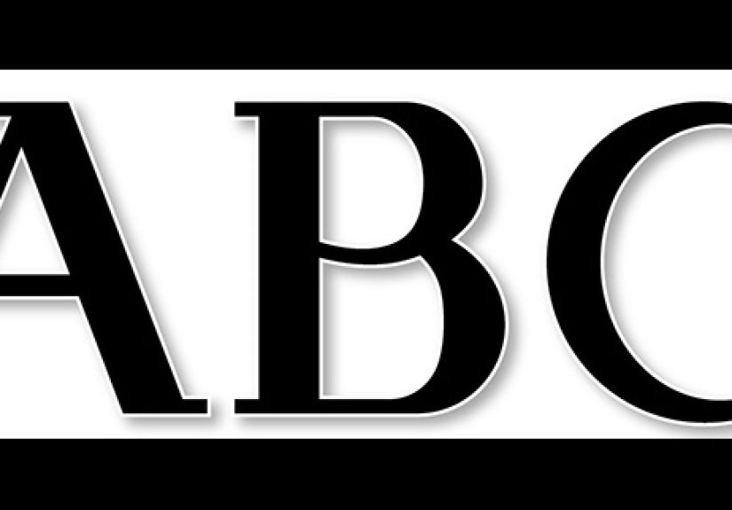
9. Awful Kerning and Tracking
Why it’s a crime
Kerning is the space between individual letters; tracking is overall spacing across a word or line.
When kerning is bad, letters either crash into each other or drift apart, sometimes forming
accidental new words or awkward letter combinations that readers can’t unsee.
Poor spacing is especially obvious in logos, headlines, and large type. It’s one of the clearest
signals that a design wasn’t professionally crafted.
How to fix it
- Zoom in on headlines and adjust kerning manually where pairs look too tight or too loose.
- Use tracking to slightly open up all caps or condensed fonts to improve readability.
- Look at words upside down or mirroredthis helps you see spacing as shapes, not letters.
10. Overusing Special Effects: All Caps, Bold, Underline, and Center
Why it’s a crime
All caps + bold + underline + bright red = your text is not “more important,” it’s just shouting.
Overusing emphasis tools makes it impossible for readers to tell what actually matters. If
everything screams, nothing speaks.
Centering every line, underlining for emphasis, or sprinkling random bold phrases through
paragraphs creates visual clutter and weakens the overall hierarchy.
How to fix it
- Use bold and color sparingly to highlight truly important elements.
- Reserve all caps for short labels, buttons, or acronyms, not full paragraphs.
- Underline only when indicating links on the webnever as a general emphasis tool.
- Use left alignment for most body text; center alignment is best for short, self-contained lines.
Bonus: How to Spot Typography Crimes in the Wild
Once you start noticing typography crimes, you can’t “unsee” them. You’ll spot menus with
12 fonts, posters with neon text on neon backgrounds, and landing pages where the hero
headline is barely legible over a stock photo of people high-fiving.
A quick checklist to run through when you look at any design:
- Can I read the text comfortably at arm’s length (or on a phone) without squinting?
- Do I clearly understand what’s most important on the page within three seconds?
- Are fonts consistent, or does it look like a font buffet?
- Do spacing, line length, and alignment feel calm and intentional rather than random?
If the answer to any of those is “no,” you’re probably looking at a crime scene.
Luckily, you now know how to file a typographic cleanup report.
Real-World Experiences With Typography Crimes
Ask any designer and they’ll have war stories about bad typography. One common scenario is
the “urgent flyer” project. Someone sends over a Word document for a community event: five
different fonts, random colors, centered paragraphs, and a phone number in 8pt size. The
intention is good; the typography is not. The fix almost always starts by calmly deleting
80% of the formatting and rebuilding from a simple hierarchy.
Another classic example is the resume rescue. A job seeker wonders why they never hear back,
and their resume turns out to be a dense block of text using an ornate script font and
justified alignment that leaves rivers of white space down the page. Simply switching to a
clean sans-serif or serif, tightening the line length, and creating a clear hierarchy for
headings (experience, skills, education) can totally transform how the document feelsand how
seriously it’s taken.
Designers also see typography crimes in restaurants. You sit down, open the menu, and
immediately feel your soul leave your body: a laminated page with tiny italic text, low
contrast against a patterned background, and prices misaligned so you can’t quickly scan.
Good menu design guides your eyes with consistent alignment and sensible spacing. When
typography fails, people order the same safe dish every time because reading the menu is work.
On the web, typography crimes show up as “fancy” landing pages that ignore basics. You’ll
find hero sections where the headline is elegant but unreadable, body text that’s too light
to see on a laptop in daylight, and lines that stretch across the entire width of a
large monitor. Visitors might not know the term “line length,” but they know how it feels
when reading is physically tiring. They leave.
There’s also the emotional side of fixing typography. When you clean up a messy layoutreduce
the fonts, increase contrast, adjust spacing, and fix widows and orphansthe whole design
suddenly “breathes.” Clients often say, “I don’t know what you changed, but it looks so much
better.” That’s typography doing its quiet magic.
Over time, you start to develop a sixth sense for these issues. You can glance at a page and
immediately feel that a headline is too tight, a body font is too small, or a paragraph would
read better if it were split into two. Those instincts come from practice: studying good
typography, comparing before-and-after examples, and deliberately correcting your own mistakes.
The biggest lesson from real-world experience is simple: typography is not decoration; it’s
part of how your message works. When you treat type as a serious design toolchoosing fonts
carefully, respecting spacing, and avoiding these common crimesyour work looks more
professional, your content feels more trustworthy, and your readers stay with you longer.
So the next time you open a design file or word processor, think like a “type detective.”
Ask what your typography is saying about you before anyone reads a single word. If it’s
shouting, stumbling, or mumbling, you know exactly which crimes to investigate first.