Table of Contents >> Show >> Hide
There are two kinds of home design inspiration on the internet. The first kind makes you whisper, “Wow, I should repaint my kitchen cabinets.” The second kind makes you say, “Well, at least I don’t have a toilet facing a staircase under a neon chandelier.” This article is proudly about the second kind.
One viral social media account that has captured this exact mood is Cheapo Architecture, a page built around laughably awkward interiors, bizarre exterior choices, and homes that seem to have been designed by committee, chaos, and maybe one very confident cousin with a tape measure. And honestly? Bless it. Because when you see a living room that looks like a dentist’s waiting area collided with a banquet hall, your own place suddenly feels a lot more charming.
But these home design fails are not just funny. They are useful. Behind every cursed carpet, sad front yard, and oddly aggressive light fixture is a lesson about proportion, function, lighting, storage, traffic flow, and common decorating mistakes. Design experts across American home publications keep returning to the same themes: use layered lighting, choose the right scale, keep layouts practical, respect clearances, avoid visual clutter, and remember that a house is supposed to be lived in, not merely survived.
So let’s enjoy the chaos, learn from it, and maybe feel a little better about that one weird corner in your own apartment you still haven’t figured out.
Why the Internet Loves Home Design Fails So Much
Home design fails hit a sweet spot between comedy and cautionary tale. They are visual, immediate, and relatable. You do not need an architecture degree to recognize that a sofa blocking half a doorway is a problem. You just need eyes and a basic desire to reach the kitchen without performing parkour.
They are also comforting because most people have made some version of these mistakes themselves. Maybe you bought a rug that looked enormous online and arrived looking like a decorative postage stamp. Maybe you installed lighting so bright your living room now feels qualified for minor surgery. Maybe you chose a trendy piece that looked incredible in a photo and deeply strange in your actual home next to the laundry basket and the dog bed. It happens.
That is why accounts like this work. They turn decorating regret into a group project. And the comment sections? Pure therapy.
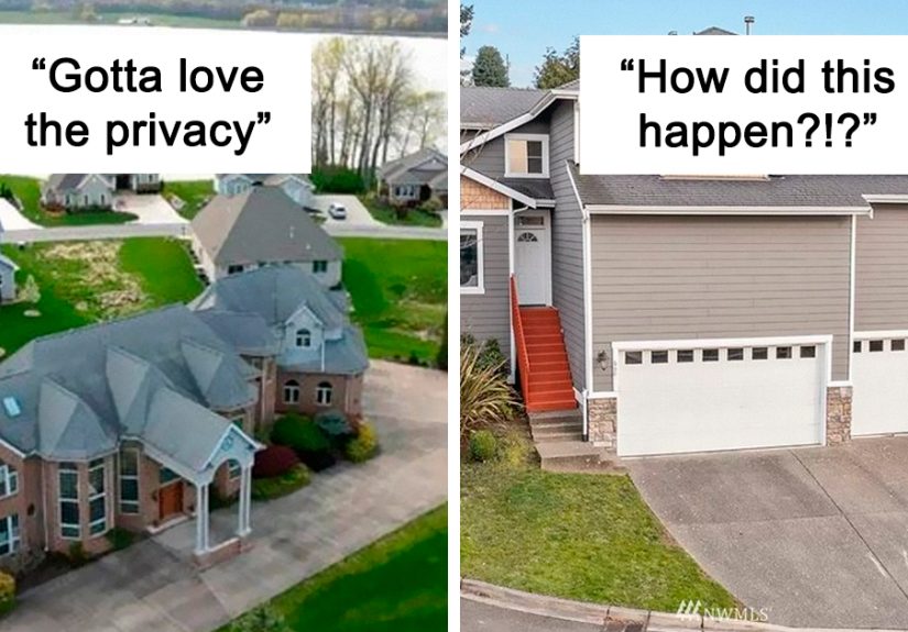
35 New Pics That Would Make Any Guest Pause at the Door
- The tiny rug under the giant sectional. Nothing says “I guessed” like a rug floating sadly in the middle of a room while all the furniture avoids it like a social obligation.
- The chandelier that is wildly too small. A dramatic dining room deserves a fixture, not a glowing earring.
- The pendant light hung so low it becomes a forehead test. Stylish, yes. Mildly dangerous, also yes.
- The kitchen with no under-cabinet lighting. Beautiful until you try chopping vegetables in your own shadow.
- The all-recessed-light ceiling. Congratulations, your cozy den now feels like a very intense pharmacy.
- The bathroom vanity light placed only above the mirror. Great for reenacting ghost stories. Not great for shaving, makeup, or seeing your face like a friend.
- The couch that is too big for the room. It may seat eight, but it also eliminates the possibility of walking.
- The living room with furniture pushed against every wall. A classic move that somehow makes the room feel both emptier and more awkward.
- The coffee table you have to sidestep like a traffic cone. If every trip to the sofa involves a hip check, the layout is wrong.
- The dining chairs that can’t slide out properly. Dinner should not require reversing strategies.
- The bed that is too big for the bedroom. If the nightstand is now in the hallway, we may have overcommitted.
- The curtain rod hung too low. It shrinks the window, flattens the room, and makes the entire wall look mildly disappointed.
- The heavy drapes blocking the only good natural light. Nothing says “small room” like actively kidnapping the sunshine.
- The dark paint in a tiny room with no balancing elements. Moody can be gorgeous. Cave-adjacent is another matter.
- The mirror placed where it reflects clutter instead of light. Technically it doubles the room. Unfortunately it also doubles the mess.
- The gallery wall with no plan. When every frame is a different size, color, and altitude, the wall starts to look like it lost a fight.
- The random accent wall that belongs to another decade. One loud wall can still work, but only if it feels intentional and not like leftover enthusiasm.
- The room full of tiny accessories. Fifteen little objects rarely read as “styled.” They usually read as “dusting challenge.”
- The shelves packed edge to edge. Somewhere between “collected” and “chaotic” lies the concept of breathing room.
- The faux luxury bathroom with zero storage. Pretty bottles on the counter are lovely until toothpaste, hair tools, and backup toilet paper stage a coup.
- The sink jammed into a corner with no elbow room. This is how ordinary routines become interpretive dance.
- The cabinet doors that collide with each other. A small but powerful reminder that opening things should not be a strategy game.
- The kitchen island that leaves no circulation space. Gorgeous in the showroom, but at home it turns meal prep into a three-point turn.
- The walkway lit like an airport runway. Outdoor lighting should be welcoming, not signal aircraft.
- The cheap exterior fixtures already rusting. Nothing ruins curb appeal faster than a light that looks tired before the mortgage does.
- The front porch packed with mismatched décor. One wreath, two planters, maybe a bench. Not seventeen frogs and a windmill.
- The fake columns doing emotional labor. If your house is pretending to be a plantation-themed event venue, it may be time to regroup.
- The lawn with one lonely patch of decorative gravel. A minimalist moment outside can work. A random dirt island cannot.
- The color scheme with no common thread. Five competing tones in one open-plan room can make the eye look for an exit.
- The matching furniture set that feels like a showroom package deal. Cohesion is good. Cloning is less charming.
- The TV mounted too high. If watching a sitcom feels like tracking a weather balloon, the install needs another look.
- The entryway with nowhere to drop shoes, keys, or coats. That is not an entryway. That is a future pile.
- The round dining table crammed into a narrow room. Lovely in theory, but in practice everyone eats with their chair leg kissing the wall.
- The backsplash that wants all the attention. Statement materials are fun until the room begins shouting at you before coffee.
- The “trend stack” room. Bouclé, checkerboard, neon slogan art, fluted wood, oversized mushroom lamp, and no editing whatsoever. One trend is a choice. Six at once is a cry for help.
What These Home Design Fails Actually Teach Us
1. Lighting Is Not a Bonus Feature
One of the clearest lessons from bad interiors is that lighting can save a room or absolutely wreck it. Good spaces usually combine ambient, task, and accent lighting instead of relying on one lonely ceiling fixture. Kitchens work better when counters are actually lit. Bathrooms are easier to use when vanity lighting avoids harsh shadows. Living rooms feel warmer when the light is layered rather than blasting from above like an interrogation scene.
2. Scale Matters More Than People Think
Design mistakes often begin with shopping in isolation. A gorgeous chair can still be wrong for the room. A stunning rug can still be too small. A giant sectional can still turn your living room into a padded hallway. Scale and proportion are the quiet rules behind rooms that feel comfortable and finished. When those rules are ignored, even expensive items look off.
3. Flow Beats Fantasy Every Time
A lot of viral design fails happen because someone prioritized looks over movement. That is how you end up with doors that hit drawers, islands that choke a kitchen, and bedrooms where opening the closet requires negotiation. Real homes need clear pathways, functional work zones, and enough breathing room for people to move naturally. A room can be beautiful, but if it is annoying to use, the beauty fades fast.
4. Clutter Makes Everything Look Worse
Even a well-decorated room can start looking cheap when every surface is crowded. Too many little accessories, visible cords, overloaded shelves, and random storage solutions create visual noise. The funny thing is that many so-called design fails are not caused by bad taste so much as bad editing. A room does not need more stuff. It usually needs more restraint.
5. Small Spaces Need Strategy, Not Suffering
Tiny rooms are especially unforgiving. Dark finishes, bulky furniture, blocked windows, and too many styles can make a compact space feel cramped in a hurry. On the flip side, lighter finishes, mirrors, multifunctional pieces, and smarter storage make small rooms feel more open and useful. In other words, your studio apartment is not doomed. It just does not need a sectional designed for a suburban basement.
6. The Outside Counts Too
Design fails are not limited to interiors. Messy curb appeal, bad porch lighting, cheap fixtures, and too many mismatched outdoor accents can make a home feel confused before anyone even steps inside. Exterior design works best when it feels clean, cohesive, and intentional. A welcoming front entry does more than look nice. It sets the tone.
Why These Fails Make You Feel Better About Your Own Place
The real magic of home design fail accounts is that they lower the temperature on perfectionism. The internet is flooded with impossible interiors: spotless kitchens, giant windows, custom millwork, and throw pillows that have apparently never known human contact. It is nice, once in a while, to see the opposite.
These photos remind us that homes are messy, personal, imperfect, and often shaped by budget, impulse, compromise, and one questionable online order placed at 11:47 p.m. They also prove that “good taste” is not just about buying expensive things. It is about making thoughtful choices that fit the room, the people in it, and the way the space actually functions.
So yes, laugh at the carpeted bathroom. Gasp at the staircase to nowhere. Marvel at the oddly corporate family room. Then look around your own place and appreciate the small wins. The lamp that works. The chair that fits. The entryway hook that saves you from throwing your jacket on the sofa. Design excellence is nice. Practical peace is better.
Final Takeaway
This Twitter Account Is Sharing Home Design Fails That Might Make You Feel Better About Your Own Place (35 New Pics) works because it is funny, but it sticks because it is true. Bad home design is rarely about one giant catastrophe. It is usually a stack of small choices: the wrong light, the wrong size, the wrong placement, the wrong amount of stuff, the wrong assumption that looks matter more than use.
The upside is encouraging. Most of the lessons behind these fails are fixable. Edit the clutter. Rework the layout. Let in more light. Choose pieces that actually fit. Give your home a clear purpose room by room. You do not need a mansion or a designer budget to make a place feel better. You just need fewer accidental obstacles and fewer decorative decisions made with unchecked confidence.
And if all else fails, pull up one more absurd photo online and remember: somewhere out there, someone really did install a chandelier where a person’s head was clearly supposed to go.
A Relatable 500-Word Experience With Home Design Fails
If we are being honest, most people do not discover good design in one graceful cinematic moment. They discover it the hard way. They buy something that looked perfect on a screen, drag it into their home, stare at it in silence, and realize they have made a terrible and highly measurable mistake.
I think that is why these design fail accounts feel so familiar. They reflect the ordinary reality of trying to make a home look nice while juggling real life. You start with innocent intentions. Maybe you want your living room to feel brighter, your bedroom to feel calmer, or your entryway to stop looking like a lost-and-found bin. Then the internet gets involved. Suddenly you are comparing pendant lights at midnight, convincing yourself that a black-painted half bath is “bold but timeless,” and ordering a trendy side table without once checking the dimensions.
Then the package arrives. The side table is tiny. Not “smaller than expected” tiny. More like “could be mistaken for a plant stand in a dollhouse” tiny. You laugh, then you get slightly offended, then you place it in the corner and pretend that was always the vision.
Most home design regret comes from this gap between fantasy and function. Online, rooms are frozen in their best possible moment. In real life, someone has to charge a phone there, store dog leashes somewhere, find the remote, sit comfortably, and walk to the bathroom in the dark without colliding with a ceramic stool. A room that photographs beautifully but functions terribly starts to feel wrong almost immediately.
A lot of us have lived with these little failures. The lamp that is too dim to read by. The rug that refuses to anchor anything. The chair that looks fabulous but feels like punishment. The shelf styled with great confidence until everyday objects moved in and ruined the illusion. Even the most put-together homes usually have one area where ambition beat practicality by a narrow but embarrassing margin.
And yet, those mistakes can be weirdly helpful. Once you have lived with bad lighting, you notice good lighting forever. Once you have squeezed around a badly placed coffee table for six months, you become passionate about traffic flow in a way that surprises even you. Once you have overdecorated a small room and felt your blood pressure rise every time you looked at it, you begin to understand the beauty of editing.
That is the real joy of seeing home design fails online. They do not just make us laugh at strangers. They remind us that making a home is a process of trial, error, and gradual improvement. Your place does not need to be flawless to be lovable. It just needs to work a little better than yesterday. And compared with a house featuring five conflicting styles, blinding recessed lights, and a porch full of random statues, you are probably doing just fine.