Table of Contents >> Show >> Hide
- First, a Reality Check: What Color Psychology Can (and Can’t) Do
- Start With the Nursery’s “Job Description”
- Color Psychology Basics for Nurseries
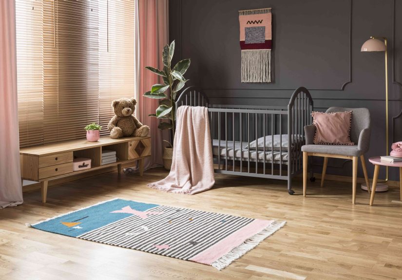
- Soft Blues: Calm, Cool, and Classic (But Keep It Muted)
- Gentle Greens: Restorative, Balanced, and Very Forgiving
- Warm Neutrals: Cozy, Timeless, and Great for “Not Sure Yet” People
- Soft Yellows: Cheerful and Sunny (Use “Butter,” Not “Highlighter”)
- Blush, Dusty Pink, and Soft Mauves: Warm, Comforting, and Not Just for “Pink Rooms”
- Reds and Oranges: High EnergyBest as Accents
- Purples: Either Dreamy or DramaticChoose Wisely
- The Most Overlooked Factor: Light Changes Color (A Lot)
- Nursery Color + Sleep: Keep the Room Rest-Friendly
- Safety and Air Quality: Pick Paint That’s Baby-Appropriate
- A Simple Step-by-Step Method to Choose Your Nursery Color
- Specific Nursery Color Ideas (With Real-Life Scenarios)
- Common Mistakes (So You Don’t Have to Learn Them the Hard Way)
- How to Make the Nursery Feel Calm Without Painting Every Wall
- Conclusion: The “Right” Nursery Color Is the One That Supports Your Real Life
- Real-World Experiences: What Parents Learn After the Paint Dries (Extra Notes)
- 1) “Calming” Often Means “Muted,” Not “Boring”
- 2) Bright Colors Can Backfire at Night (Even if You Love Them at Noon)
- 3) Undertones Become Personal Enemies (Until You Test Them Properly)
- 4) The Nursery Is Also for the Adults Living in It
- 5) The Best Compliment Is “This Room Feels Peaceful”
- 6) A Flexible Palette Wins Over a Perfectly Themed Palette
- 7) If You’re Overwhelmed, Pick One of These “Safe Wins”
Picking a nursery color sounds like a small decisionuntil you realize you’re choosing the backdrop for late-night feedings,
early-morning diaper negotiations, and the occasional “Is that… on the wall?” mystery.
The good news: color psychology can help you choose shades that feel calm, cozy, and practicalwithout turning your baby’s room
into either a sterile lab or a circus tent.
This guide walks you through how different colors tend to affect mood and energy, how light changes everything, and how to land on
a palette that supports sleep and comfort while still looking like a room you’d proudly show other adults.
(Yes, even if the laundry basket lives there now.)
First, a Reality Check: What Color Psychology Can (and Can’t) Do
Color psychology is useful, but it’s not magic. Research suggests colors can be associated with different emotional responses,
but effects vary by person, culture, lighting, saturation, and context. In other words: a “calming green” can feel spa-like in one
room and swampy in anotherespecially under the wrong bulb.
Think of color psychology as a strong nudge, not a guarantee. Your goal is to design a space that signals calm when you need calm,
and supports gentle alertness when it’s playtime.
Start With the Nursery’s “Job Description”
Before you pick paint chips, decide what the room needs to do most of the time. Many nurseries have three “modes”:
- Sleep mode: soothing, low stimulation, cozy
- Care mode: practical visibility for feeding/changing
- Play mode: cheerful, engaging, but not chaos-inducing
If your baby will sleep in this room regularly, prioritize colors that feel soft and restful. You can always add playful energy
with removable decor (art, rugs, mobiles) instead of committing to neon walls that scream “PARTY” at 2:00 a.m.
Color Psychology Basics for Nurseries
Soft Blues: Calm, Cool, and Classic (But Keep It Muted)
Blue is commonly linked with calm and relaxation. In a nursery, soft, dusty blues can feel tranquil and breathable.
The trick is avoiding overly saturated “sports-team blue,” which can feel colder and more energizing than you want.
Best for: sleep-forward nurseries, sunny rooms that need a cooler balance
Try this: a gray-blue with warm accents (cream textiles, light wood) so the room stays cozy.
Gentle Greens: Restorative, Balanced, and Very Forgiving
Green is often associated with nature and restoration. In nurseries, sage, eucalyptus, and soft green-grays tend to feel
balancedcalming without being sleepy. They also play well with almost everything: warm woods, whites, tans, even blush accents.
Best for: gender-neutral palettes, “grow with me” rooms, parents who like calm but not bland
Try this: a muted sage on walls and a slightly deeper tone on an accent wall or built-ins.
Warm Neutrals: Cozy, Timeless, and Great for “Not Sure Yet” People
Neutrals aren’t boringthey’re strategic. Warm whites, creamy off-whites, soft beige, greige, and mushroom tones can make a nursery feel
safe and cocoon-like, especially when layered with texture (knits, baskets, linen curtains).
Best for: small nurseries, low-light rooms, minimalist or classic styles
Try this: warm neutral walls + a color pop through art, bedding, or a removable wallpaper panel.
Soft Yellows: Cheerful and Sunny (Use “Butter,” Not “Highlighter”)
Yellow is often associated with happiness and energy. In nurseries, a pale buttery yellow can feel welcoming and brightespecially in darker rooms.
But intense yellow can become visually loud fast. If you’ve ever felt stressed in a fast-food dining room, you know what I mean.
Best for: north-facing rooms, spaces that need warmth, playful-but-gentle vibes
Try this: a creamy pastel yellow with white trim and natural textures to keep it soft.
Blush, Dusty Pink, and Soft Mauves: Warm, Comforting, and Not Just for “Pink Rooms”
Muted pinks can feel nurturing and warm when they’re dusty or clay-toned. The key is undertone: a pink with a little beige or gray reads
sophisticated and calming; a bright bubblegum pink can feel more stimulating and theme-park.
Best for: cozy nurseries, warm light rooms, modern vintage styles
Try this: blush walls + brass accents + walnut or oak furniture for a grown-up finish.
Reds and Oranges: High EnergyBest as Accents
Research and reviews of color-emotion associations often link reds to higher arousal and intensity. That doesn’t mean “never use red,”
it just means a full red room can feel like an espresso shot when you’re hoping for herbal tea.
Best for: small dosesart, bookshelves, a single toy chest, a patterned rug
Try this: terracotta accents (warm, earthy) instead of primary red.
Purples: Either Dreamy or DramaticChoose Wisely
Purple ranges from soft lavender (gentle, airy) to deep plum (moody, cozy, dramatic). Lavender can be calming when muted;
darker purples can feel heavy in small rooms unless there’s great light and balance.
Best for: accent walls, textiles, or a subtle lavender wash in bright rooms
Try this: pale lavender with warm white trim and natural wood to avoid “cold castle” energy.
The Most Overlooked Factor: Light Changes Color (A Lot)
A paint color is basically a mood that depends on your lighting. Here’s how to avoid choosing a “calm cloud gray” that turns into
“sad dentist waiting room” after sunset:
- North-facing rooms: cooler light; colors can look grayer/bluer. Warm undertones help.
- South-facing rooms: strong warm light; colors can look brighter. Muted tones stay balanced.
- East-facing rooms: warm mornings, cooler afternoons. Test your swatches at multiple times.
- West-facing rooms: cooler mornings, warm golden eveningsgreat for cozy tones.
Practical tip: Paint large sample boards (or use peel-and-stick samples), move them around the room,
and observe them during daytime, evening, and night-light conditions.
Nursery Color + Sleep: Keep the Room Rest-Friendly
Color doesn’t replace safe sleep practices, but it can support a calmer environment. For sleep, aim for low visual “noise”:
muted walls, gentle contrast, and lighting that doesn’t blast blue-rich brightness at bedtime.
Use Color to Reduce Stimulation at Night
Highly saturated colors, bold patterns, and strong contrasts can feel energizing. Instead, consider:
- Muted wall color (sage, dusty blue, warm neutral)
- Soft white ceiling and trim (keeps the room bright when needed)
- One “focus zone” (like an accent wall behind the crib) rather than visual chaos everywhere
Choose Night Lighting That Supports Sleep
Light affects sleepiness and circadian rhythms, and blue-rich light is especially disruptive at night.
For midnight feedings, use a dim, warm light rather than bright overhead LEDs.
- Best bedtime bulbs: warm white (lower color temperature), dimmable if possible
- Best night light style: low, indirect, warm-toned glow
- Avoid: bright, cool “daylight” bulbs and glowing screens right before bed
Safety and Air Quality: Pick Paint That’s Baby-Appropriate
Babies breathe more rapidly than adults and spend lots of time indoors, so indoor air quality matters.
Many paints and finishes can release volatile organic compounds (VOCs), especially during and after painting.
The most parent-friendly approach is choosing low- or zero-VOC options and ventilating well.
What to Look For in Nursery Paint
- Low-VOC or zero-VOC paint labels (definitions can vary by manufacturer)
- Third-party certifications where available (helps cut through marketing)
- Water-based formulas (often lower odor than oil-based products)
Ventilation: The Unsexy Secret That Actually Helps
Even with low-VOC paint, ventilation matters. Open windows, use fans exhausting air out, and consider keeping the nursery aired out
for a few days before regular use when possible.
If you’re pregnant or you have a newborn at home, recruit help for the painting work and keep the space ventilated and off-limits
until odors are gone. (Your baby will not remember the paint job. Your lungs will.)
A Simple Step-by-Step Method to Choose Your Nursery Color
Step 1: Decide the “Feeling” First
Choose 2–3 words you want the nursery to feel like. Examples:
calm + cozy + light or fresh + warm + simple.
This keeps you from getting derailed by trendy names like “Mystic Fog Latte Whisper.”
Step 2: Pick a Base Color Family
Use these quick matches:
- Calm + airy: dusty blue, pale blue-gray, soft warm white
- Natural + balanced: sage green, green-gray, warm greige
- Cozy + nurturing: warm neutral, blush-beige, clay-tinted off-white
- Cheerful + bright: buttercream yellow, warm ivory
Step 3: Choose Saturation (This Matters More Than Hue)
If you do one thing from this article, do this: choose lower saturation for main walls.
Saturation is how intense a color is. Lower saturation = calmer, more flexible, easier on sleepy eyes.
Step 4: Test Undertones With the Furniture You Already Have
Undertones are sneaky. A “neutral” can lean pink, green, yellow, or blue. Compare samples next to:
the crib finish, flooring, curtains, and the biggest rug you plan to use.
Step 5: Build a 60–30–10 Palette
This classic design ratio keeps things cohesive:
- 60% main wall color
- 30% secondary color (textiles, curtains, large rug)
- 10% accent color (art, pillows, a lamp, small decor)
Example: sage walls (60) + warm cream textiles (30) + terracotta accents (10).
Step 6: Use Contrast Strategically
Babies are drawn to contrast, especially early on. You can support visual interest without overstimulating the entire room by using:
- high-contrast art in a small gallery area
- black-and-white board books on a shelf
- a patterned changing pad cover
That way, the room can feel calm overall while still offering “look at this!” moments.
Specific Nursery Color Ideas (With Real-Life Scenarios)
Scenario 1: Small Nursery With Limited Natural Light
Go for warm, light-reflective colors:
creamy off-white, soft beige, or buttercream.
Add a gentle accent like sage in textiles to keep it from feeling flat.
Scenario 2: Bright, Sun-Filled Room That Feels “Too Hot”
Choose cooler-muted tones to balance:
blue-gray or green-gray.
Keep trim warm white so the room stays inviting.
Scenario 3: You Want Gender-Neutral Without Looking Like a Hotel
Try a nature palette:
sage, mushroom, sand-washed beige, with accents in
rust, navy, or mustardjust not all at once.
Scenario 4: You Love Bold Colors but Also Love Sleep
Use bold color as an accent wall (behind a dresser, not necessarily behind the crib) or in decor.
Keep main walls muted so you get personality without turning bedtime into a rave.
Common Mistakes (So You Don’t Have to Learn Them the Hard Way)
- Picking paint in the store lighting: that’s how “soft beige” becomes “banana pudding” at home.
- Ignoring sheen: flat/matte hides wall bumps; eggshell is wipeable; high gloss shows everything.
- Overdoing themes: a “jungle nursery” is cuteuntil your baby becomes a toddler who demands dinosaurs.
- Forgetting nighttime reality: your beautiful color should still feel gentle under dim warm light.
How to Make the Nursery Feel Calm Without Painting Every Wall
Renting? Short on time? Emotionally allergic to painting?
You can still use color psychology with:
- peel-and-stick wallpaper (one panel or one wall)
- large fabric wall hangings in soothing tones
- curtains that soften the light (and the mood)
- a rug that anchors the palette
- art prints in a cohesive color family
Conclusion: The “Right” Nursery Color Is the One That Supports Your Real Life
The best nursery color choice usually isn’t the boldest or trendiestit’s the one that makes the room feel steady, soft, and functional
during the most unglamorous hours of parenting. Start with the feeling you want, choose muted versions of calming hues, test in your actual light,
and keep air quality and lighting in mind. Then add personality with accents you can swap out as your baby grows.
And if you’re torn between two colors, choose the one that makes you exhale when you walk in. Babies pick up on the vibe. Parents set it.
(Also, your future self will thank you when the nursery doubles as a “quiet corner” during toddlerhood.)
Real-World Experiences: What Parents Learn After the Paint Dries (Extra Notes)
Here are practical, experience-based lessons that come up again and again from real householdsbecause color theory is helpful,
but lived reality is undefeated.
1) “Calming” Often Means “Muted,” Not “Boring”
Many parents start with a fear: “If I choose a soft neutral or a dusty green, will the room feel dull?” Then the paint goes up, and
the surprise hits: muted colors don’t feel emptythey feel restful. The room becomes a place your nervous system can unclench,
which matters when you’re doing the 3:00 a.m. shuffle with one sock on and a bottle in hand.
The trick is adding texture. A warm neutral wall plus a chunky knit throw, woven baskets, and a patterned rug looks layerednot bland.
Parents who go this route often say the nursery feels “finished” faster because everything matches more easily.
2) Bright Colors Can Backfire at Night (Even if You Love Them at Noon)
A common story: someone paints a nursery a happy bright yellow or a bold teal because it looks amazing in daylight. Then nighttime arrives.
Under a cool overhead bulb, that same color can feel louder, sharper, andthis is the word people use“busy.”
Parents who end up happiest long-term often handle bold color like hot sauce: a little adds flavor; dumping the whole bottle makes you cry.
They use bold shades in art, toys, or a single painted piece of furniture, while keeping walls softer. The room stays fun, but bedtime doesn’t
feel like a pep rally.
3) Undertones Become Personal Enemies (Until You Test Them Properly)
Another repeat experience: someone falls in love with a “perfect greige” online, then paints the room and suddenly everything looks faintly pink,
or slightly green, or somehow… gray-ish purple? That’s undertones doing what undertones do.
The fix that seasoned parents swear by: test samples next to the crib and the floor, and check them in the exact lighting you’ll use at night.
A color that looks calm in sunlight can look icy at bedtime. Testing feels slow, but repainting feels slower.
4) The Nursery Is Also for the Adults Living in It
Parents regularly report that their favorite nursery colors are the ones that support their mood too. A soft sage can feel grounding.
A warm cream can feel safe. A dusty blue can feel like a deep breath. When you’re spending hours in that room, your comfort matters.
One helpful mindset is choosing a palette you’d enjoy in a small bedroom or reading nook. If the nursery feels like a real room (not just a theme),
it tends to “grow up” better. That means fewer redesigns when the baby becomes a kid with strong opinions and a shocking ability to out-negotiate you.
5) The Best Compliment Is “This Room Feels Peaceful”
People rarely walk into a nursery and say, “Wow, your LRV choices are immaculate.” What they say is, “This feels peaceful,” or “This is cozy,”
or “I want to nap here.” Those reactions usually come from:
- low-to-medium contrast overall
- muted main color
- warm, dimmable lighting
- cohesive palette with a few playful accents
6) A Flexible Palette Wins Over a Perfectly Themed Palette
The parents who feel the least “nursery regret” tend to choose colors that can morph over time. Sage, warm white, soft beige, and blue-gray
can transition from infant nursery to toddler room to kid space with minimal changes.
The parents who choose a very specific theme color sometimes love ituntil their child’s interests change. If the walls are “mermaid lagoon teal”
and your toddler decides they’re a dinosaur astronaut, the room suddenly feels like it belongs to a different family.
7) If You’re Overwhelmed, Pick One of These “Safe Wins”
When decision fatigue hits (common symptom of preparing for a baby), these options tend to work in most homes:
- Warm white (not stark white) + natural textures
- Muted sage green + cream + light wood
- Dusty blue-gray + warm white trim + tan accents
- Soft greige/mushroom + black-and-white art + a gentle accent color
They’re calm, flexible, and forgiving under different lightingbasically the “good sleepers” of paint colors.