Table of Contents >> Show >> Hide
- Why London Makes the Perfect Case for Dark Interiors
- What Is Mad About the Houseand Why It Fits the Dark Side So Well?
- The Dark Side Myth: “Dark = Gloomy”
- How to Choose a Dark Color That Won’t Betray You at 3 P.M.
- Make Dark Colors Work: The London-Proof Formula
- Room-by-Room Ideas: Going Dark Without Going Overboard
- The Mad About the House Way to Keep Dark Rooms Balanced
- London Field Guide: Where to “Try On” the Dark Side
- Common Dark-Room Mistakes (and How to Avoid Them)
- Quick-Start Plan: Try the Dark Side Without Repainting Your Whole Life
- Conclusion: Dark Done Right Feels Like Confidence, Not Costume
- Experience Section: A London “Dark Side” Day Inspired by Mad About the House (Approx. )
There are two kinds of people in the world: the “white walls fix everything” crowd and the “hand me the inky paint, I’m feeling brave” crowd.
If you’ve ever scrolled past a moody London living room and thought, That looks like a hug from a fancy library, congratulationsyou may be ready
to go to the dark side. Don’t worry, there’s no villain laugh required. Just a willingness to trade “light and bright” for “cozy and iconic.”
This is where Mad About the House energy comes in: London-rooted, practical, and allergic to design nonsense. It’s the kind of guidance that
says, “Yes, paint it darkjust do it with intention, good lighting, and something shiny so you can still find your coffee.”
Why London Makes the Perfect Case for Dark Interiors
London is a masterclass in mood. The city has grand townhouses, compact flats, Victorian terraces, and plenty of days when the sky looks like it’s considering
a nap. In that kind of light, dark interiors don’t feel like a mistakethey feel like a strategy. Deep colors can make a room feel grounded and calm, and they
help architecture (moldings, fireplaces, paneling) look extra intentional instead of “random trim we keep meaning to paint.”
And here’s the twist: dark rooms aren’t automatically “smaller.” Done well, they can feel smoother and more unifiedespecially in tight spaces where lots of
contrast can chop the room into visual pieces. Dark color, used thoughtfully, can act like a backdrop that lets art, brass, wood, and textiles do the talking.
It’s basically the interior design version of wearing black: it’s not “sad,” it’s “I know what I’m doing.”
What Is Mad About the Houseand Why It Fits the Dark Side So Well?
Mad About the House is a design voice associated with interiors journalist and author Kate Watson-Smyth, based in London.
The whole vibe is “real homes, real decisions,” not “this room was staged by twelve stylists and a fog machine.” That practicality matters when you’re choosing
darker colors, because dark paint is honest: it will show you your lighting situation, your clutter habits, and whether you actually like your sofaor you just
tolerated it because the walls were white and forgiving.
What makes this approach especially useful is the emphasis on rules that are simple enough to remember and flexible enough to live with. Dark decorating isn’t
about being edgy. It’s about being deliberate: balancing old and new, adding contrast, and using black (or near-black) as an anchor so the room doesn’t float
away into “beige ambiguity.”
The Dark Side Myth: “Dark = Gloomy”
Let’s clear this up: dark interiors aren’t a haunted-house subscription service. The difference between “moody-chic” and “why does it feel like a basement?” is
usually three things:
- Lighting (layered, warm, and intentionalnot one sad ceiling bulb doing overtime)
- Texture (wood, wool, velvet, linen, leather, woven shadesanything that adds depth)
- Contrast (art, trim, metals, and pale elements that keep the room from turning into a single dark blob)
Dark colors can actually feel soothing because they reduce visual noise. Instead of everything competing for attention, the room becomes a stage, and the
best piecesyour rug, your artwork, your record player you swear you useget to be the stars.
How to Choose a Dark Color That Won’t Betray You at 3 P.M.
Start with “friendly darks” before you go full black hole
If painting a room black sounds thrilling and terrifying (a classic combo), start with deep colors that behave like neutrals:
charcoal, inky navy, forest green, aubergine, or blue-black.
These shades are dramatic, but they’re also forgiving because they have undertones that can play nicely with wood, brass, stone, and warm whites.
Pay attention to undertones and existing “fixed” materials
Your paint doesn’t live alone. It moves in with your floors, countertops, tile, and that one orange-toned wood piece you keep because it was expensive and you’re
emotionally mature now. Dark paint will amplify undertones, so test samples next to what you can’t change.
- Cool undertones (blue/green) often feel crisp and tailored.
- Warm undertones (brown/red) often feel cozy and “historic,” especially in older homes.
- Neutral-leaning darks (charcoal, soot, soft black) work across styles.
Pick the finish like you pick shoes: based on where you’re going
Paint finish changes everything in dark colors.
- Matte: velvety, hides wall flaws, feels modern and calm.
- Eggshell/satin: a bit more wipeable, better for busy rooms.
- High-gloss: bold and reflective; gorgeous on trim, doors, or a “statement ceiling,” but it shows imperfections.
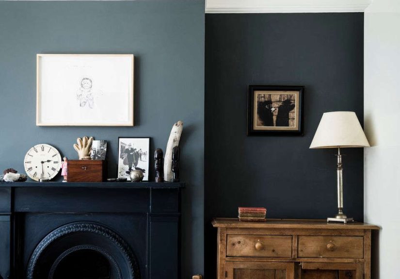
Make Dark Colors Work: The London-Proof Formula
1) Layer your lighting (one light is a tragedy; three lights is a plan)
Dark rooms need light that comes from different heights and angles. Aim for:
overhead (ambient), table/floor lamps (task), and accent lighting (picture lights, shelf lights, sconces).
Choose warm bulbs so the room feels inviting, not like a suspense movie.
2) Add reflective moments, not reflective chaos
Mirrors, metallics, glossy ceramics, and glass help bounce lightespecially in London-style homes where daylight can be shy. The trick is to use a few reflective
elements with intention: a large mirror opposite a window, a brass lamp, a framed print with a bit of sheen.
3) Use contrast to keep the mood, not the murk
Contrast doesn’t have to mean bright white walls. It can look like:
- dark walls + lighter upholstery
- dark walls + warm wood
- dark paint + pale stone or tile
- dark background + colorful art
- dark walls + crisp trim (if you love that tailored look)
4) Don’t forget texturedark needs dimension
Texture is your secret weapon. In a dark room, flat surfaces can look heavy. Mix materials:
linen curtains, a nubby wool rug, leather chair, cane cabinet doors, velvet pillows, a matte ceramic vase, or even subtle wall paneling.
Texture keeps the room from feeling like one big swatch.
Room-by-Room Ideas: Going Dark Without Going Overboard
The hallway: the perfect place to be dramatic
London hallways are often narrow and hardworking, which makes them ideal for dark paint. A deep shade can make the transition into the home feel intentionallike
the opening credits of a well-designed movie. Add a runner, a mirror, and one lamp (yes, even in a hallway) and suddenly it’s not “corridor,” it’s “arrival.”
The living room: cozy, grown-up, and surprisingly forgiving
A dark living room is where moody paint earns its fan club. Choose a deep neutral and let furniture and art stand out.
If you’re nervous, paint only the fireplace wall or the wall behind the sofa. If you’re feeling brave, go all inwalls and maybe even the ceilingfor that “London
snug” feeling.
The kitchen: dark cabinets or a deep wall color for instant polish
Dark kitchens look expensive even when they aren’t (a public service). If full dark cabinetry feels like too much commitment, try:
- a dark island with lighter perimeter cabinets
- a deep color on just one wall
- dark lower cabinets with lighter uppers
- dark paint paired with warm brass hardware and wood accents
Keep lighting layered here: under-cabinet lights, pendants, and warm bulbs make a dark kitchen feel rich instead of shadowy.
The bedroom: where dark colors can actually feel restful
Bedrooms are made for mood. Deep colors can feel calming and cocoon-like, especially paired with soft bedding and warm bedside lighting. A dark headboard wall is a
classic move, but a fully color-drenched room (walls + trim, sometimes ceiling) can look incredibly polished if you keep textiles light and plush.
The bathroom: small, bold, and low-risk
Powder rooms are the design world’s legal loophole: you can do almost anything, and if it’s intense, people just say “wow” and leave.
Dark paint plus a good mirror and flattering light is a great way to experiment with the dark sidewithout repainting your entire life.
The Mad About the House Way to Keep Dark Rooms Balanced
A useful framework is to think in contrasts and anchorsmixing pieces that bring character and definition. One memorable approach is:
something new (fresh and functional), something old (patina and story), something black (definition), and
something metallic (light-catching sparkle).
How it looks in real life
- New: a sofa that fits your life now (comfortable, durable, not a “museum couch”).
- Old: a vintage sideboard, an antique mirror, a worn-in ruganything with history.
- Black: frames, lamp bases, chair legs, a bold stripesmall hits count.
- Metallic: brass picture lights, a gold-toned tray, chrome hardware, a silver vase.
This matters in dark rooms because it prevents the space from becoming one-note. Dark paint is the backdrop. Your mix of eras, finishes, and shapes is the music.
(And yes, you are allowed to be the DJ.)
London Field Guide: Where to “Try On” the Dark Side
If you’re in Londonor planning a tripuse the city like a showroom. You’re not just sightseeing; you’re collecting design evidence.
Here are a few ways to build dark-room confidence in the wild:
Museums and galleries for color + texture ideas
- The Design Museum: modern materials, lighting, and graphic color moments.
- The Wallace Collection: rich, layered interiors energyart, gold frames, deep tones, and historic atmosphere.
Department stores and shopping streets for “one-stop” styling
- Selfridges: a fast way to see how brands mix dark palettes with texture, lighting, and metallic accents.
- Oxford Street / West End: not subtle, but excellent for spotting lighting trends and homeware pairings.
Make it practical: collect swatches like souvenirs
Don’t just take photos. Gather paint chips, fabric samples, and screenshots of lighting you like. Dark rooms depend on nuancetwo “charcoals” can behave like
completely different colors once the sun goes away.
Common Dark-Room Mistakes (and How to Avoid Them)
Mistake: Choosing a dark color and then lighting it like a parking garage
Fix: Add lamps. Add dimmers. Add warm bulbs. If your dark room is “mysterious,” great. If it’s “I can’t find my phone,” not great.
Mistake: No contrast anywhere
Fix: Bring in wood tones, lighter textiles, or metallic accents. Even a dark-on-dark room needs variation in sheen and texture.
Mistake: Skipping prep and then blaming the color
Fix: Dark colors show uneven walls and patchy coverage. Prep, prime if needed, and commit to proper coats. Your future self will thank youpossibly with cookies.
Mistake: Picking paint at night and judging it at noon
Fix: Test samples in the room for a few days. Look at them in morning light, afternoon light, and under lamps. Dark colors are shape-shifters.
Quick-Start Plan: Try the Dark Side Without Repainting Your Whole Life
- Pick one room that benefits from cozy vibes (bedroom, den, hallway, powder room).
- Choose one deep “neutral” (charcoal, navy, deep green) and test it.
- Decide your contrast strategy: trim, art, textiles, or wood.
- Add two light sources you don’t currently have (table lamp + floor lamp, or sconces + lamp).
- Anchor with black in small doses (frames, legs, hardware) and lift with metal (brass, chrome, gold-toned accents).
Conclusion: Dark Done Right Feels Like Confidence, Not Costume
Going dark isn’t about copying a trend. It’s about creating a room that feels intentionalcalm in the daytime, glowing at night, and stylish in a way that doesn’t
require you to whisper “don’t touch anything” when guests arrive. The London lesson is simple: embrace atmosphere. The Mad About the House lesson is even simpler:
balance it with contrast, character, and a little sparkle.
Because “the dark side” of interiors isn’t scary. It’s just where the lamps look better, the art pops harder, and your living room finally stops pretending it
wants to be a dentist’s office.
Experience Section: A London “Dark Side” Day Inspired by Mad About the House (Approx. )
Picture this: it’s London, and the sky is doing that classic thing where it can’t decide between “misty romance” and “mildly damp inconvenience.” You step out with
one mission: to understand why dark interiors feel so right hereand how to bring that feeling home without accidentally creating a cave.
The day starts in a neighborhood that feels effortlessly put-together, where cafés have tiny tables and big opinions about oat milk. You walk past rows of brick
townhouses and notice something: even from the street, you can spot rooms that aren’t afraid of depth. A window reveals a dark wall behind a bookshelf, and instead
of looking gloomy, it looks… composed. Like the room got dressed on purpose.
You pop into a museum for a quick design resetbecause sometimes you need to look at objects made by geniuses to remember that your “design crisis” is mostly
about whether your lamps match. In galleries and historic rooms, you notice the same trick repeated in different ways: deep backgrounds, warm pools of light, and
glints of metal that catch your eye. Gold frames. Brass details. A mirror that makes the room feel twice as bright without changing the wall color at all. It’s not
“dark for drama.” It’s dark for balance.
After that, it’s shoppingbut not the frantic kind. This is research shopping, which is the nicest kind because it comes with snacks and no obligation to buy a
velvet chair you can’t explain to your bank account. You wander through a big department store and head straight for the home floor. Under the warm lighting, dark
palettes look plush and welcoming, not heavy. You see charcoal linens paired with creamy throws, navy ceramics next to pale stone, and brass lamps that somehow make
everything look more expensiveincluding you, just by standing near them.
Somewhere between the lighting section and the cushions (a place where time famously stops existing), the “Mad About the House” idea clicks: dark rooms don’t succeed
because the paint is magical. They succeed because the room has a plan. There’s something new that functions well, something old that adds soul, something black that
outlines the space, and something metallic that throws light back into the room. It’s not a rigid ruleit’s a checklist that keeps you from going overboard.
By late afternoon, you’re back outside. The daylight is fading, but instead of panicking, you’re paying attention. Through windows, you can see the rooms that truly
work: they glow. Not because they’re bright, but because they’re layeredlamps on, reflections doing their job, textures absorbing and bouncing light in a way that
feels intentional. You head back with a pocket full of swatches and a very clear takeaway: the dark side isn’t a leap. It’s a series of smart little choices, made
bravelypreferably with a good lamp and a snack.