Table of Contents >> Show >> Hide
- Why an “Architect-Inspired” Thanksgiving Table Works
- Design DNA: David Stark’s Signature, Simplified for DIY
- What You’ll Need (and What You Can Totally Hack)
- Step-by-Step: Build the Architect-Inspired Table
- Step 1: Pick Your Grid Moment
- Step 2: Establish a Clean “Floor Plan” for Place Settings
- Step 3: Create the David Stark–Style Grid Centerpiece (No Floral Foam Required)
- Step 4: Add “Organic Contrast” Without Losing the Plot
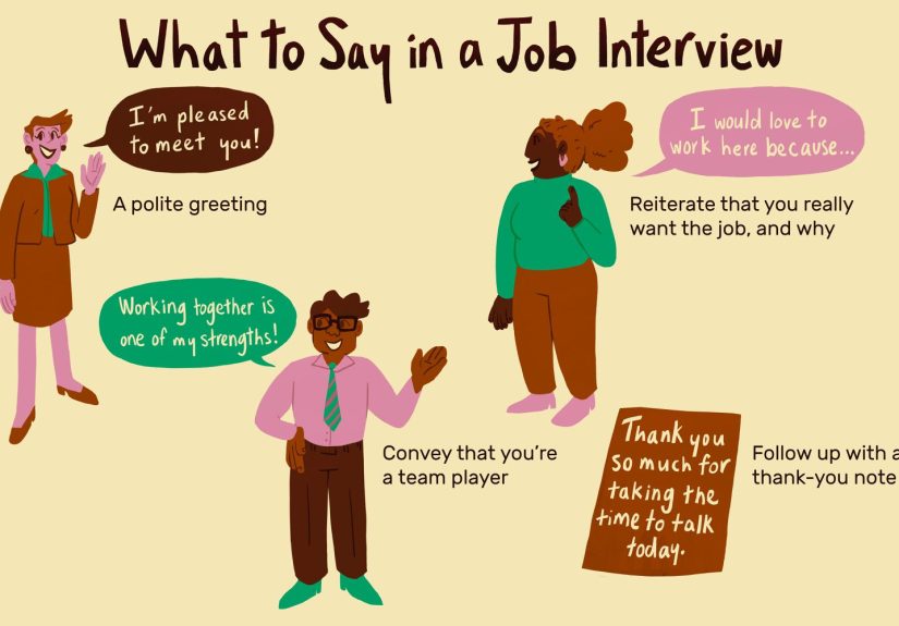
- Step 5: Upgrade Place Cards with “Blueprint Energy”
- Step 6: Finish with Light, Shine, and Negative Space
- Architect Tricks That Instantly Make the Table Look Designed
- Three Variations on the Stark-Inspired Look
- Practical Hosting Notes (So the Table Survives Real Humans)
- A Simple Timeline to Pull This Off Without Chaos
- Common Mistakes (and the Easy Fixes)
- Conclusion: A Table With Structure, Soul, and Zero Pretension
- Hosting “Experience” Add-On: What This Table Feels Like in Real Life (and Why Guests Love It)
If your Thanksgiving table usually starts with “Where did I put the good napkins?” and ends with “Why does everything look like a beige buffet?”, allow me to introduce a more interesting plan: build your tablescape the way an architect wouldusing a grid, clean lines, clever materials, and just enough autumn drama to make the turkey feel emotionally supported.
This DIY is inspired by designer David Stark’s architect-leaning Thanksgiving look: minimal, modern, and grounded in that satisfying “everything has a place” geometry. Think: crisp squares, measured spacing, and a centerpiece that feels like it came from a studio critique (but in a friendly way, not a “who approved this?” way).
Why an “Architect-Inspired” Thanksgiving Table Works
Architecture isn’t only about buildingsit’s about composition: proportion, rhythm, repetition, and negative space. Translating that to a table is surprisingly easy because a dining table already behaves like a mini site plan: guests are the “program,” plates are the “fixtures,” and the stuffing is… well, the stuffing is a miracle of civil engineering.
David Stark’s approach leans into a grid motifsquares show up in patterns, layout, and even the way the centerpiece holds stems in place. The payoff: the table feels modern and intentional, even if you assembled half of it while pretending not to panic.
Design DNA: David Stark’s Signature, Simplified for DIY
Stark is known for event design that’s imaginative, often surprising, and big on “WaitTHAT’S what you used?” materials. The architect-inspired Thanksgiving table follows the same spirit, but keeps the vibe clean: a disciplined grid paired with loose, natural fall foliage.
Here’s the core idea you’re borrowing:
- Structure + softness: crisp squares and straight lines mixed with organic branches, berries, and leaves.
- Graphic repetition: grids in napkins, table details, and placement.
- Simple mechanics: smart, practical ways to keep florals looking designednot like they fainted.
What You’ll Need (and What You Can Totally Hack)
The Base Layer
- Tablecloth or runner in white, oatmeal, or charcoal (or bare wood if your table is the main character)
- Optional: a grid runner (store-bought check pattern) or DIY grid lines (details below)
The Place Settings
- Dinner plates (white works best for a modern, architectural look)
- Salad plates or small starters (solid color or subtle pattern)
- Flatware and drinking glasses
- Napkins (bonus points for a check/grid pattern)
- Place cards (index cards, cardstock, or folded paper)
The “Architectural” Centerpiece
- 3–7 cylindrical glass vases (mixing heights looks great; thrift stores are your best friend)
- Chicken wire (yes, the garden kind)
- Wire cutters + gloves
- Fall stems: branches, berries, leaves, seed pods, dried grasses, or simple blooms in autumn colors
Optional “Studio Nerd” Extras
- Painters tape (for crisp temporary grid lines)
- Vellum or tracing paper (for place cards or menu sheets)
- A fine-line black marker (for “blueprint” typography)
- Small ruler (because the grid demands respect)
Step-by-Step: Build the Architect-Inspired Table
Step 1: Pick Your Grid Moment
You have two easy options:
- Go literal: Use check/grid napkins or a grid-pattern runner.
- Go DIY: Make a grid runner using painters tape on a plain runner or kraft paper (more on this in a second).
DIY grid runner idea: Lay kraft paper down the center of the table and create a clean-lined grid using thin strips of painters tape. Keep the lines evenly spacedsimple squares read more “modern” than random spacing. The paper also doubles as a spill-friendly, guilt-free layer (a true holiday miracle).
Step 2: Establish a Clean “Floor Plan” for Place Settings
Before you add anything decorative, place your plates, glasses, and flatware first. This is your “plan view.” The goal is even spacing and alignment so the final look reads intentionalnot “the chairs were hungry so we fed them plates.”
Use a simple rule: keep each setting centered with consistent distance between guests. If you’re using multiple utensils, arrange them in the order of use from the outside in. (Yes, even casual tables look more elevated when they follow tiny invisible rules.)
Step 3: Create the David Stark–Style Grid Centerpiece (No Floral Foam Required)
This is the signature move: use squares of chicken wire laid over the openings of cylindrical glass vases. The wire acts like a grid, holding individual stems where you want themlike a minimalist floral drafting board.
- Cut the wire: Using gloves and wire cutters, cut chicken wire into squares large enough to cover the top of each vase with a little overhang.
- Shape it gently: Lightly curve the wire so it “drapes” and stays in place over the vase opening.
- Add water: Fill each vase with water (not to the brimleave room for stems).
- Insert stems: Place one stem per square opening or cluster a few small stems in adjacent openings for a looser look.
Centerpiece design tip: Keep arrangements low enough for conversation. If guests have to lean around a bouquet like they’re negotiating a hedge maze, the centerpiece is doing too much.
Step 4: Add “Organic Contrast” Without Losing the Plot
The grid provides structure; now add warmth. Look for stems with varied texturesberries, leaves, dried pods, and branches. The contrast between straight lines and natural shapes is what makes the table feel modern instead of sterile.
Easy palette formulas:
- Modern harvest: rust + amber + olive + cream
- Graphic fall: black + white + wheat + persimmon
- Soft architecture: taupe + clay + dusty blue + sage
Step 5: Upgrade Place Cards with “Blueprint Energy”
Keep it simple, crisp, and graphic:
- Fold a small piece of white cardstock.
- Write names in all-caps with a thin black marker.
- Add one small detail: a tiny square border, a mini grid in the corner, or a single measured line like “1:50” for fun.
If you want extra credit: place each card on a small square of chipboard or a ceramic tile sample for a subtle architectural nod.
Step 6: Finish with Light, Shine, and Negative Space
Architects love negative space because it makes the “stuff” feel more important. Don’t crowd the table with ten different decorative objects fighting for attention like competitive cousins.
Instead:
- Use two to four slim candles (or flameless candles if you want zero stress).
- Keep glassware consistent so the grid and foliage stay the star.
- Add one “reflective” element: metallic flatware, a subtle charger, or a glossy plate.
Architect Tricks That Instantly Make the Table Look Designed
1) Work in Modules
Repeat one unitlike a square vase, a pair of candles, or a small cluster of stemsdown the table. Repetition reads intentional. Random reads like you forgot you were decorating and got interrupted by pie.
2) Use a Clear Visual Axis
Keep the centerline strong: runner, centerpiece, candles, all aligned. Even a casual setup looks elevated when it has a “main street.”
3) Layer, Don’t Pile
Think in layers: base (cloth/runner), settings (plates/napkins), then decor (centerpiece + light). This prevents the table from feeling cluttered and makes cleanup easierbecause you deserve joy, not an after-dinner scavenger hunt.
Three Variations on the Stark-Inspired Look
Variation A: The Minimal Modern Grid
- White plates, black flatware (or matte silver)
- Black-and-white grid napkins
- Centerpiece in mostly branches + greenery, minimal flowers
Variation B: The Soft “Studio Warmth” Version
- Neutral linens, warm stoneware
- Grid only in the centerpiece mechanics
- Palette: rust + beige + olive with soft candlelight
Variation C: The Bold Event-Designer Pop
- Simple white base + one bold accent (like cobalt glassware or bright napkins)
- More berries and color in the stems
- Graphic place cards with playful “spec sheet” details
Practical Hosting Notes (So the Table Survives Real Humans)
Keep Candles and Decor From Becoming a Fire-Drama Subplot
If you use real candles, keep them away from flammable decor and never leave them unattended. Consider flameless candles if you’ll be moving dishes around a lot or if kids/pets are part of your guest list.
Food Safety Isn’t “Decor,” But It’s the Best Kind of Hosting Confidence
Thanksgiving means lots of food sitting out. A simple guideline: don’t leave perishable foods out too long at room temperature; refrigerate leftovers promptly and use shallow containers to cool food faster.
A Simple Timeline to Pull This Off Without Chaos
- 2–3 days before: Gather vases, wire, linens, and paper goods; test the grid layout quickly.
- 1 day before: Prep place cards, cut chicken wire squares, wash glassware.
- Day of (morning): Set the base layer and place settings.
- 1–2 hours before guests: Add stems to the chicken wire vases and light candles (or switch on flameless ones).
Common Mistakes (and the Easy Fixes)
Mistake: The centerpiece is too tall
Fix: Swap tall blooms for branches laid horizontally, keep stems shorter, and use more vases instead of bigger arrangements.
Mistake: The grid looks harsh
Fix: Warm it up with natural textureslinen napkins, wood elements, or more foliage.
Mistake: Everything matches too perfectly
Fix: Add one imperfect element: mismatched small plates, varied vase heights, or a single unexpected color pop.
Conclusion: A Table With Structure, Soul, and Zero Pretension
A David Stark–inspired, architect-minded Thanksgiving table is basically the best of both worlds: it’s clean and graphic, but still full of seasonal warmth. The grid keeps the table crisp. The foliage keeps it human. And the chicken wire trick gives you that “professional tablescape” look without forcing you to buy specialty floral tools you’ll store forever next to the waffle iron.
Set the tone, keep the layout intentional, and let the foodand the peopledo the rest.
Hosting “Experience” Add-On: What This Table Feels Like in Real Life (and Why Guests Love It)
Here’s the fun part about an architect-inspired Thanksgiving table: the experience is as noticeable as the look. Even people who don’t care about design tend to react to this setup because it feels calm. There’s a weirdly comforting order to a grid. It signals, “You are in good hands. Someone thought this through.” Which, honestly, is exactly the vibe you want while the oven is juggling turkey, rolls, and your last shred of patience.
The first moment usually happens before anyone sits down. Guests arrive, drift toward the dining room, and you’ll see the “pause.” It’s that little beat where they take it in and go, “Oh wow.” Not because it’s flashy, but because it’s crisp. A grid reads like intention. The place settings feel evenly spaced, and the centerpiece doesn’t block sightlines, so the table looks inviting instead of intimidating. People can already picture themselves sitting there, talking, passing food, and pretending they don’t want seconds.
Then comes the centerpiece effect. The chicken wire grid over the vases looks slightly mysterious up closein a good way. People often lean in and ask how the stems are standing so neatly. That’s your easy conversational win: you get to share one clever trick, everyone nods like they might try it someday, and the table earns “creative” points without requiring you to explain contemporary art.
During dinner, you’ll notice how functional the design is. Because the centerpiece is modular (multiple smaller vases instead of one huge arrangement), it’s easier to pass dishes. Nobody is playing floral Jenga to reach the gravy. Guests can see each other’s facesan underrated luxury at holiday dinners. And because the decor is contained and structured, the table stays looking good even as plates shift around and the meal gets real. A loose, fluffy centerpiece can collapse into chaos; a grid-based one tends to hold its shape longer, which means your table still looks great when dessert arrives and the photos happen.
After the meal, the “architect” logic keeps paying off. Cleanup is simpler because you built in layers. You can lift off the centerpiece modules one by one. Place cards stack. The runner stays mostly intact. If you used kraft paper, you can roll it up and toss itno dramatic laundering saga. It’s one of those rare entertaining setups that looks elevated but behaves practically, like a nice coat with actual pockets.
And here’s the softest, most Thanksgiving part: a structured table can make guests feel more at ease. The layout subtly encourages slower pacing and better conversation. People linger. They notice details. They feel hosted, not just fed. The table becomes a “container” for the gatheringwarm, intentional, and quietly memorable. That’s the real goal. Not perfection. Just a space that feels designed for connection (and pie).