Table of Contents >> Show >> Hide
- Why a Userpilot Resource Center Matters
- What You Can Build Inside Userpilot
- How to Build a Resource Center in Userpilot, Step by Step
- 1. Start With a Simple Strategy
- 2. Build the Home Tab First
- 3. Use Targeting on the Module Level
- 4. Group Related Modules
- 5. Connect Your Knowledge Base
- 6. Configure Search Carefully
- 7. Style It to Match Your Product
- 8. Localize When Needed
- 9. Preview, Test, Then Test Again
- 10. Publish With a Real Rollout Plan
- Content Best Practices That Make the Center Actually Useful
- Common Mistakes to Avoid
- How to Measure Success After Publishing
- Conclusion
- Experience Notes: What Building a Resource Center Usually Teaches Teams
If your support team keeps answering the same question for the fiftieth time this week, congratulations: you do not have a people problem. You have a discoverability problem. That is exactly why a resource center matters. Instead of forcing users to leave your product, open twelve tabs, and perform a dramatic reenactment of “Where on earth is the help article?”, a well-built in-app resource center gives them guidance right where confusion happens.
Userpilot’s Resource Center is built for that job. It lets SaaS teams surface on-demand help, connect an external knowledge base, share product updates, and guide users with contextual content inside the product experience. In plain English, it becomes a support desk, onboarding assistant, release notes hub, and “please don’t open another ticket” machine all rolled into one tidy widget.
This guide walks through how to build and publish a Resource Center in Userpilot, plus how to make it genuinely useful instead of just visually charming. Because a beautiful help widget nobody uses is still just decorative furniture.
Why a Userpilot Resource Center Matters
A resource center sits at the intersection of self-service support, user onboarding, and product adoption. When done well, it helps users find answers fast, replay guidance they have already seen, discover new features, and stay updated without waiting for human intervention. That saves support time, reduces friction, and gives customers a stronger sense of control.
More importantly, it shifts help from reactive to proactive. Traditional documentation is often reactive: users go hunting only after something breaks. An in-app resource center is different. It can appear on the right page, for the right audience, with the right content at the right moment. That is a much better experience than sending someone to a giant help center and wishing them luck.
For product-led teams, this is gold. A resource center can support trial users who need setup help, new customers who need onboarding, power users who want advanced workflows, and everyone in between who simply forgot where the export button went.
What You Can Build Inside Userpilot
Home Tab
The Home tab acts like the front lobby of your Resource Center. This is where you add the widget’s title, subtitle, and the core modules users will see first. It is the best place to organize your most important content and make the experience feel welcoming instead of clinical. You can even personalize the copy so the center feels more relevant to the end user.
Modules
Userpilot allows several module types, which is useful because users do not all learn the same way. Some want a quick checklist. Some want a walkthrough. Some want a video. Some want a single answer and then wish to disappear quietly back into their workflow.
- Flow: great for a guided in-app walkthrough.
- Checklist: useful for onboarding milestones and setup tasks.
- Survey: ideal for gathering feedback when users hit a roadblock.
- Link: sends users to external resources such as your knowledge base.
- Video: helpful for visual learners and quick demos.
- Custom JavaScript: useful if you want to trigger other tools, such as chat widgets or custom actions.
Help Tab
The Help tab is where your self-service engine really earns its salary. Userpilot lets you connect your external knowledge base and enable search so users can find both Resource Center content and help-center content from one place. That means users do not need to guess whether the answer lives in a guide, a widget module, or a support article. Search handles the heavy lifting.
News Tab
The News tab is for product announcements, release notes, and important updates. This matters more than many teams realize. A resource center should not just answer “How do I do this?” It should also answer “What changed?” That keeps users informed and can reduce the classic support ticket that begins with, “Did you move something, or am I losing it?”
How to Build a Resource Center in Userpilot, Step by Step
1. Start With a Simple Strategy
Before touching the design, decide what jobs your Resource Center should perform. Most teams should start with three goals: reduce repetitive support questions, accelerate onboarding, and improve feature discovery. That focus keeps the content clean.
A good starter structure looks like this:
- Getting Started
- Top Tasks
- Troubleshooting
- What’s New
- Contact Support
Do not try to cram every article, every video, and every idea your company has ever produced into version one. A resource center is a convenience layer, not an attic.
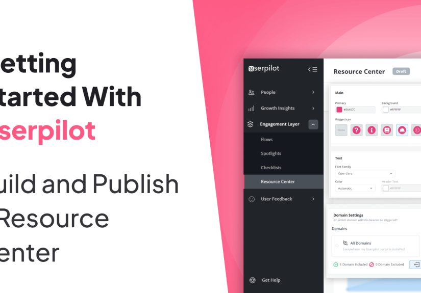
2. Build the Home Tab First
In Userpilot, create the Resource Center and configure the Home tab. Write a clear header and subtitle that tell users what this space is for. Something like “Need help?” is fine. Something like “Explore Product Enablement Assets” sounds like it was written by a committee trapped in a conference room. Choose clarity.
Then add modules in a sensible order. Put the most common tasks at the top. If most new users need to import data, invite teammates, and customize settings, those should be visible immediately. This is not the place to bury the basics under a cinematic product video and a three-part thought leadership series.
3. Use Targeting on the Module Level
One of Userpilot’s strongest advantages is module-level targeting. That means you can decide which content appears for which users or on which pages. This is where the Resource Center becomes contextual rather than generic.
For example:
- Trial users can see setup checklists and upgrade education.
- Admins can see billing or workspace configuration help.
- Users on a reporting page can see analytics tutorials.
- Users on a settings page can see permissions and integration guides.
This targeting prevents content overload. It also makes the Resource Center feel smart, which users appreciate even if they never say it out loud in your NPS survey.
4. Group Related Modules
If your Resource Center begins to look like a junk drawer, use groups. Grouping modules into sections such as “Start Here,” “Learn by Video,” or “Account Setup” creates structure and makes scanning easier. That aligns with broader documentation best practices: people rarely read support content from top to bottom. They scan, hunt, and pounce.
5. Connect Your Knowledge Base
Now set up the Help section by connecting your knowledge base. Userpilot supports integrations with platforms such as HubSpot, Zendesk, Salesforce, Freshdesk, Document360, Zoho Desk, and Intercom. If your help content is on a Google-indexed domain, you can also configure a domain-based search source.
This matters because an in-app resource center should not become a second documentation universe with contradictory instructions. Your best move is to let Userpilot surface your existing help content and then use in-app modules for the moments when a user needs immediate action, not just reading material.
6. Configure Search Carefully
Search is not a side feature. It is the feature. A great resource center with weak search is like a library where all the books are shelved by emotional vibe. Configure search so it pulls from the sources that actually help users: Help articles, Home modules, and News posts.
Use customer language in your titles and module names. If your team calls something “workspace provisioning” but users call it “setting up my account,” guess which phrase belongs in the headline. The user wins that argument every time.
7. Style It to Match Your Product
Userpilot allows you to customize colors, fonts, widget appearance, beacon style, and trigger options. Brand consistency matters because help should feel like part of the product, not like a suspicious popup from another universe.
That said, branding should never outrank readability. High contrast, generous spacing, obvious headings, and predictable layout beat “creative” design choices that require interpretation. If your beacon is beautiful but invisible, it is not helpful. It is just shy.
8. Localize When Needed
If you serve users in multiple languages, localization should be part of the plan early. Userpilot can display localized Resource Center content based on language settings. This is important because self-service fails quickly when the guidance is technically available but practically unusable for part of your audience.
9. Preview, Test, Then Test Again
Before publishing, use Userpilot’s preview options and live test mode. Check whether the widget appears on the correct pages, obeys audience targeting, fits the UI without covering critical buttons, and behaves correctly when users interact with modules.
Test it in a staging environment first if possible. Userpilot supports publishing safely to a test or staging domain. You can also limit visibility to internal testers using audience rules such as user IDs, emails, or names. That gives you a controlled launch instead of a public experiment disguised as confidence.
10. Publish With a Real Rollout Plan
Once testing looks good, expand the targeting to the intended audience and publish live. But publishing is not the finish line. Announce the Resource Center in onboarding flows, release notes, customer emails, and support replies. Users cannot adopt a resource they do not notice.
A simple support-team habit works wonders here: when responding to tickets, include the relevant article or module and mention that similar help is available in the Resource Center. Over time, this trains users to self-serve without feeling abandoned.
Content Best Practices That Make the Center Actually Useful
Building the shell is easy. Filling it with helpful content is the part that separates a high-performing resource center from a digital brochure.
Write Short, Task-Focused Content
Each article or module should solve one problem well. Keep headings specific. Use numbered steps for actions, bullets for options, and visuals where they shorten explanation. Long paragraphs are wonderful in novels and terrible in support content.
Use the Words Your Customers Use
Review tickets, chat logs, onboarding calls, and search queries. Then mirror that language in article titles and module names. You are not writing to impress the product team. You are writing to help a busy user fix something before their coffee gets cold.
Include Multiple Learning Formats
Some users prefer reading, some prefer watching, and some want a guided walkthrough inside the UI. Blend help articles, videos, checklists, and interactive flows so the Resource Center supports different learning preferences.
Offer a Support Escape Hatch
Self-service should reduce friction, not trap users in a maze of cheerful documentation. If a task is complex or urgent, give users a clear path to contact support. A good Resource Center says, “Here is the fastest answer,” not, “Please remain inside the widget until morale improves.”
Maintain the Content Like a Product
Stale documentation breaks trust fast. Assign content owners, set review dates, collect article feedback, and retire outdated pieces. If your UI changes every month but your help content changes once a year, the Resource Center will become a museum.
Common Mistakes to Avoid
- Launching with too much content: start with the most common tasks and questions.
- Ignoring search terms: users search with their vocabulary, not your internal taxonomy.
- Skipping targeting: showing everything to everyone creates clutter.
- Overdesigning the widget: readable beats fancy almost every time.
- Forgetting post-launch promotion: a hidden resource center helps nobody.
- Neglecting updates: outdated help content is worse than no help content because it sounds confident while being wrong.
How to Measure Success After Publishing
Once live, track whether the Resource Center is improving the user experience, not just existing attractively in the interface. Look at support ticket trends, repeated issue categories, article feedback, search behavior, onboarding completion, and adoption of the modules you surface most often.
A few strong signs you are on the right path:
- Fewer repetitive “how do I” tickets
- Better activation and onboarding completion rates
- Higher engagement with guides, checklists, and help content
- Faster time-to-value for new users
- More confidence in product changes because the News tab keeps users informed
If adoption is low, do not assume users hate self-service. Usually the problem is simpler: the content is hard to find, too broad, too long, or poorly matched to the context where people need help.
Conclusion
Building and publishing a Resource Center in Userpilot is not just a setup task. It is a strategic move that blends product education, support, onboarding, and communication into one in-app destination. Userpilot gives teams the mechanics: tabs, modules, search, targeting, styling, localization, testing, and publishing. Your job is to provide the judgment: what users need, when they need it, and how to present it without turning help into homework.
The best Resource Centers feel effortless to users because the hard work happened behind the scenes. The content is clean. The targeting is smart. The search works. The design is readable. The help is contextual. And when users do need a human, that path is obvious too. Build it that way, and your Resource Center stops being a widget and starts being a real growth asset.
Experience Notes: What Building a Resource Center Usually Teaches Teams
Here is the part many teams only learn after launch: building a Resource Center is as much an organizational exercise as it is a product setup project. On paper, it sounds simple. Add a widget, plug in articles, publish, and wait for support tickets to melt away like ice cream in July. In reality, the experience is more revealing. It shows you how clear your documentation really is, how well your teams agree on terminology, and whether your product education strategy exists beyond “we should probably make more help content someday.”
One common experience is discovering that the most valuable content is rarely the flashiest. Teams often begin by wanting to feature polished videos, major release announcements, and big educational hubs. Those are useful, but the articles that users lean on most are usually humble, practical pieces: how to invite a teammate, how to reset something, where to find a report, why an integration is not syncing, or what permission level controls a feature. In other words, the glamorous content may win internal applause, but the plainspoken troubleshooting guide pays the rent.
Another frequent lesson is that targeting changes everything. When teams first see the same Resource Center shown to all users, it can feel crowded fast. But once content is targeted by role, plan, lifecycle stage, or page context, the center starts feeling less like a pile of documents and more like a smart assistant. That is usually the moment stakeholders go from “nice support feature” to “oh, this can actually drive adoption.” Context is not just a UX bonus. It is the difference between relevant guidance and digital noise.
Teams also learn very quickly that search quality exposes weak content mercilessly. If titles are vague, if articles are too broad, or if the wording does not match how customers speak, users will search, fail, and either leave frustrated or open a ticket anyway. Nothing humbles a company faster than realizing customers search for “change plan” while the article is titled “subscription reconfiguration workflow.” A Resource Center is wonderfully honest that way. It does not care about internal jargon, and neither do users.
Perhaps the most valuable experience is what happens after publishing. The best teams treat launch day as the beginning, not the finale. They watch what users search for, which modules get clicked, where people still get stuck, and which articles get poor feedback. Then they refine. They rename titles. They split long articles into shorter ones. They add screenshots. They move a buried checklist to the top. They retire content that aged badly. Over time, the Resource Center gets smarter because the team gets better at listening.
That is why the most successful Resource Centers rarely appear fully formed on day one. They evolve. They become sharper, simpler, and more aligned with real user needs. And that is the encouraging part: you do not need perfection to publish. You need a solid structure, useful first content, good testing habits, and the willingness to improve. The teams that win are not the ones with the fanciest widget. They are the ones that keep making help easier to find, easier to trust, and easier to use.