Table of Contents >> Show >> Hide
- From Downtrodden to Dreamy: The Backstory
- Respecting the Bones: Historic Meets Modern
- The New Layout: Every Square Foot Working Overtime
- The Heart of the Home: Kitchen and Living Area
- Bedrooms and Bath: Quiet, Characterful Retreats
- What This Remodel Teaches About NYC Apartment Renovations
- Practical Tips for Your Own Gramercy-Style Transformation
- Experiences and Lessons from Gramercy Park–Style Makeovers
- Conclusion: A Blueprint for Your Own Before & After
Every New Yorker has heard the phrase “good bones.” It’s what keeps people from running out of open houses screaming after seeing brown linoleum and fluorescent light boxes. A few years ago, a musical theater actress named Mary Bolt looked past the peeling finishes and awkward layout of a tired Gramercy Park apartment and saw those good bones. With the help of architect Denise Lee, she turned a downtrodden prewar space into a layered, storage-rich home that feels calm, modern, and quietly dramatic all at once.
This is more than a pretty before-and-after story. It’s a master class in how to renovate a prewar NYC apartment: respecting 1870s architectural details while solving very 21st-century problems like no closets, bad circulation, and too much stuff. Let’s walk through what changed, why it works so well, and how you can steal the smartest ideas for your own space.
From Downtrodden to Dreamy: The Backstory
The apartment, roughly 1,000 square feet, sits in a former 19th-century bank building just off Gramercy Park. Before the renovation, it had a familiar set of New York issues: low-storage everything, a chopped-up layout, dated finishes, and original details buried under layers of paint and makeshift upgrades.
Bolt’s aunt, who lived next door, spotted the listing and knew the space had potential: 12-foot ceilings, tall windows, and original woodwork hiding beneath the cosmetic chaos. Bolt took the plunge, bought the apartment, and hired architect Denise Lee to rethink it from scratch. The verdict at the first walkthrough was blunt: this place needed a true gut renovation, not just “a coat of white and a new sofa.”
The challenge was ambitious: create a fully functional home with two bedrooms, a sleeping loft, and one-and-a-half baths in the same footprint, without sacrificing the character that makes a Gramercy Park apartment special. The solution was to treat every inch as potential storage or circulation, while letting the historic bones shine again.
Respecting the Bones: Historic Meets Modern
Surfacing the 1870s Details
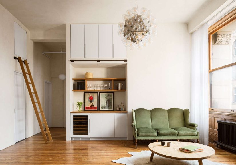
One of the guiding principles of the remodel was simple: if the building survived from the 1870s, its best features deserved a second life. During demolition, the team uncovered an original structural columnleft over from the building’s past as a bankand decided to make it a focal point in the new kitchen rather than hide it again. Original window casings, paneling, and cast-iron radiators were stripped of their thick paint shells and restored instead of replaced.
In the bedrooms, the existing wood floors had been smothered under engineered flooring. Once revealed, they needed only light repair, sanding, and refinishing to become one of the apartment’s star features. This “restore first, replace last” approach is common in thoughtfully done prewar renovations across New York: it maintains a sense of history, adds visual warmth, and often saves money compared with installing all-new finishes.
A Material Palette with Patina
To bridge historic architecture and a modern lifestyle, Lee chose materials that would age gracefully. Throughout the apartment, walls and ceilings are finished in hand-troweled natural plaster, which gives soft, shadowy texture rather than a flat, builder-grade look. In a prewar space with high ceilings, this kind of finish keeps the rooms from feeling sterile and makes the light read warmer and more nuanced.
In the kitchen, reclaimed white oak cabinetry pairs with concrete countertops and backsplash. Concrete, when properly sealed, offers a durable work surface with a subtle, organic variation; paired with the warmth of wood, it reads as “modern classic” rather than coldly industrial. Hardware and fixtureslike a streamlined chrome faucetkeep the space from slipping into nostalgia. The overall effect is a calm, neutral envelope that lets the architecture and the owner’s belongings do the talking.
The New Layout: Every Square Foot Working Overtime
Good looks alone don’t make a successful renovation; functionality does. Before the work, the layout wasted wall space on awkward hallways and didn’t offer enough built-in storage. The revised plan takes the opposite approach: the circulation is tighter and more logical, and nearly every vertical surface either hides storage or frames a view.
Within the same 1,000 square feet, the apartment now accommodates two true bedrooms, a sleeping loft, a full bath, and a half bathall while keeping the main living area open and airy. This mirrors what small-space designers across New York recommend: prioritize flexibility, vertical volume, and integrated storage instead of relying on bulky freestanding furniture.
Storage as Architecture
The star of the storage story is the custom staircase leading to the sleeping loft. Instead of standard risers, each step conceals deep drawers. Faced in a clean-lined laminate and cedar inside, they hold everyday clothing, shoes, and accessories. It’s essentially a full dresser built into the circulation path.
Under and around the loft, more storage appears in the form of tall closets and built-in cabinets. What used to be dead air space becomes a compact dressing zone and linen storage area. This approach echoes the best practices often seen in smart studio renovations: treat storage as part of the architecturewalls, stairs, soffitsrather than an afterthought squeezed in later.
Making the Most of a Sleeping Loft
The sleeping loft, tucked under those 12-foot ceilings, serves double duty. Most days it functions as a quiet reading nook, a place where Bolt can escape the bustle of the city. When visitors come to town, it becomes a guest “room” that feels cozy rather than cramped, thanks to the warm plaster, wood floors, and soft lighting.
Using vertical space like this is a classic NYC solution: you’re not going to steal square footage from your neighbors, but you can borrow from the height you already have. The key, as seen here, is making access comfortable (via the storage stair) and giving the loft some breathing room, rather than treating it like a crawlspace.
The Heart of the Home: Kitchen and Living Area
The kitchen sits at the center of the apartment’s social life. The newly exposed column becomes a character piece, anchoring the reclaimed oak cabinets and concrete surfaces. Open shelves and carefully scaled appliances keep the footprint compact but highly functional. It’s not a showy chef’s kitchen; it’s a working NYC kitchen designed for real weeknight cooking and late-night pasta after a show.
In the adjacent living area, a sliding library ladder runs on a custom rail above the bathroom door and other built-in cabinets. When needed, it allows access to high storage and mechanical panels; when not, it parks neatly on a wall-mounted rail and reads like a sculptural element. A green velvet sofa, simple coffee table in matching oak, and layered rug soften the modern millwork.
The result is a room that balances performance and personality. It’s easy to move around, lit by tall windows, and visually cohesive because the same wood-and-plaster palette repeats throughout. For anyone planning a small-space renovation, this is a reminder that consistency in materials can make a modest home feel much larger and calmer.
Bedrooms and Bath: Quiet, Characterful Retreats
The two bedrooms are designed to feel simple and restful. Original trim and window frames, once lost under heavy paint, now frame views with crisp lines and authentic detail. The decision to refinish the old floors rather than install new planks preserves the creak and patina that give prewar apartments their charm.
The main bath continues the material story from the kitchen: a custom white oak vanity, topped with concrete, supports a wall-mounted faucet. In the shower, elongated white tile is stacked vertically with contrasting grout, drawing the eye up to the high ceiling and making the narrow room feel taller. It’s a smart trick borrowed from many modern bath renovationsespecially effective in older buildings where you can’t always widen the footprint but you can exaggerate the height.
What This Remodel Teaches About NYC Apartment Renovations
While every building and board is different, this Gramercy Park transformation reflects the broader realities of renovating in New York Cityand offers lessons anyone can apply.
1. Sometimes a Gut Is the Kindest Option
It’s tempting to keep as many walls and fixtures as possible to save money. But when the existing layout is fundamentally dysfunctional, patchwork upgrades can cost more in the long run. Here, committing to a gut renovation allowed the architect to upgrade mechanical systems, improve circulation, and add proper insulation and sound controlall essential for comfort in a dense city.
2. Respect the Building, Win Over the Board
Co-op and condo boards in prewar buildings tend to look more favorably on projects that preserve or restore original details rather than erase them. Retaining radiators, refinishing historic floors, and exposing the original column are exactly the sort of moves that honor the building’s character while still updating it for modern living.
3. Storage Is Not an Afterthought
New Yorkers rarely complain that they have too many closets. Integrated storagethe staircase drawers, loft closets, and tall cabinetrymakes this apartment livable for the long haul, not just Instagrammable for a moment. Smart NYC renovation guides consistently emphasize planning storage early, not squeezing it in after the furniture plan.
4. Vertical Space Is Your Secret Weapon
Whether it’s a sleeping loft, sky-high bookshelves, or tall built-in wardrobes, using vertical space turns a small apartment into something that feels expansive. This project layers lofted zones, ladder-access storage, and high cabinets to make the most of those 12-foot ceilings.
5. Neighbor-Friendly Planning Matters
In real life, successful NYC renovations also involve detailed planning around noise, debris, and common areas. Coordinating contractor schedules, protecting hallways, and respecting work-hour rules can mean the difference between a smooth project and a building full of irritated neighbors. The most seasoned renovators treat this “social architecture” as seriously as the physical plans.
Practical Tips for Your Own Gramercy-Style Transformation
Feeling inspired to tackle your own before-and-after? Here are actionable ideas drawn from this apartment and other well-executed NYC renovations:
- Start with a clear program. List what you actually need: number of beds, work zones, storage types, and privacy levels. Then judge every design decision against that list.
- Choose a tight material palette. Pick two or three core finishes (for example, warm wood, soft plaster, simple tile) and repeat them to create cohesion.
- Turn transitions into opportunities. Staircases, soffits, and loft undersides can all hide cabinets, drawers, or open shelving.
- Invest in lighting. High ceilings and plaster walls love layered lightrecessed ambient lighting plus a few standout fixtures can shift the mood from “rental” to “boutique hotel.”
- Budget for surprises. In prewar buildings, you may uncover aging wiring, hidden pipes, or, if you’re lucky, original architectural details. Build contingency into your budget so you can address the bad surprises and celebrate the good ones.
- Work with pros who know NYC. Architects and contractors familiar with local codes and board processes can save months of frustration and help keep your project on track.
Experiences and Lessons from Gramercy Park–Style Makeovers
This project isn’t the only Gramercy Park story with a satisfying ending. Across the neighborhood, owners are rethinking compact apartments in clever, livable waysand their experiences echo many of the same themes.
Take the design-savvy couple who turned a small Gramercy studio into a pied-à-terre with a hidden kitchen. Behind mirrored doors, the cook space disappears entirely when not in use, allowing the main room to read as a lounge rather than a cramped kitchenette. Mirrored surfaces bounce light, visually enlarging the room, while bold color on a single accent wall keeps things lively instead of sterile. Their biggest lesson: if your apartment does double duty (office by day, living room by night, guest room on weekends), treat certain elementslike a kitchen or Murphy bedas “scenery” you can reveal or conceal as needed.
Another Gramercy resident, a stylist living in just over 200 square feet, approached her studio like a magazine spread. She chose a soothing blue palette, repeating the same tones in textiles, art, and even storage boxes. Instead of fighting the small size, she leaned into it, creating “zones” with rugs and lighting: a seating vignette by the window, a compact dining spot by the wall, and a sleeping nook that doubles as a daybed. Her takeaway: in tiny homes, the color story and styling discipline matter as much as the floor plan. If everything looks like it belongs together, the space feels intentional, not improvised.
Stagers working in Gramercy Park apartments tell a similar story from a different angle. One stager transformed a dated unit largely by editing and rearranging what the owner already had. Heavy curtains came down to reveal original windows; bulky armoires were removed to show off the room volume; and a few modern piecesa streamlined sofa, a large neutral rug, a simple dining tableinstantly made the space feel current. The stager’s key insight: buyers (and guests) read “potential” in terms of light, circulation, and proportion, not in the number of pieces you squeeze into a room.
Owners of prewar apartments also talk candidly about the less glamorous side of renovations: permit delays, board approval meetings, and the delicate politics of noise and dust. One common strategy is to over-communicate with neighbors before demolition startssharing timelines, quiet hours, and contact info for the contractor. Many also recommend moving out temporarily during the messiest phase if possible, especially if walls are being opened up or plaster is being replaced. Living in a construction zone can sour even the most exciting project.
Yet when you hear these residents describe the moment they finally move back in, there’s a common emotional thread: it feels like living in the same story, but with a completely different ending. They still walk through the same lobby and ride the same old elevator. But crossing the threshold into a home that finally fits their lifewhere original details and modern comforts coexistthat’s the real transformation.
The Gramercy Park apartment from our Remodelista-inspired tour captures this perfectly. It’s still very much an 1870s building, still very much New York. But the inside now tells a new story about how its owner lives, works, hosts, and rests. That’s the power of a thoughtful before-and-after: not just prettier pictures, but a completely different way of experiencing the same square footage.
Conclusion: A Blueprint for Your Own Before & After
This Gramercy Park makeover is a love letter to prewar architecture and a case study in smart, contemporary design. By exposing original columns and radiators instead of hiding them, choosing a calm, patina-friendly palette, and turning storage into a design feature rather than an eyesore, the architect and owner created a home that feels both timeless and personal.
If you’re staring at your own weary apartment and wondering whether it can ever feel like “you,” take heart from this transformation. Good bones plus thoughtful planning, a disciplined material palette, and hardworking storage can turn almost any space into a place you’re proud to come home to. Your building’s facade might never changebut the life you live inside it absolutely can.