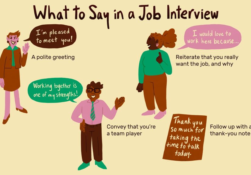
Table of Contents >> Show >> Hide
- Before You Pick a Color: The 60-Second Curb-Appeal Checklist
- 1) DO Treat Your Door Like an Accent Color DON’T Ignore Your Home’s Permanent Features
- 2) DO Use “Bold Neutrals” for Timeless Style DON’T Assume Neutral Means Invisible
- 3) DO Test Undertones Outdoors DON’T Trust Your Screen (or the Store Aisle Lighting)
- 4) DO Think About Sheen DON’T Pick High Gloss Unless You’re Ready for the Spotlight
- 5) DO Coordinate With Trim and Hardware DON’T Let Metals Fight Your Paint
- 6) DO Match Color to Architecture DON’T Force a Trend That Doesn’t Fit
- 7) DO Use Color Psychology Wisely DON’T Accidentally Send the Wrong Vibe
- 8) DO Consider Sun, Heat, and Fading DON’T Pick a “Pretty” Color That Won’t Age Well
- 9) DO Decide How “Resale-Friendly” You Need to Be DON’T Forget Curb Appeal Can Be Financial
- 10) DO Make the Color Look “Expensive” With Prep DON’T Skip the Boring Stuff That Makes the Pretty Stuff Last
- Quick “Works Almost Anywhere” Color Pairings
- Common Mistakes That Make a Door Color Look “Off”
- of Real-World “Been There” Experiences to Help You Choose
- Conclusion
Your front door is basically your home’s handshake. It introduces you to the neighbors, greets delivery drivers,
and silently judges whether your wreath is “seasonal charm” or “I forgot it was still up from 2022.”
The right front door color can boost curb appeal fast, make your entry feel intentional,
and tie your whole exterior together. The wrong one can look like you lost a paintball fight with your siding.
The good news: choosing a door color doesn’t require an art degree or a dramatic montage set to inspirational music.
It just requires a few smart rules, a little honesty about your home’s fixed features (brick doesn’t care about your feelings),
and some testing in real outdoor light. Designers and paint pros consistently point to the same fundamentals:
coordinate with the exterior palette, respect undertones, and use finishes that can survive weather and fingerprints.
Before You Pick a Color: The 60-Second Curb-Appeal Checklist
- Fixed colors: roof shingles, brick/stone, driveway, and major landscaping tones (these don’t change easily).
- Existing palette: siding + trim + shutters + porch ceiling (if you have one).
- Hardware: knob/handle, knocker, house numbers, lighting finish (black, brass, nickel, bronze).
- Light exposure: full sun, shade, or “mystery lighting that makes everything look different at noon.”
- Goal: resale-friendly, personal statement, or “I want my house to feel happier when I come home.”
1) DO Treat Your Door Like an Accent Color DON’T Ignore Your Home’s Permanent Features
DO: Let the door act like the “statement accessory” for your exteriorbold, intentional, and coordinated.
Paint brands and design editors often describe the door as an accent that should harmonize with siding, trim, and landscape.
DON’T: Choose a color in isolation. If you have red brick, warm stone, or a roof with strong undertones,
those elements are the boss of your palette, not the other way around. A door color that fights your brick will always lose.
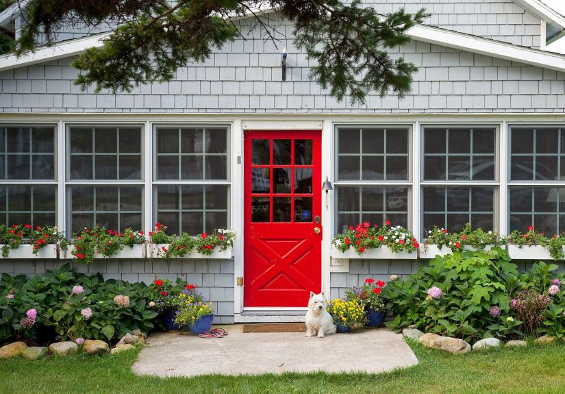
Example: A warm-toned red brick often pairs beautifully with deep greens, rich navies, or classic black because the contrast feels deliberate,
not accidental.
2) DO Use “Bold Neutrals” for Timeless Style DON’T Assume Neutral Means Invisible
DO: Consider strong, classic shades that behave like neutrals: black, charcoal, deep navy, and deep red can read “timeless”
while still giving your entry presence. Lifestyle and shelter publications regularly flag these as dependable choices across many home styles.
DON’T: Pick a neutral that disappears. A pale beige door on beige siding can look less “elegant restraint”
and more “I couldn’t find the ‘Add Personality’ aisle.”
Example: On a white house, a black door feels crisp and architectural. On a gray house, a deep navy adds depth without looking trendy.
3) DO Test Undertones Outdoors DON’T Trust Your Screen (or the Store Aisle Lighting)
DO: Test samples on the actual door (or foam board) and check them morning, midday, and evening.
Exterior light changes everythingespecially undertones (blue-green, red-brown, violet-gray). Pros consistently recommend viewing colors
in the real setting before committing.
DON’T: Choose based on a phone photo. Your camera will “correct” color like it’s auditioning for a makeover show.
Also, that cute “sage” you saved may turn into “hospital scrubs” in full sun if its undertone is too cool.
4) DO Think About Sheen DON’T Pick High Gloss Unless You’re Ready for the Spotlight
DO: Use a durable finish that can handle weather and sticky fingerprints. Many paint guides note that glossier sheens reflect more light,
can brighten darker entryways, and are easier to wipe downmaking them popular for doors.
DON’T: Go super glossy if your door surface is rough, dented, or unevenshine highlights imperfections like a stage spotlight.
If your door has character (read: dings), a lower sheen can be more forgiving.
Example: A deep, moody color in satin or semi-gloss often looks rich and intentional. Full high-gloss can be stunningif the prep is flawless
and the style fits your home.
5) DO Coordinate With Trim and Hardware DON’T Let Metals Fight Your Paint
DO: Treat the door color and hardware as a team. If you have warm brass lighting and house numbers,
consider colors that flatter warm metals: deep green, navy, oxblood, warm black, or creamy tones.
If your hardware is brushed nickel, crisp colors like black, charcoal, true navy, and cool greens often feel clean and modern.
DON’T: Ignore the frame. Some designers note that a door can look more “finished” when the frame and door color relationship is intentional
(either matching for a bold statement or clearly contrasting for definition).
6) DO Match Color to Architecture DON’T Force a Trend That Doesn’t Fit
DO: Let your home’s style guide you. A Craftsman often looks great with earthy colors (greens, ochres, warm reds).
A modern home can pull off charcoal, black, or saturated jewel tones. A traditional Colonial can look sharp with black, navy, deep red, or classic green.
Design editors repeatedly emphasize using the door for personalitywithout breaking the overall look.
DON’T: Pick a “viral” color just because it’s trending. Trends are fun; repainting every year is… a lifestyle.
If you love the look of a bold teal but your home reads very formal and traditional, consider a deeper, dustier version
that still feels elevated.
7) DO Use Color Psychology Wisely DON’T Accidentally Send the Wrong Vibe
DO: Think about the impression you want your entry to make.
Blues are often associated with calm and trust, greens with growth and nature, reds with energy and warmth, and black with sophistication and drama.
DON’T: Choose a color that feels “off” for your neighborhood and your own taste.
Your front door is allowed to have personalitybut it shouldn’t feel like it’s wearing a costume.
Example: If you want cheerful without chaos, try a warm yellow with depth (more sunflower or ochre than highlighter).
If you want moody and modern, charcoal or inky blue can feel dramatic without being loud.
8) DO Consider Sun, Heat, and Fading DON’T Pick a “Pretty” Color That Won’t Age Well
DO: Pay attention to exposure. Strong sun can fade bright or highly saturated colors faster, and dark colors can absorb heat.
Some designers and home publications specifically caution that very dark hues can run hotter on the surface, which may be a concern for certain doors
or climates.
DON’T: Ignore maintenance reality. Pure white doors show grime quickly, and ultra-bright colors can look tired if they fade unevenly.
Choose a quality exterior paint system and a finish level you can realistically keep looking good.
9) DO Decide How “Resale-Friendly” You Need to Be DON’T Forget Curb Appeal Can Be Financial
DO: If selling soon is on your radar, lean toward broadly appealing options like black or deep blues.
Real estate research and reporting has found that certain door colors (especially black and blue families) can correlate with stronger buyer interest
and higher offers in some analyses.
DON’T: Treat resale like a rule that bans personality forever. If you’re staying put, pick something you love
and keep it cohesive with the home. (Your house should make you happy before it makes a buyer happy.)
10) DO Make the Color Look “Expensive” With Prep DON’T Skip the Boring Stuff That Makes the Pretty Stuff Last
DO: Plan for proper prep: cleaning, sanding/deglossing if needed, priming for the door material, and using exterior-grade products.
This Old House and other how-to sources emphasize primer choice, durability, and techniques that help paint hold up on exterior doors.
DON’T: Rush straight to color without considering the door’s condition. The best shade in the world won’t look right over peeling paint,
dusty panels, or yesterday’s cobwebs (which, unfortunately, are excellent at photo-bombing first impressions).
Quick “Works Almost Anywhere” Color Pairings
- White siding + black door: crisp, classic, and high contrast.
- Gray siding + deep navy door: polished, coastal-leaning without being theme-y.
- Brick + deep green door: grounded, traditional, and rich.
- Neutral exterior + warm red door: welcoming, classic, and instantly noticeable (in a good way).
- Modern exterior + charcoal door: clean lines, understated drama.
Common Mistakes That Make a Door Color Look “Off”
- Picking a color with the wrong undertone (warm house + icy door = visual argument).
- Forgetting the trim color and leaving the door looking “cut out.”
- Using the wrong sheen for the door’s condition (too glossy on a beat-up surface).
- Choosing a trendy shade that clashes with the home’s architecture.
of Real-World “Been There” Experiences to Help You Choose
If you’ve ever stood in the paint aisle holding five tiny swatches like they’re rare trading cards, congratulationsyou’re normal.
One of the most common homeowner experiences is falling in love with a color in theory and then watching it transform into something else
the second it hits outdoor light. That “cute muted blue” can turn surprisingly bright at noon, while a “soft gray” can drift purple at sunset.
The fix is boring but magical: test outside, look at it in multiple lighting conditions, and give yourself at least a day to live with it.
That pause saves a lot of “why does my door look like wet cement?” regret.
Another classic experience: choosing the perfect door color… and then realizing your hardware suddenly looks wrong.
A door isn’t just paintit’s paint plus metal plus lighting plus trim. People often report that their new color looked amazing
until the old brass knob made it feel dated, or the modern black sconce clashed with a warm, orangey red. The best “aha” moment happens
when you look at the entry as one composition. Even small tweaksnew house numbers, a coordinating knocker, or swapping a bulb for a warmer tone
can make your chosen color feel intentional instead of accidental.
There’s also the experience of picking a bold color and then worrying it’s “too much.” Here’s the funny part: the front door is the safest place
to be brave. It’s a small area, it’s easy to repaint, and it can carry personality without committing your whole exterior to a statement.
People who try a saturated shade (like deep green, inky blue, or a rich red) often find the rest of the house looks more polished afterwardlike the door
gave everything else a purpose. That’s why designers keep recommending rich, confident hues that still coordinate with the home’s materials.
Practical reality shows up fast, too. Dark colors can look stunning, but if your door gets intense afternoon sun, you may notice heat and fading
become part of the conversation. Homeowners in sunny exposures often end up choosing slightly less extreme versions of dark tones (think charcoal instead of
pure black, or deep slate instead of midnight) and pairing them with a durable exterior paint and a sensible sheen for easy cleaning.
Finally, there’s the emotional experiencethe reason people bother painting the door in the first place. A front door color can genuinely change
how it feels to come home. A warm, welcoming shade can make a house feel friendlier. A crisp black or navy can make it feel more “finished.”
And a cheerful color can give you a little spark every time you pull into the driveway. If you’re stuck, choose the feeling you want first,
then pick a shade that supports that feeling while staying friendly with your siding, trim, and roof. That’s not just design adviceit’s a sanity strategy.
Conclusion
Choosing the best front door color isn’t about chasing trends or playing it painfully safeit’s about making one smart accent choice
that fits your home’s fixed features, looks good in real outdoor light, and holds up to real life. Test undertones, pick a practical sheen, coordinate
with trim and hardware, and decide whether you’re optimizing for resale or self-expression (or both). When you get it right, your entire exterior looks more
intentionallike it got dressed on purpose.